Sherwin Williams' Dover White SW 6385, which boasts an RGB composition of 240,234,220, exudes a warm and welcoming ambiance often associated with the versatile hue of soft cream rather than just Beige. This shade serves as an ideal backdrop in both contemporary and traditional spaces, effortlessly complementing a variety of decor styles. Its subtle undertones lend a sense of sophistication and timelessness to interiors, creating a serene atmosphere that enhances natural light.
Color Description
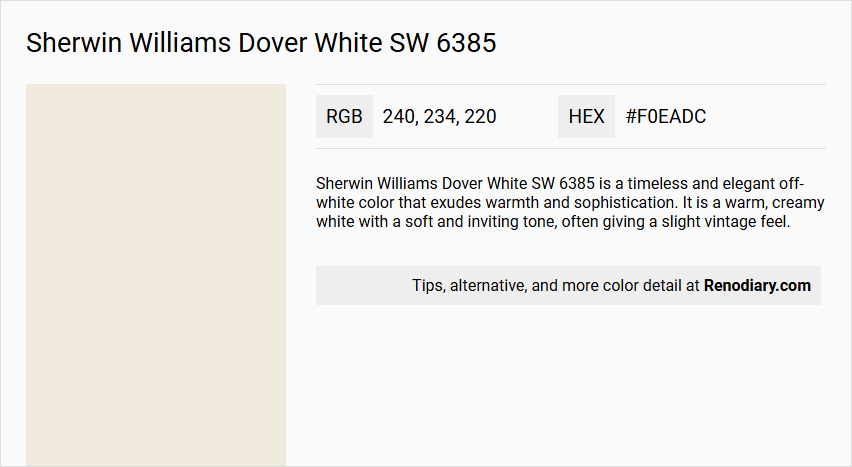
Sherwin Williams Dover White SW 6385 is a timeless and elegant off-white color that exudes warmth and sophistication. It is a warm, creamy white with a soft and inviting tone, often giving a slight vintage feel.
Undertones
Dover White has noticeable yellow and creamy undertones. These undertones can become more pronounced when paired with cool tones or certain greige paint colors, and they are particularly evident in west-facing rooms.
Color Values
- HEX Value: #F0EADC
- RGB Values: Red = 240, Green = 234, Blue = 220
- LRV (Light Reflectance Value): 83
The LRV of 83 indicates that it is a relatively light but not overly bright color.
Usage
Dover White is versatile and can be used in a variety of settings:
- Interior: It works well in bedrooms, nurseries, kids' rooms, and north-facing rooms to brighten them up. It is also suitable for trim and main wall colors.
- Exterior: It is a good choice for exterior paint, especially in warm, tropical zones, and pairs well with natural stone, wood, brick, and green accents.
Atmosphere
Dover White creates a calm, relaxing, and warm atmosphere. It adds a touch of understated luxury and can make a space feel cozy and inviting, making it particularly suited for Country and Farmhouse interiors.
Sherwin Williams Dover White SW 6385 Color Alternative
Sherwin Williams Dover White SW 6385 serves as a refined base color, widely appreciated for its versatility and enduring appeal in various design settings. Tikkurila Canvas G485, Tikkurila Chalk F484, and Tikkurila Acropolis F458 are carefully selected alternatives that offer distinct nuances and complement the original tone without compromising its elegance. Designers can confidently blend these options to enhance the vibrancy and depth of any space, ensuring a harmonious balance between classic refinement and modern aesthetics.
Bathroom
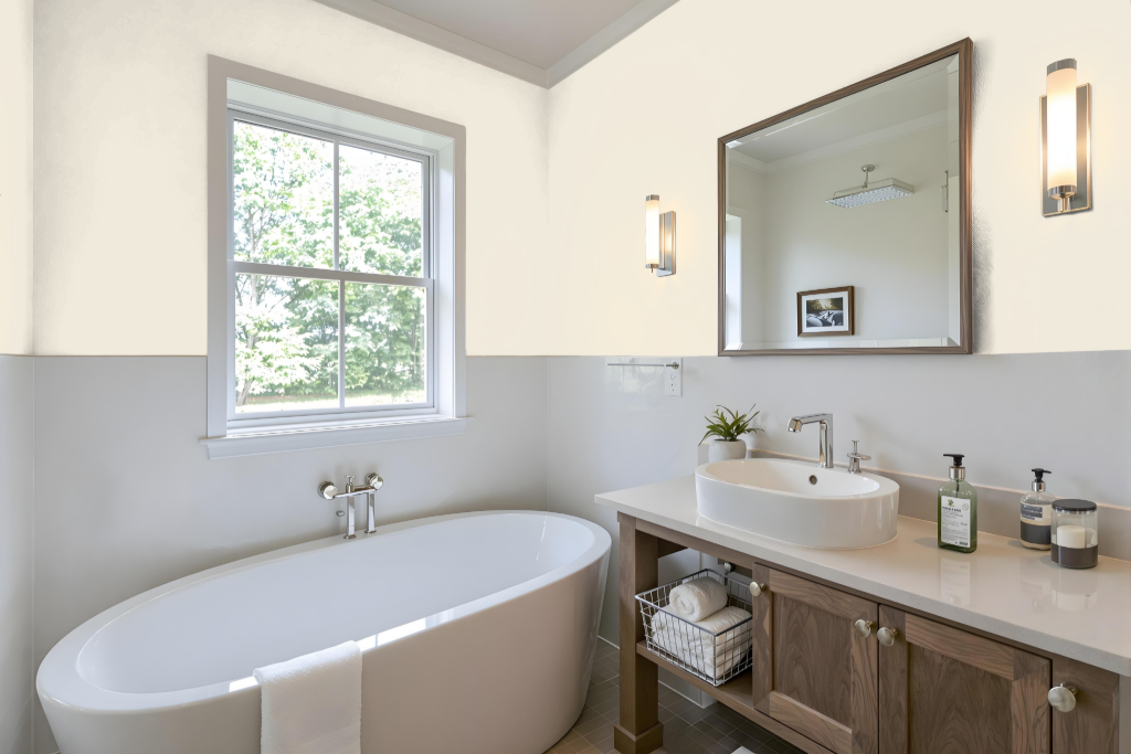
For a bathroom, Sherwin Williams Dover White SW 6385 offers a calming tone that works harmoniously with fixtures and materials like natural stone, wood, and green accents often found in bathroom designs. Its yellow nuances provide a warm backdrop that can elevate the overall aesthetic.
Considering the bathroom’s lighting is essential since north-facing rooms can balance its warmth whereas southern exposures may intensify the effect. Complementing Dover White with cooler hues such as grays or blues can achieve a dynamic contrast, ensuring the color adapts well to specific lighting conditions and design fixtures.
Bedroom
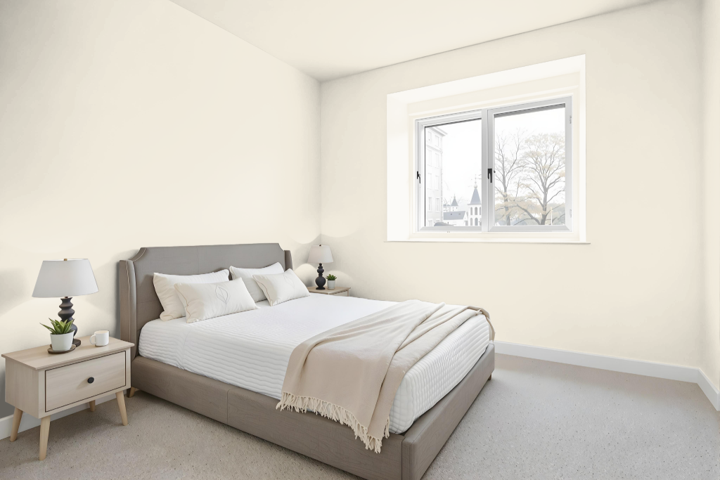
For a bedroom color scheme, Sherwin Williams Dover White SW 6385 offers an inviting and warm ambiance, perfect for creating balance in a north-facing room. It brings a welcoming brightness that harmonizes well with darker accents like black or deep gray, while also pairing beautifully with natural materials such as wood and green accents to foster a calming atmosphere.
Its pronounced yellow undertones, however, require careful coordination when mixing with cooler hues or softer neutrals, necessitating thoughtful complementary selections. When combined with hues like SW 9023 Dakota Wheat or SW 9141 Waterloo, as well as soft blues and greens, this color can enhance a modern farmhouse style while maintaining a visually appealing contrast.
Kitchen
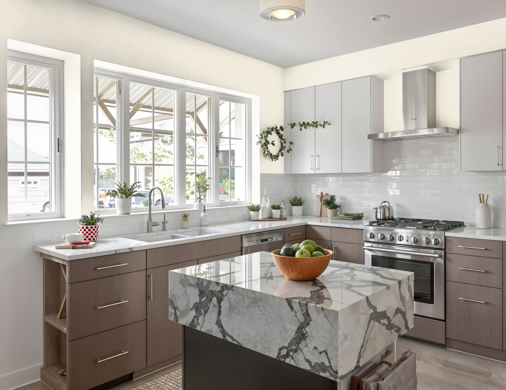
For a kitchen color scheme, Sherwin Williams Dover White SW 6385 offers a warm, soft tone that can be challenging when used on cabinets because its pronounced yellow undertones may cause them to appear overly yellow or dingy, especially alongside cooler tones and brighter whites. When pairing wall colors with Dover White cabinets, it is critical to choose shades that neutralize its warmth rather than amplify it, opting for hues that bring out complementary characteristics.
Using Dover White for both trim and cabinets can work if the surrounding palette is carefully managed; a backsplash in a color that echoes its warmth is preferable over a stark white, which might accentuate the yellow cast. Selecting wall colors such as darker creams, tans, or greige with lower light reflectance can harmonize with Dover White, ensuring a balanced and inviting kitchen space.
Living Room
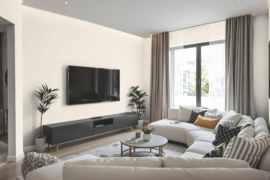
An inviting living room color, Dover White is known for its warm, inviting nature that brightens north-facing spaces and enhances the overall ambiance. Its inherent warmth lends a distinctive glow to interiors, making it a favored choice for creating both country and modern farmhouse aesthetics when paired with soft blues, greens, darker creams, or tan accents.
This hue’s warm undertones call for careful consideration when coordinating with cooler shades such as lighter grays and greiges to avoid any clashing effects. Complementary colors like Dakota Wheat and Waterloo can be paired for a balanced look, and the color also works well on trim and ceilings when attention is given to its subtle yellow nuances.
Outdoor
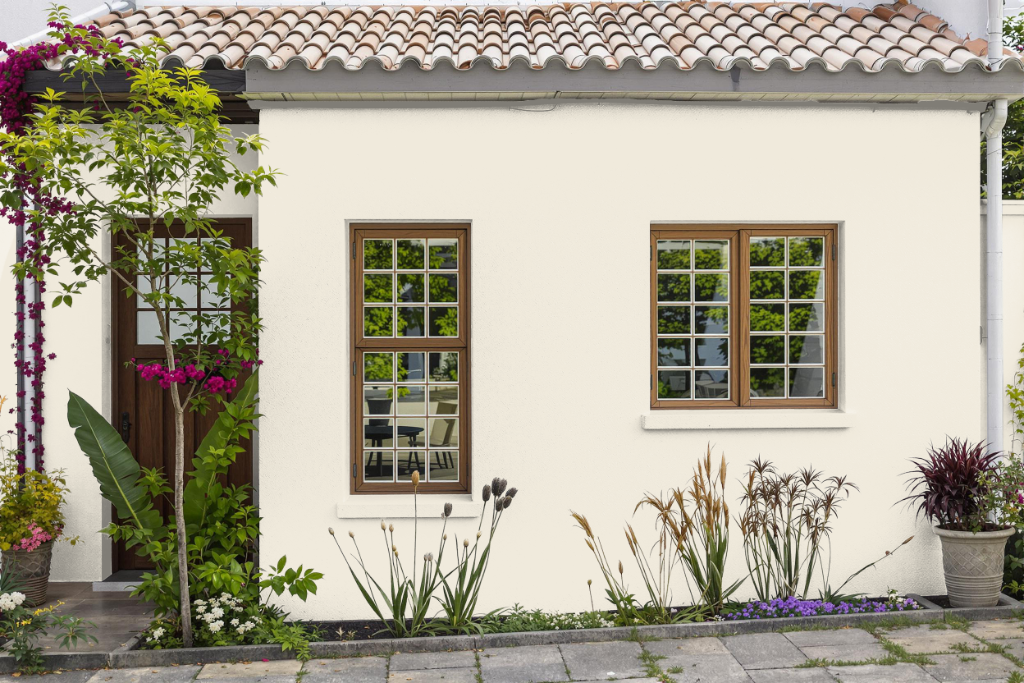
Sherwin Williams Dover White SW 6385 is a home outdoor color that sets a warm and inviting tone for both primary exteriors and accent features. Its inviting character harmonizes beautifully with natural stone, wood, brick, and green details, making it especially appealing for Mediterranean, Southwestern, and stucco homes.
Applied to exteriors, this color creates striking contrasts when paired with darker elements like black doors and trim, while also complementing crisp whites and greens. However, care is needed when matching it with some neutral shades, as its yellow undertones can become more prominent alongside cooler hues.