Sherwin Williams Jubilee SW 6248 is a sophisticated shade often described as Blue Gray, embodying both warmth and modern elegance. With its RGB composition of 173, 181, and 185, it offers a balance that is neither too cool nor overly warm, making it a versatile choice for various design themes. This hue seamlessly integrates into spaces aiming for a serene and stylish atmosphere, harmonizing with a range of textures and accents.
Color Description
Sherwin Williams Jubilee SW 6248 is a sophisticated and timeless gray color with a slight blue undertone, creating a serene and calming ambiance. It has a cool mid-tone quality that is neither too light nor too dark, making it versatile for various decor styles, from contemporary to traditional.
Undertones
The undertone of Jubilee SW 6248 can be accurately described as a blue hue. This blue undertone is subtle and does not dominate the overall gray tone of the color.
Color Values
- HEX Value: #ADB5B9
- RGB Code: 173, 181, 185
- Light Reflectance Value (LRV): 45
The LRV indicates it reflects just under half of the light that hits it, giving it a balanced and not overly saturated appearance.
Usage
Jubilee SW 6248 can be used as a main wall color or as an accent color. It pairs well with crisp whites like Sherwin Williams Pure White (SW 7005) for a clean and modern look, or with warmer colors like Accessible Beige (SW 7036) or Alabaster (SW 7008) to create a cozy and inviting atmosphere. It is suitable for various rooms, including bedrooms, bathrooms, living rooms, and offices.
Atmosphere
This color creates a serene and calming ambiance, making it ideal for spaces where a peaceful atmosphere is desired. It adds a touch of elegance and refinement to any room, making it suitable for both contemporary and traditional decor styles.
Sherwin Williams Jubilee SW 6248 Color Alternative
Sherwin Williams Jubilee SW 6248 is a remarkable hue whose classic appeal invites exploration of distinctive alternatives for different design visions. Tikkurila Panorama J428 brings a bold, contemporary twist, Little Greene Bone China Blue 107 adds an element of refined subtlety, and Sherwin Williams Stardew SW 9138 provides a fresh yet harmonious complement. These alternatives present designers with a versatile palette, ensuring that every project can achieve a unique balance of style and character while staying true to the original inspiration.
Bathroom
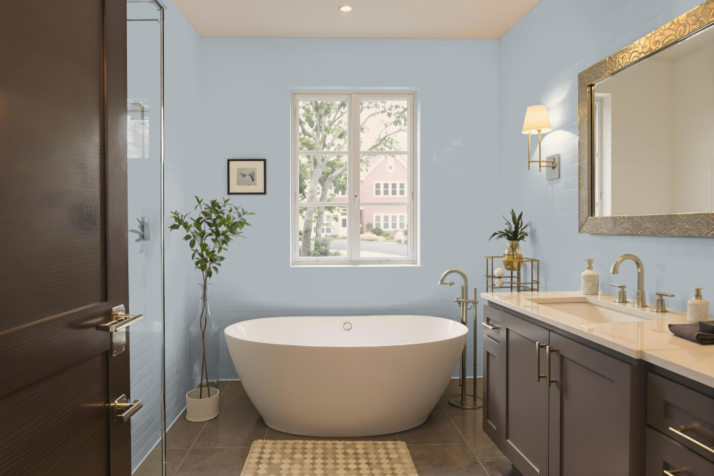
For a bathroom, Sherwin Williams Jubilee SW 6248 can create a serene and calming atmosphere. Its balanced, mid-tone hue reflects enough light to keep the space bright while imparting a refined, modern look, especially when paired with crisp whites that enhance clarity and simplicity.
Integrating warmer accents through complementary shades like Accessible Beige or Alabaster introduces a welcoming contrast, adding depth and softness to the setting. For trim and detail work, using clean whites or deeper, richer tones further accentuates the room's sophisticated design, creating a cohesive and inviting environment.
Bedroom
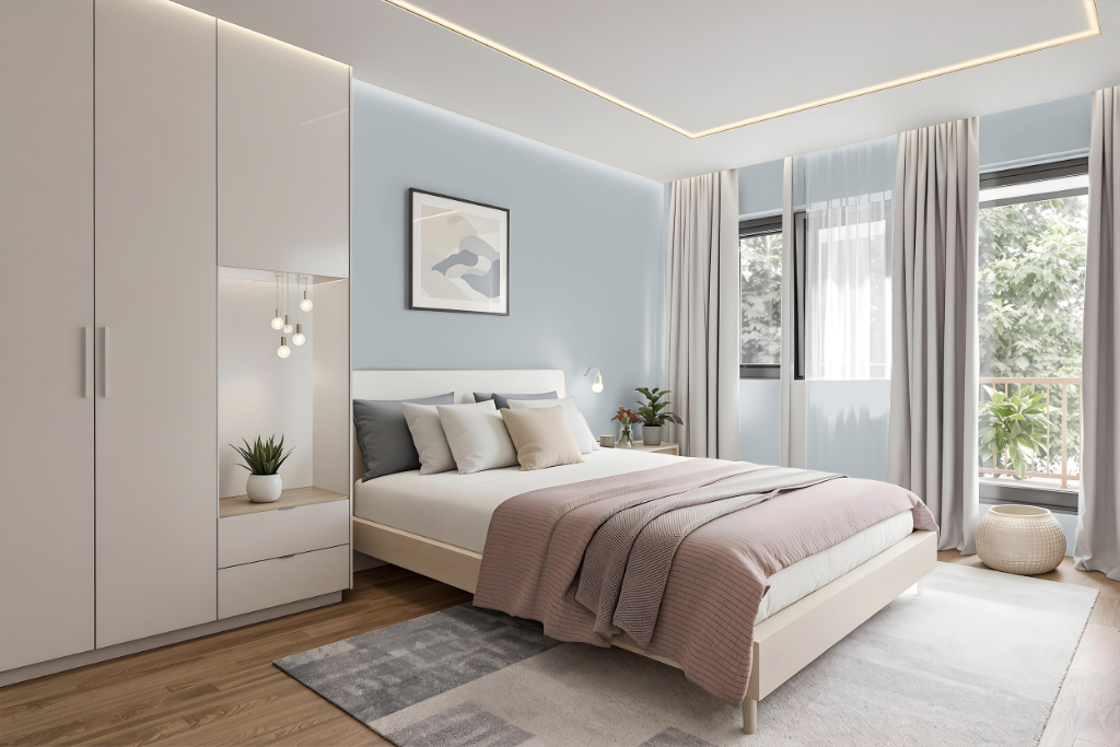
This bedroom color scheme centers on Sherwin Williams Jubilee SW 6248, creating a serene and calming retreat. Crisp white for trim and accents promotes a clean, modern feel, while warmer tones like Accessible Beige or Alabaster introduce a cozy, inviting touch. A darker accent option adds depth and a dramatic effect to the overall design.
Nature-inspired shades, including soothing greens and deep blues for accent walls or accessories, further enhance the sense of balance and visual interest. The curated mix of these hues results in a layered, sophisticated space that feels both contemporary and warmly welcoming.
Kitchen
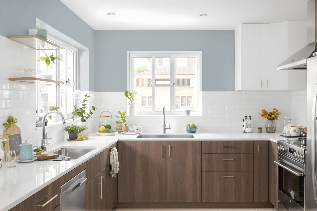
For a kitchen color scheme, Sherwin Williams Jubilee SW 6248 creates an elegant atmosphere that pairs well with crisp white trim, such as Pure White, for a clean, modern look. Warm neutrals like Accessible Beige or Alabaster can be used to introduce inviting warmth, while richer tones such as Peppercorn offer a striking contrast when opting for darker trim.
Additional layers of interest can be achieved by incorporating complementary shades, from muted greens to deep blues, alongside lighter accents like a mid-tone beige with subtle peach undertones. This thoughtful combination of cool and warm tones produces a balanced design that enhances the kitchen’s overall appeal.
Living Room
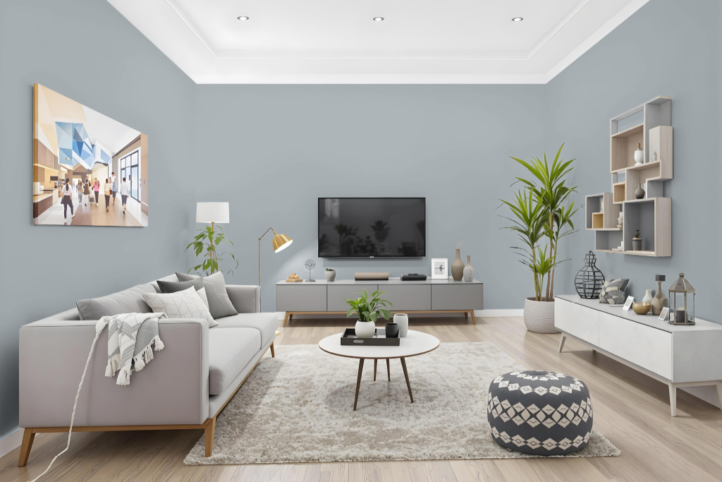
In a living room, Sherwin Williams Jubilee sets a sophisticated tone that enhances the ambiance even in spaces with limited natural light. Its carefully balanced reflective quality makes it an excellent backdrop whether used as the main wall color or as an accent.
Paired with crisp whites for a modern look or warmer neutrals for added coziness, Jubilee harmonizes seamlessly with various decor styles ranging from contemporary to traditional. Complementary shades such as nature-inspired greens, deeper blue accents, or warm beige tones further enrich its appeal.
Outdoor
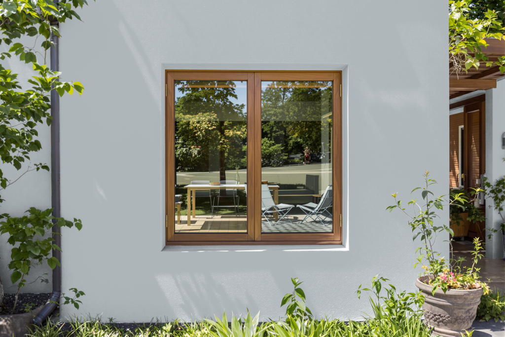
Sherwin Williams Jubilee SW 6248 is an elegant home outdoor color that lends a sophisticated touch to any setting. While it performs beautifully as an interior paint with its light-reflecting properties, its appearance on exteriors, particularly on north-facing surfaces with limited natural light, may seem darker.
For a clean, modern look, pairing this hue with crisp white trim creates a striking contrast, while a warmer ambiance can be achieved by combining it with complementary soft neutrals. Testing the color with peel-and-stick samples on various surfaces and under different lighting conditions is essential to ensure it meets your design vision.