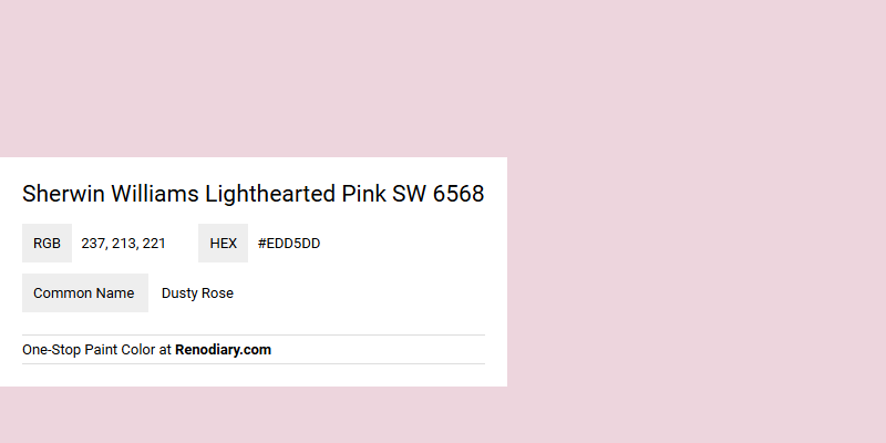
Sherwin Williams' Lighthearted Pink SW 6568, with its RGB composition of 237, 213, 221, is often likened to the soft and muted tones of Dusty Rose. This elegant hue captures a delicate balance between warmth and neutrality, making it an ideal choice for spaces seeking a serene and inviting atmosphere. Its subtle charm and timeless appeal allow it to seamlessly complement a variety of interior styles, from vintage chic to modern minimalism.
Color Description
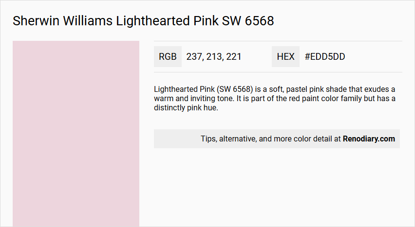
Lighthearted Pink (SW 6568) is a soft, pastel pink shade that exudes a warm and inviting tone. It is part of the red paint color family but has a distinctly pink hue.
Undertones
This color has subtle undertones that lean slightly towards a warm, gentle red, but it remains predominantly a light pink.
Color Values
- Lab Values: The Lab color values for Lighthearted Pink are provided, though specific numbers are not listed here. However, it can be found in detailed color profiles.
- RGB Values: The RGB value for Lighthearted Pink is approximately #edd5dd.
- HLC Values: Also available, but specific numbers are not provided here.
Usage
Lighthearted Pink is suitable for both interior and exterior paint projects. It can be used to create a warm and welcoming atmosphere in various spaces, from bedrooms and living rooms to exterior walls and decorative elements.
Atmosphere
This color creates a light, airy, and cheerful atmosphere. It is ideal for spaces where a soft, feminine, and calming ambiance is desired. The warm undertones add a sense of comfort and coziness to the room.
Sherwin Williams Lighthearted Pink SW 6568 Color Alternative
Sherwin Williams Lighthearted Pink SW 6568 is a captivating shade that inspires a playful yet sophisticated atmosphere. Its color alternative options, including Tikkurila Feather F487, Tikkurila Steam G497, and Tikkurila Cloud Y481, provide designers with versatile choices to suit varying styles and moods. Each of these colors offers a unique twist while maintaining the charm and appeal of Lighthearted Pink SW 6568 in dynamic applications.
Bathroom
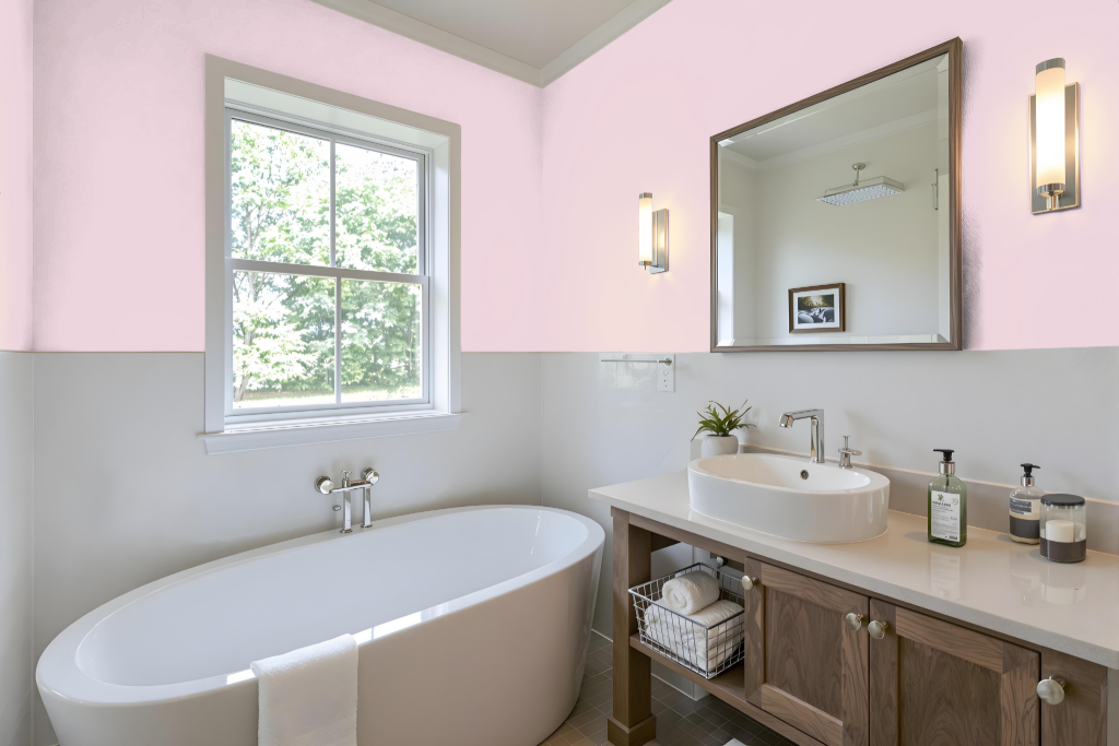
Sherwin Williams Lighthearted Pink SW 6568 offers a playful and unique option for a bathroom, creating a bold alternative to the more traditional calming hues often chosen for such spaces. While this cheerful shade is typically favored for nurseries, bedrooms, or cozy reading areas, it brings an unexpected level of character when used in a bathroom setting, inviting a distinctive, lighthearted ambiance.
To achieve a balanced look, consider pairing this color with complementary hues—such as soft greens—to create a vibrant yet harmonious contrast or using it as an accent wall to prevent overwhelming the space. Additionally, carefully evaluating the bathroom’s lighting and decor style will ensure that the overall design retains cohesion while still showcasing the lively spirit of this refreshing shade.
Bedroom
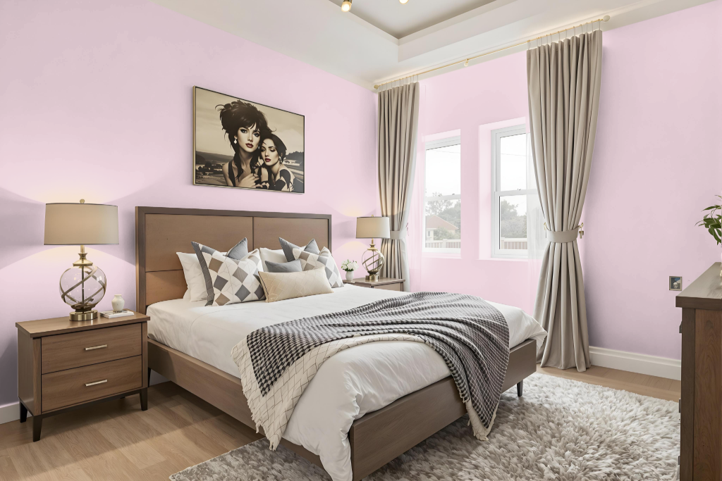
Sherwin Williams Lighthearted Pink SW 6568 is an ideal choice for a bedroom color that promotes relaxation and creativity. This gentle shade not only creates a calming environment perfect for winding down but also lends itself well to spaces like nurseries or intimate reading nooks.
Enhance the overall aesthetic by exploring a range of hues within this color family, using varying shades to add depth while incorporating accent decor to break any monotony. Combining this soft tone with complementary greens or pairing it with calming neutral colors such as whites and light grays further elevates the serene atmosphere.
Kitchen
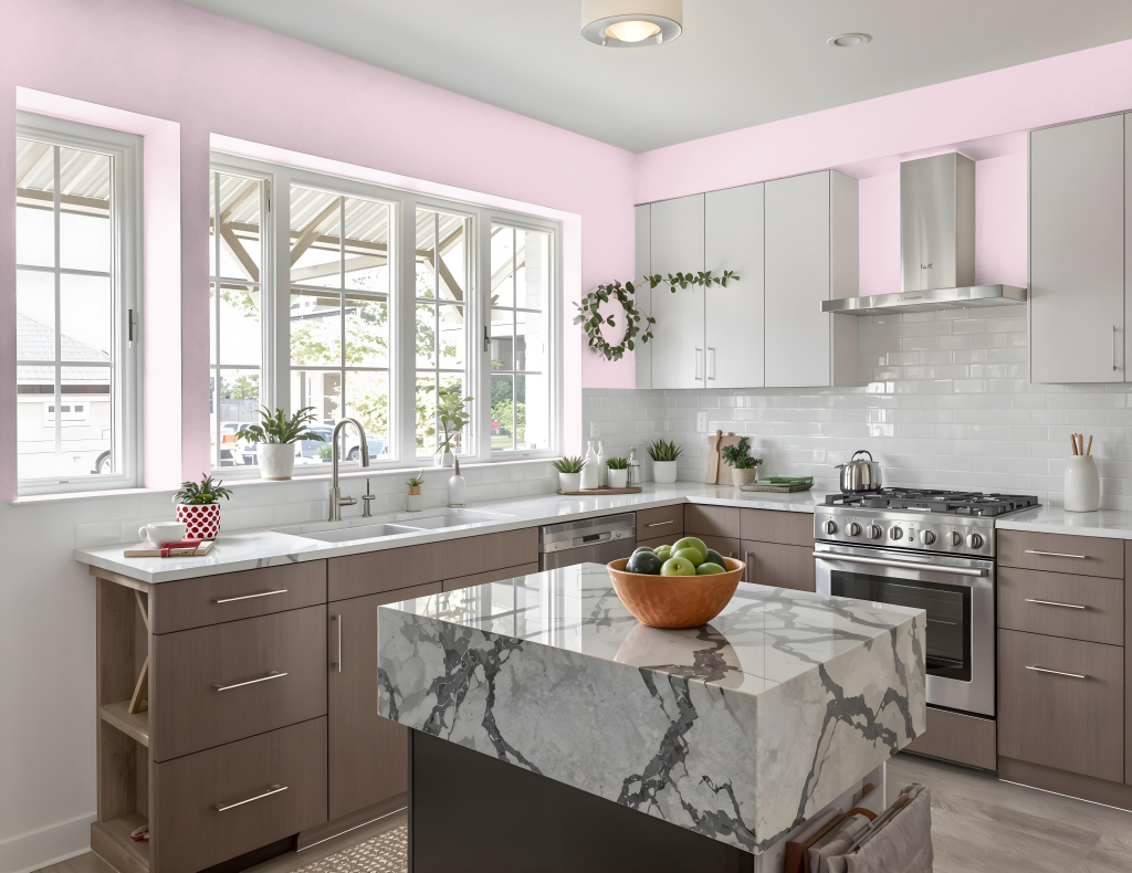
For a kitchen color scheme, Sherwin Williams Lighthearted Pink is a creative choice that can energize the space when applied thoughtfully. It works well as an accent on walls, cabinetry, or even a statement ceiling, introducing a fresh and unexpected element to the overall design.
Pairing this hue with complementary tones such as certain greens or with neutral shades like white, beige, or light gray helps maintain balance while creating a dynamic visual impact. Using it in moderation ensures the kitchen remains harmonious and inviting without becoming overpowering.
Living Room
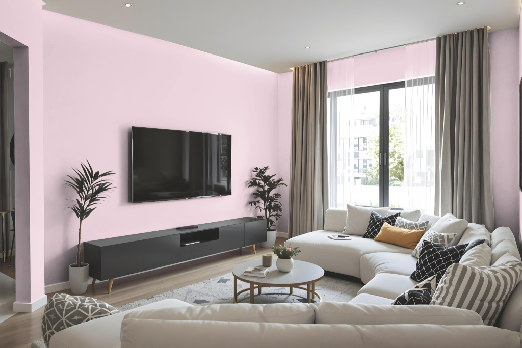
Living room design benefits from the warmth and allure of Lighthearted Pink, an inviting option that creates a whimsical and charming ambiance. Ideal for spaces like nurseries, bedrooms, and cozy nooks designed for relaxation and creativity, this hue sets a soothing tone that encourages personal expression.
When incorporated into a color scheme, Lighthearted Pink pairs beautifully with shades found in green within complementary palettes, adding depth and balance to the overall decor. For best results, it is recommended to inspect a physical sample, as screen representations might differ from the actual appearance.
Outdoor
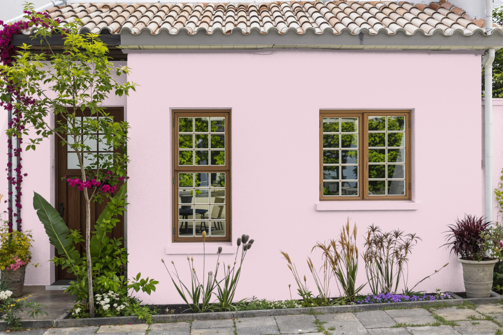
Sherwin Williams Lighthearted Pink SW 6568 makes a statement as a charming home outdoor color, although it is generally not advised for exterior applications because of its limited durability against harsh weather conditions.
This hue excels in creating a whimsical and inviting atmosphere in interior spaces like nurseries, bedrooms, or cozy reading nooks. For exteriors, it is recommended to consider options specifically engineered to withstand outdoor elements, ensuring long-lasting performance and protection.