Sherwin Williams Perfect Periwinkle SW 9065 is a soothing shade that beautifully merges elements of both blue and lavender, embodying a gentle elegance. With its RGB values of 100, 135, and 176, it is often perceived as a Dusty Blue, offering a soft, tranquil aesthetic that enhances any space. This versatile color effortlessly complements a variety of interior styles, from modern to traditional, infusing rooms with a serene and sophisticated ambiance.
Color Description
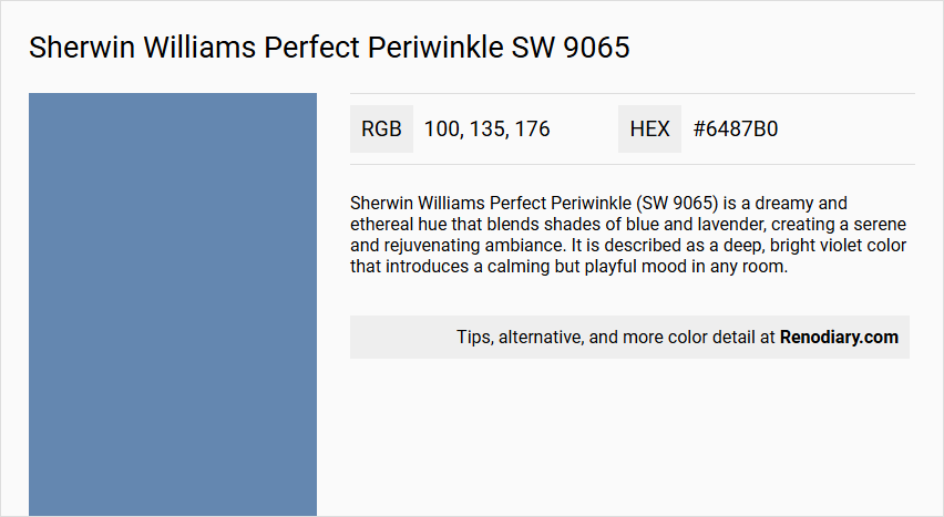
Sherwin Williams Perfect Periwinkle (SW 9065) is a dreamy and ethereal hue that blends shades of blue and lavender, creating a serene and rejuvenating ambiance. It is described as a deep, bright violet color that introduces a calming but playful mood in any room.
Undertones
The undertone of Perfect Periwinkle is predominantly blue, as evident from its color space and hue analysis.
Color Values
- HEX value: #6487B0
- RGB code: 100, 135, 176
- Light Reflectance Value (LRV): 23.071
Usage
This color is versatile and can be used in various rooms such as cozy bedrooms, soothing nurseries, or elegant living rooms. It complements both modern and traditional decor styles, making it suitable for a wide range of interior design needs.
Atmosphere
Perfect Periwinkle creates a tranquil and sophisticated atmosphere, bringing a sense of calm and whimsical adventure to the space. It is ideal for those seeking to infuse their living spaces with a touch of elegance and serenity.
Sherwin Williams Perfect Periwinkle SW 9065 Color Alternative
Sherwin Williams Perfect Periwinkle SW 9065 offers a unique foundation that inspires a range of complementary alternatives. Little Greene Blue Verditer 104 presents a bright twist on the classic tone, while Little Greene Tivoli 206 brings an enriched depth that retains its chic essence. Meanwhile, Farrow and Ball Cook's Blue 237 stands as a captivating option, weaving tradition with modernity to create a striking design narrative.
Bathroom
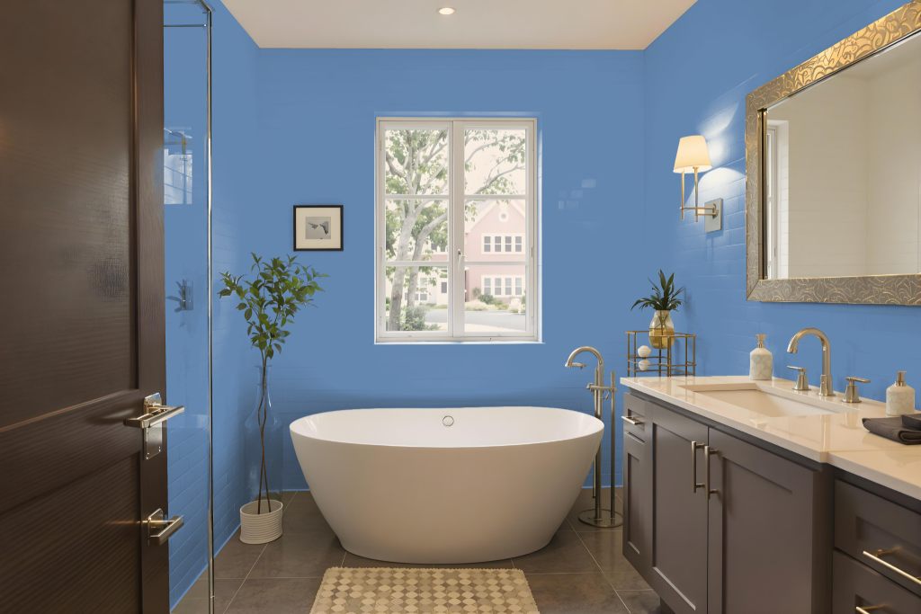
Sherwin Williams Perfect Periwinkle SW 9065 is an elegant choice for a bathroom that brings sophistication and a calming ambiance to the space. It enhances a range of design styles, from modern to traditional, allowing the room to take on a distinct character that feels both refreshing and refined.
By pairing this hue with complementary warm tones or more subtle, lighter neutrals, designers can either create a vibrant, energetic contrast or maintain a serene, spa-like atmosphere. The color’s inherent tranquility makes it particularly well-suited for spaces intended for relaxation and rejuvenation.
Bedroom
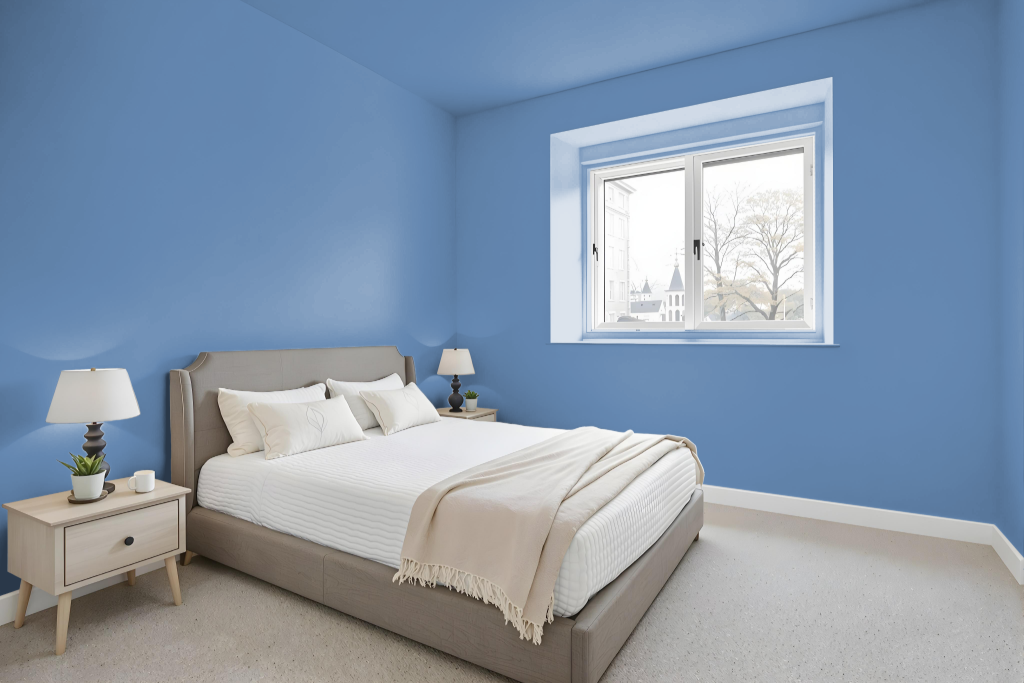
For a bedroom, Sherwin Williams Perfect Periwinkle SW 9065 exudes sophistication and tranquility, making it an ideal choice to foster a calming environment. The color’s nuanced qualities facilitate a serene, rejuvenating ambiance that works beautifully in both cozy bedrooms and soothing nurseries, complementing designs that straddle modern and traditional aesthetics.
Layering various shades, tints, and tones of this elegant hue can create a harmonious, monochromatic look, while pairing it with other complementary colors can introduce a vibrant contrast that still maintains a relaxed atmosphere. When used with neutral or soft-toned furnishings, this color enhances the overall sense of calm, rendering it a thoughtful backdrop for any space aiming for peaceful sophistication.
Kitchen
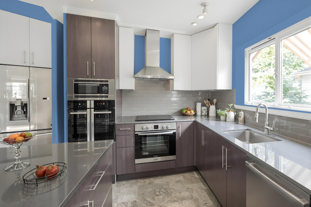
For a kitchen color scheme, Sherwin Williams Perfect Periwinkle SW 9065 offers a unique and captivating option that brings a sophisticated and calming feel. Paired with warm-toned hues like those with an orange tint, this shade creates a dynamic contrast that energizes the space, while accents in pale yellow can enhance the overall harmony and visual appeal of areas like wall paint or backsplash tiles.
Incorporating Perfect Periwinkle into a kitchen design provides a modern twist that pairs well with both contrasting and monochromatic palettes. Thoughtful accent decor further enriches the environment, ensuring the space remains engaging without sacrificing the balance between vibrancy and a serene atmosphere.
Living Room
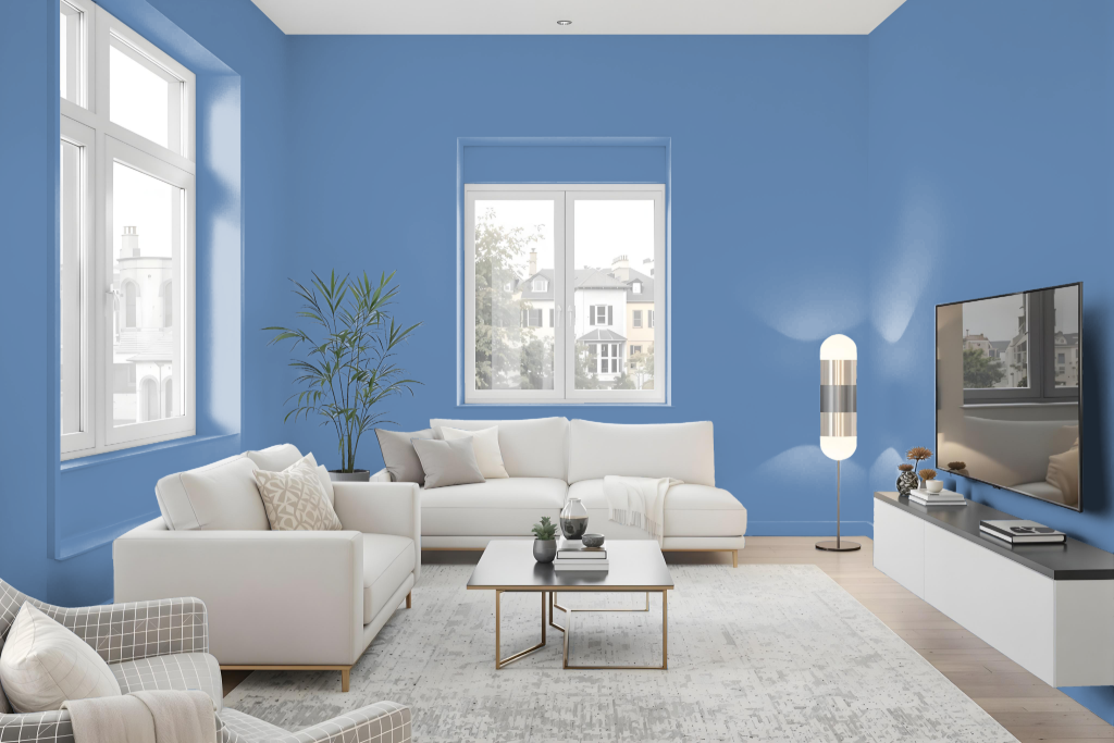
In a living room, Sherwin Williams Perfect Periwinkle SW 9065 sets an elegant tone that exudes calm sophistication. This refined color enhances spaces such as cozy bedrooms and soothing nurseries, providing a serene backdrop that complements both modern and traditional design aesthetics.
For a cohesive look, consider creating a monochromatic scheme using varied shades, tints, and tones to highlight depth and interest. Alternatively, pairing this cool hue with contrasting colors can introduce a vibrant, dynamic visual effect that elevates any interior space.
Outdoor
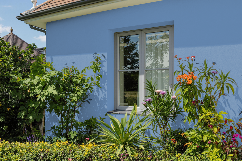
Sherwin-Williams Perfect Periwinkle SW 9065 is an attractive choice for home outdoor applications that features a darker, cooler tone. Its deep hue, influenced by blue undertones, tends to absorb more sunlight and heat, which can potentially lead to issues such as fading, cracking, and peeling over time.
To help counteract these challenges, opting for a high-quality 100% acrylic latex paint, available in options like Duration or SuperPaint, is recommended for better resistance to environmental stresses. Additionally, the color’s relatively low light reflectance signals the need for more diligent maintenance compared to lighter shades.