Sherwin Williams Ponder SW 7079 is widely recognized for its subtle, neutral tones that lend a sense of tranquility and elegance to interior spaces. Its RGB composition of 188, 182, 182 reflects a harmonious blend of gray and beige, often referred to as Dove Gray, which effortlessly complements a range of decor styles. This versatile shade is ideal for creating a serene and sophisticated ambiance in both contemporary and traditional settings.
Color Description
Sherwin-Williams Ponder (SW 7079) is a cool neutral color that falls within the gray family, but it has a distinct character. It is often described as a gray with a slight purple or violet undertone, which can give it a cool and somewhat unique appearance.
Undertones
Ponder has noticeable violet or purple undertones, making it a cool neutral. These undertones can be more pronounced in certain lighting conditions, especially under incandescent or fluorescent lights.
Color Values
- RGB: 188, 182, 182
- Hex: #BCB6B6
- CMYK: 0.0%, 3.2%, 3.2%, 26.3%
- Light Reflectance Value (LRV): Approximately 48
Usage
Ponder can be used in various interior settings, particularly where cool colors dominate. It works well with decor that includes teal, blue, and green, and it can be complemented by gold accents due to the complementary nature of purple and yellow undertones. However, it may not be suitable for all lighting conditions or color schemes, especially those with warm undertones.
Atmosphere
The color Ponder creates a calm and serene atmosphere, especially when paired with natural light, which shows the color in its purest form. It can add a sophisticated and cool tone to a room, but it may require careful consideration of surrounding decor and lighting to avoid any unwanted color shifts.
Sherwin Williams Ponder SW 7079 Color Alternative
Sherwin Williams Ponder SW 7079 offers a distinctive style that has drawn attention in various design projects. Alternatives such as Tikkurila J499, Tikkurila K496, and Dulux Dusted Fondant 30RR 49/067 provide comparable hues and depth, ensuring they capture the unique charm of the original color. Selecting these alternatives allows designers to maintain aesthetic integrity while exploring slight variations that enhance overall visual appeal.
Bathroom
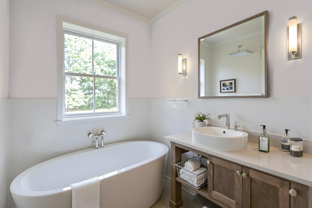
In bathrooms, Sherwin Williams Ponder SW 7079 sets a calming tone that pairs well with crisp white accents and natural textures, resulting in a refreshing and contemporary look. Its subtle red undertone enriches the space, providing an engaging backdrop that harmonizes with lighter shades to maintain a serene and airy ambiance.
Accent the calming effect of Ponder by incorporating complementary colors with a green hue to create a vibrant yet balanced design. Thoughtful combinations with lighter or neutral shades help add depth and avoid monotony, ensuring the overall space remains dynamic and inviting.
Bedroom
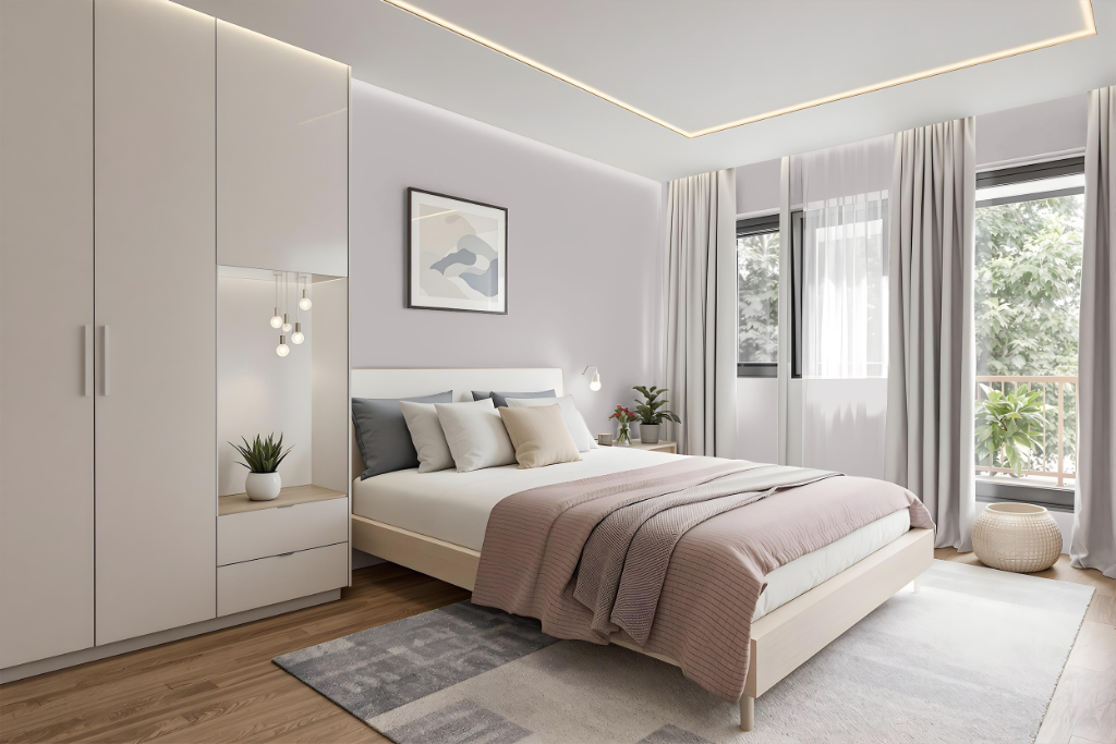
Sherwin Williams Ponder SW 7079 makes an excellent bedroom color choice with its soothing and serene character, perfect for fostering a tranquil retreat. Its medium-light quality creates a balanced and inviting atmosphere, especially when paired with crisp white accents and natural textures that heighten the room's brightness and modern appeal.
To further enhance the bedroom ambiance, consider developing a monochromatic scheme with varied shades and tints of this calming hue or incorporating complementary tones featuring subtle green undertones. This approach will reinforce a cohesive, relaxing environment ideal for encouraging rest and focus.
Kitchen
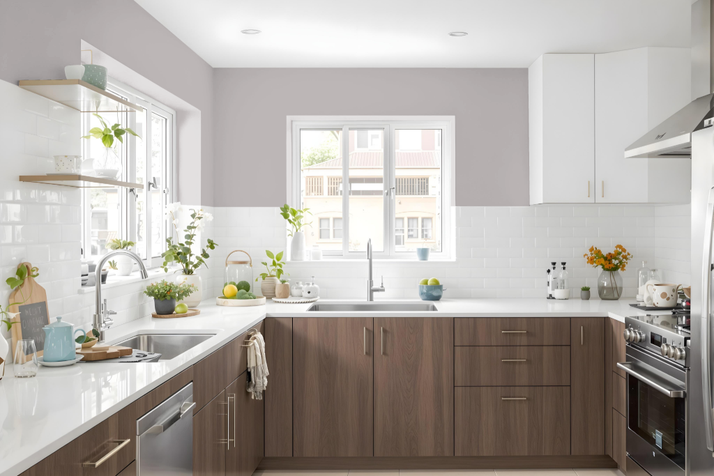
For a kitchen color scheme, Sherwin Williams Ponder SW 7079 offers a calming atmosphere that enriches the space's balance with its medium light tone. Its nearly 48 LRV provides a sturdy backdrop for crisp white accents on cabinets and countertops, while natural textures like wood or stone in flooring and furniture contribute to a harmonious aesthetic.
Complement the room by introducing green-inflected hues to evoke dynamic visual interest. Design approaches using monochromatic, analogous, or triadic color palettes further build depth and cohesion in the overall space.
Living Room
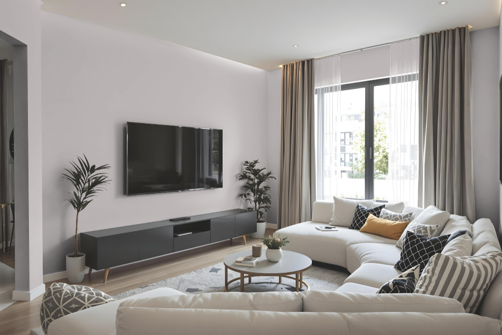
In the living room, Sherwin Williams Ponder SW 7079 brings a balanced blend of brightness and mood to any space. This sophisticated medium-light hue works well with crisp white accents and natural textures, creating a refreshing, contemporary aesthetic that adapts seamlessly from living rooms to bedrooms and home offices.
Designed for diverse color schemes—from monochromatic to complementary approaches—it also pairs effectively with colors bearing a green hue for added vibrancy. Its balanced light reflection ensures that rooms maintain a harmonious ambiance without feeling too dark or too bright, fostering a serene and inviting environment.
Outdoor
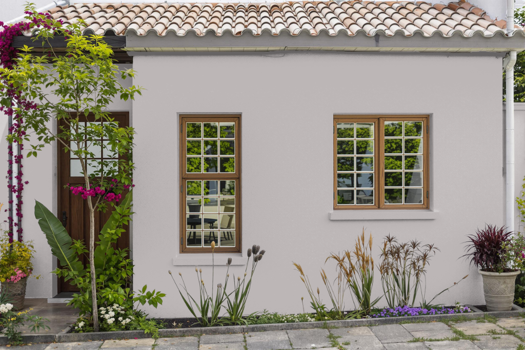
Home outdoor color Ponder SW 7079 introduces a modern and refreshing option for exterior spaces. Its appearance can change based on the texture of surfaces and natural light exposure, making it essential to consider environmental factors when applying it to walls, cabinets, or similar outdoor elements, especially when aiming for a dynamic look by pairing it with complimentary colors that have subtle green undertones.
Before committing to a full paint job, it is advisable to conduct a small-scale test using peel-and-stick samples to verify that the final appearance meets your expectations. This proactive approach helps to avoid unwanted discrepancies and ensures that the professional finish remains consistent over time.