Sherwin Williams Porcelain SW 0053 is a sophisticated hue that embodies a gentle warmth, reminiscent of delicate porcelain. With its balanced RGB composition of 233, 224, 213, this shade offers a creamy tone that is both subtle and elegant. Ideal for creating a serene atmosphere, it harmoniously complements both modern and traditional design elements, making it a versatile choice for any space.
Color Description
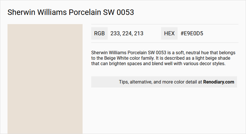
Sherwin Williams Porcelain SW 0053 is a soft, neutral hue that belongs to the Beige White color family. It is described as a light beige shade that can brighten spaces and blend well with various decor styles.
Undertones
The undertone of Porcelain SW 0053 can be accurately described as having a red hue. This is determined by isolating the pure hue and eliminating any tints, tones, and shades.
Color Values
- HEX value: #E9E0D5
- RGB code: 233, 224, 213
Usage
Porcelain SW 0053 is versatile and can be used as a main wall color or as an accent. It pairs beautifully with deep navy blues for a classic, elegant contrast. It can also be combined with warm earth tones like terracotta and olive to create a cozy atmosphere, or with trendy sage green or soft blush pink for a more modern look.
Atmosphere
This color adds a touch of understated elegance to any room. When used with deep navy blues, it creates a classic and elegant atmosphere. With warm earth tones, it can create a cozy and inviting space. For a modern look, it complements well with accents in sage green or soft blush pink.
Sherwin Williams Porcelain SW 0053 Color Alternative
Sherwin Williams Porcelain SW 0053 has excellent alternatives that can provide similar aesthetic appeal and performance in varied design scenarios. Tikkurila Canvas G485, Tikkurila Talcum G484, and Tikkurila Parchment F466 each offer distinctive qualities that cater to both modern and classic interior themes. These colors serve as a versatile palette for designers seeking to refresh spaces while ensuring that the original inspiration of Porcelain SW 0053 remains intact.
Bathroom
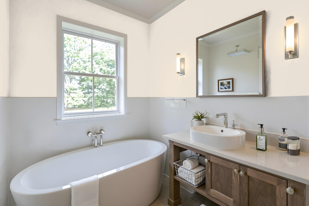
For bathrooms, Sherwin Williams Porcelain SW 0053 offers an elegant color that forms the perfect backdrop for a range of design moods. Its clean and refined appearance pairs seamlessly with deep, dramatic tones to craft a classic ambience or with warm, earthy hues to evoke a cozy feel, while contemporary accents in soft, muted shades add a modern twist.
Included in several curated collections, this color supports a variety of design themes. With multiple finishes available, it provides the ability to customize the overall look and feel of your bathroom while maintaining an inviting and stylish environment.
Bedroom
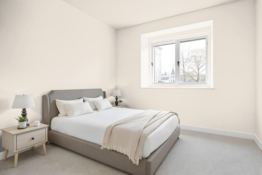
For a bedroom color scheme, Sherwin Williams Porcelain creates a soothing and elegant atmosphere that sets the ideal backdrop for varied design themes. Its refined character effortlessly harmonizes with deep navy hues for an elevated contrast or with warm earth tones to establish a cozy, welcoming space.
Enhance the overall aesthetic by integrating accents in shades like sage green or soft blush pink, which add modern touches to the setting. Additionally, this color serves effectively in both monochromatic layouts and complementary arrangements with other dynamic hues to achieve a balanced yet visually engaging effect.
Kitchen
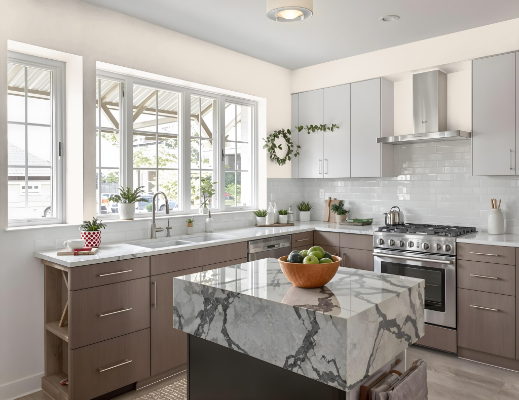
For a kitchen color scheme, Sherwin Williams Porcelain SW 0053 brings an inviting softness and refined charm to the space. This hue pairs well with rich navy blues or warm tones like terracotta and olive to create either a classic contrast or a cozy ambiance. It can be featured as a primary wall color or highlighted on cabinets, islands, or ceilings to add an air of understated elegance.
For a contemporary twist, complementing Porcelain with accents such as trendy sage green or soft blush provides subtle yet dynamic variation. Additionally, it integrates seamlessly into a monochromatic approach or a complementary design incorporating bold blues, resulting in a well-balanced and visually engaging kitchen environment.
Living Room
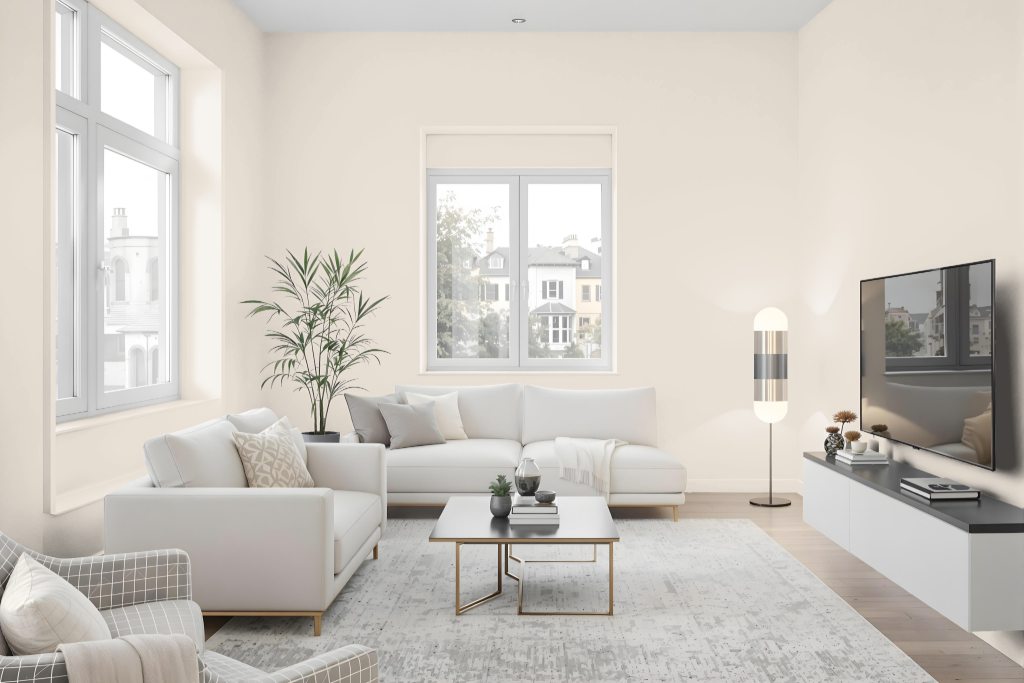
Sherwin Williams Porcelain SW 0053 serves as an excellent living room color, offering a range of expressive effects when paired with complementary shades. It creates a classic and elegant contrast alongside deep navy blues while evoking a warm and inviting ambiance when matched with earth tones like terracotta and olive.
This color also adapts well to modern design aesthetics with the inclusion of accents such as sage green or soft blush pink. It functions effectively within both monochromatic themes and contrasting color schemes, expanding its design potential through the use of lighter and darker variations or other striking complementary choices.
Outdoor
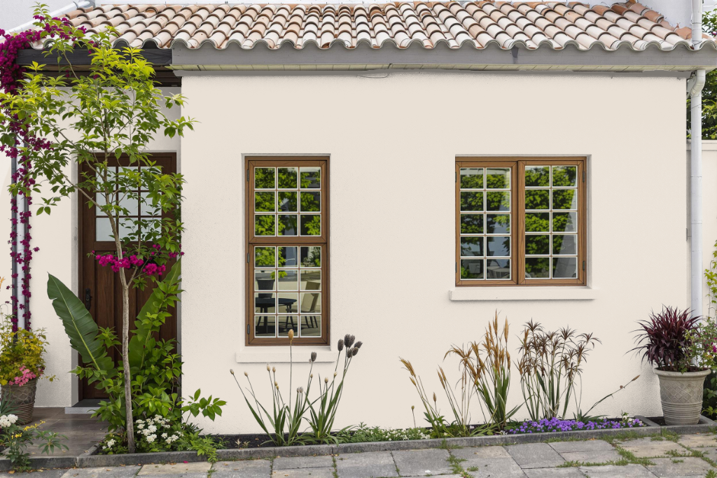
Sherwin Williams Porcelain SW 0053 is a distinctive home outdoor color that enhances exterior spaces with its durable finish and inviting appeal. When planning an exterior project using this hue, it is essential to reference a physical sample or color card to verify its true appearance, as digital displays may not accurately represent the finish.
This color harmonizes well with complementary shades, such as deep navy, rich earth tones, and modern accents like trendy greens and soft pinks to elevate curb appeal. Additionally, proper surface preparation and careful selection of the appropriate finish are key in achieving an optimal result for various exterior applications.