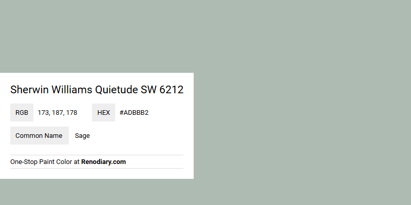
Sherwin Williams Quietude SW 6212 is a tranquil hue that falls under the category of sage, characterized by its soothing blend of green and gray tones. With an RGB value of (173,187,178), it evokes a sense of calm and serenity, making it an ideal choice for spaces designed to promote relaxation. This versatile color can beautifully complement both modern and traditional decor, offering a subtle yet sophisticated aesthetic.
Color Description
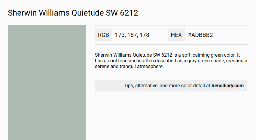
Sherwin Williams Quietude SW 6212 is a soft, calming green color. It has a cool tone and is often described as a gray-green shade, creating a serene and tranquil atmosphere.
Undertones
The undertones of Quietude are predominantly gray, with additional notes of blue. These undertones help to keep the color neutral and prevent it from becoming too bright or garish.
Color Values
- RGB: R: 173, G: 187, B: 178
- Hex Value: #ADBBB2
- LRV (Light Reflective Value): 48
The LRV indicates it is on the darker side but still appears relatively light in use.
Usage
- Bedrooms, Living Rooms, and Bathrooms: Creates a peaceful atmosphere.
- Front Doors: Adds curb appeal and a welcoming touch.
- Kitchens: Works well on walls or cabinets, suitable for both high and low light conditions.
- Furniture: Ideal for creating a shabby chic aesthetic when distressed.
- Exterior: Pairs well with white trim on paneling or siding.
Atmosphere
Quietude fosters a calm and tranquil atmosphere, making it perfect for spaces where relaxation is desired. It pairs well with natural materials like wood and stone, enhancing the serene and peaceful vibe of any room.
Sherwin Williams Quietude SW 6212 Color Alternative
Sherwin Williams Quietude SW 6212 is well-known for its soothing and versatile impact, enhancing both residential and commercial spaces with its calm allure. Tikkurila Lido X445, Farrow and Ball Green Blue 84, and Sherwin Williams Silvermist SW 7621 offer distinct alternatives that maintain a similar serene atmosphere, each bringing its own subtle variation in hue. Designers and homeowners can select among these options to create a peaceful environment while ensuring continuity in the cool, balanced color palette.
Bathroom
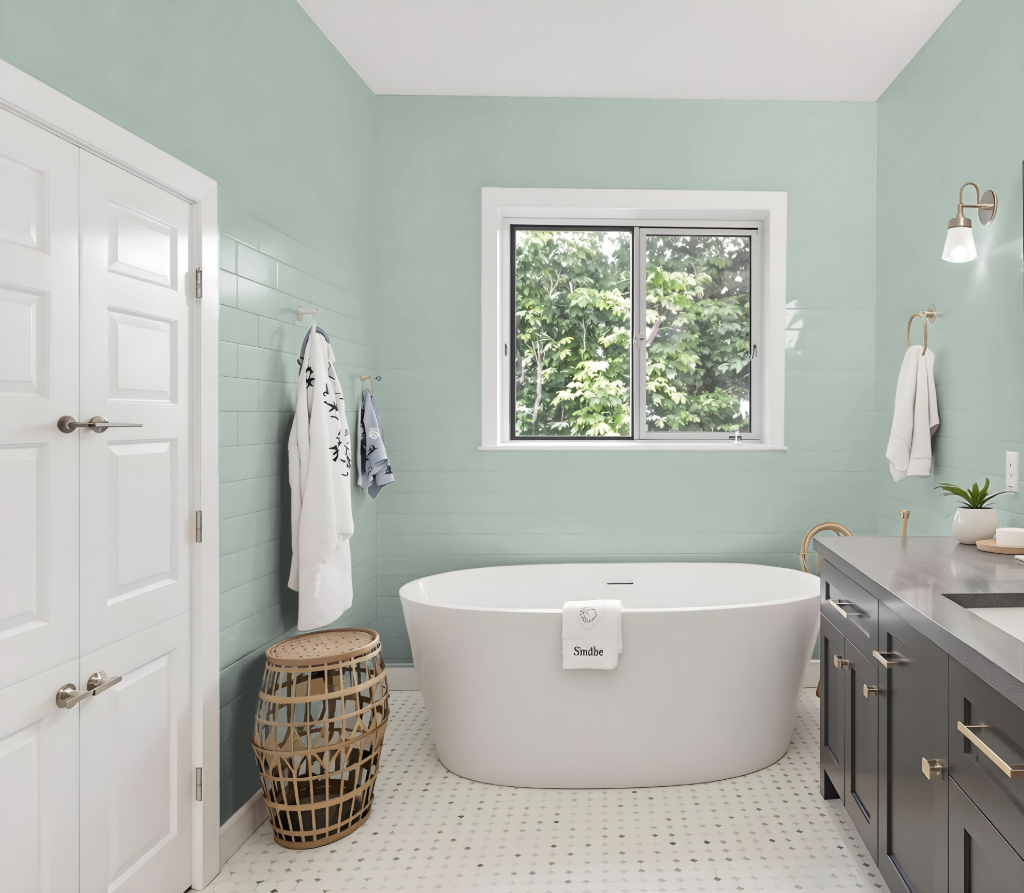
For a bathroom, Sherwin-Williams Quietude is a calming choice that brings balance to the space. Its light-medium tone adapts gracefully to varying lighting conditions, appearing brighter in well-lit areas and deeper when the light is softer.
Ideal for accent walls, vanities, or an all-over treatment, Quietude works beautifully with crisp white trim and molding to create a refined look. Paired with natural materials like wood and stone and contrasted against lighter off-white shades on ceilings and additional trim, it helps establish a serene and inviting environment.
Bedroom
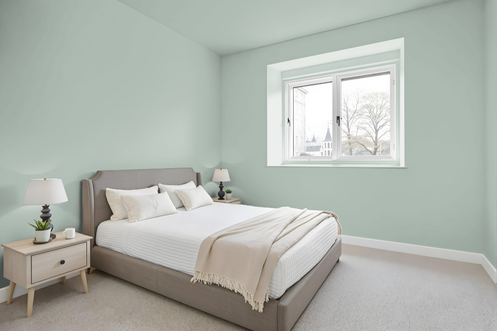
Sherwin Williams Quietude SW 6212 is a calming and serene bedroom color that sets a peaceful tone, creating a relaxing retreat. Its subtle mix of blue and green undertones works beautifully with natural materials like wood and stone and is enhanced by pairing it with light complementary tones such as light gray, cream, and off-white.
The balanced light-medium depth of this hue ensures it maintains its soft appeal in various lighting conditions. When brought together with warm wood furniture and gold accents, the overall ambiance becomes inviting and harmonious, perfect for unwinding in a tranquil bedroom setting.
Kitchen
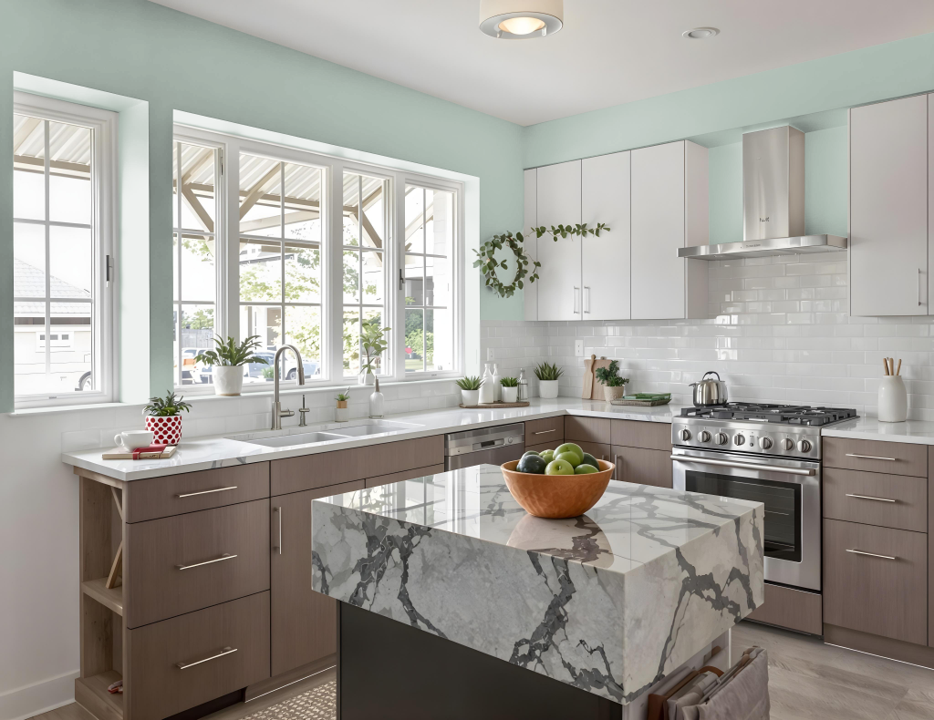
For a kitchen color scheme, Sherwin Williams Quietude SW 6212 is an appealing choice for cabinets and accents, particularly within coastal or traditional-meets-modern designs. It works beautifully when paired with white upper cabinets and light countertops or backsplashes, creating a balanced visual impact in Tuxedo Cabinet kitchen designs.
Quietude also enhances the overall ambiance when combined with neutral whites for trim and ceilings, deepening its calming effect. The color integrates well into a palette featuring complementary shades such as Delft, Rocky River, and Nomadic Desert, contributing to a welcoming and refined kitchen environment.
Living Room
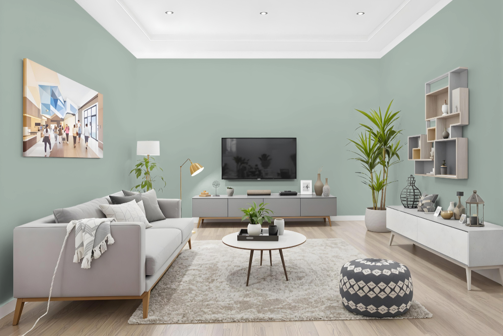
In the living room, Sherwin Williams Quietude SW 6212 sets a calming backdrop that transforms the space into a bright and inviting retreat. It can be applied to walls or accent pieces, harmonizing effortlessly with design elements like wood and stone to create a distinctive, serene environment.
Beyond the living room, Quietude seamlessly enhances bedrooms and bathrooms by establishing a peaceful atmosphere throughout the home. Its neutral undertones pair beautifully with various decor styles, from vintage charm with rich, dark woods and antique furnishings to a playful look when combined with brighter accents.
Outdoor
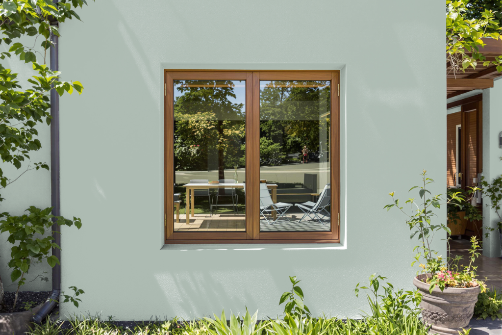
Sherwin Williams Quietude SW 6212 offers an appealing home outdoor color ideal for enhancing curb appeal. It pairs beautifully with white trim and is effective on paneling or siding, contributing a touch of elegance and sophistication to the home's exterior.
This color adapts gracefully to various lighting, maintaining its tranquil vibe in both bright and subdued conditions. It also complements natural materials such as wood and stone, creating an inviting and harmonious aesthetic for your property's facade.