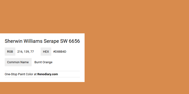
Sherwin Williams Serape SW 6656 exudes a vibrant and inviting hue that blends beautifully with a range of interior and exterior designs. This shade of Burnt Orange, characterized by its distinct RGB composition of (216,139,77), captures the warmth and earthiness reminiscent of southwestern landscapes. Its bold yet comforting presence ensures a dynamic addition to any space seeking to evoke a sense of comfort and creativity.
Color Description
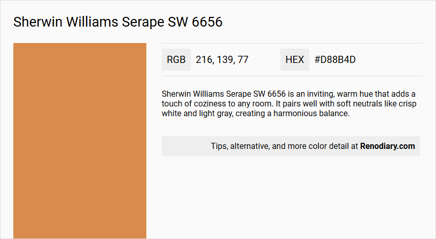
Sherwin Williams Serape SW 6656 is an inviting, warm hue that adds a touch of coziness to any room. It pairs well with soft neutrals like crisp white and light gray, creating a harmonious balance.
Undertones
The undertone of Serape SW 6656 is a red hue, which is evident from its color profile.
Color Values
- HEX value: #D88B4D
- RGB code: 216, 139, 77
(another source lists it as 216, 145, 72; the difference is minor and likely due to slight variations in color representation)
Usage
Serape SW 6656 can be used in various ways to achieve different looks. For a more subtle appearance, it can be paired with soft neutrals. For a bolder look, it can be combined with rich navy or deep forest green to add depth and a pop of color.
Atmosphere
This color helps create a warm and inviting atmosphere in any room. It is versatile and can be used to achieve a range of moods, from harmonious and balanced to vibrant and dynamic, depending on the coordinating colors chosen.
Sherwin Williams Serape SW 6656 Color Alternative
Sherwin Williams Serape SW 6656 has compelling alternative options that maintain the rich and warm aesthetic desired in diverse design projects. Sherwin Williams Tassel SW 6369 and Sherwin Williams Autumnal SW 6361 offer a similar depth of character while providing distinct nuances for contemporary interiors, whereas Benjamin Moore Cornucopia Tan 119 brings in its own unique take on warmth. Exploring these alternatives allows designers to tailor their projects with subtle variations in tone and finish, ensuring a harmonious blend of color and style without deviating from the original vision.
Bathroom
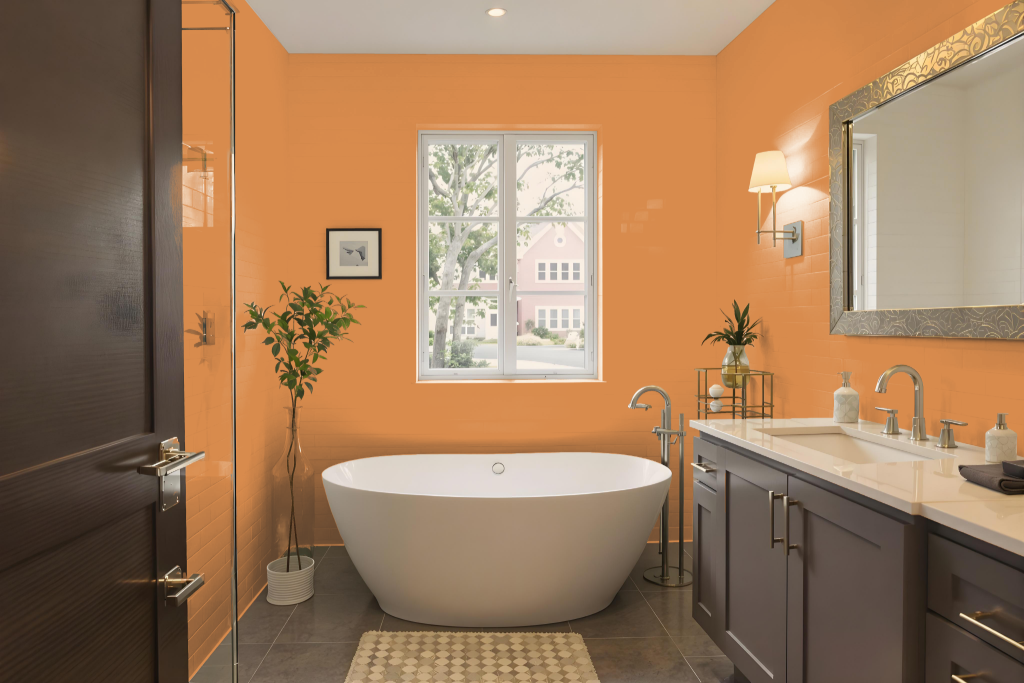
Sherwin Williams Serape SW 6656 in a bathroom delivers a distinct and vibrant look that stands apart from more traditional, calming hues typically used in these spaces. Its warm, bold character brings energy to the room, yet this intensity might conflict with the serene, spa-like atmosphere that many seek in a bathroom setting.
Given its lively nature, Serape may feel at odds with the conventional fixtures and neutral design elements often found in bathrooms. For those considering this shade, pairing it with deeper shades of greens or blues could help balance its strong presence, though achieving a consistently relaxing vibe can still prove challenging in such an environment.
Bedroom
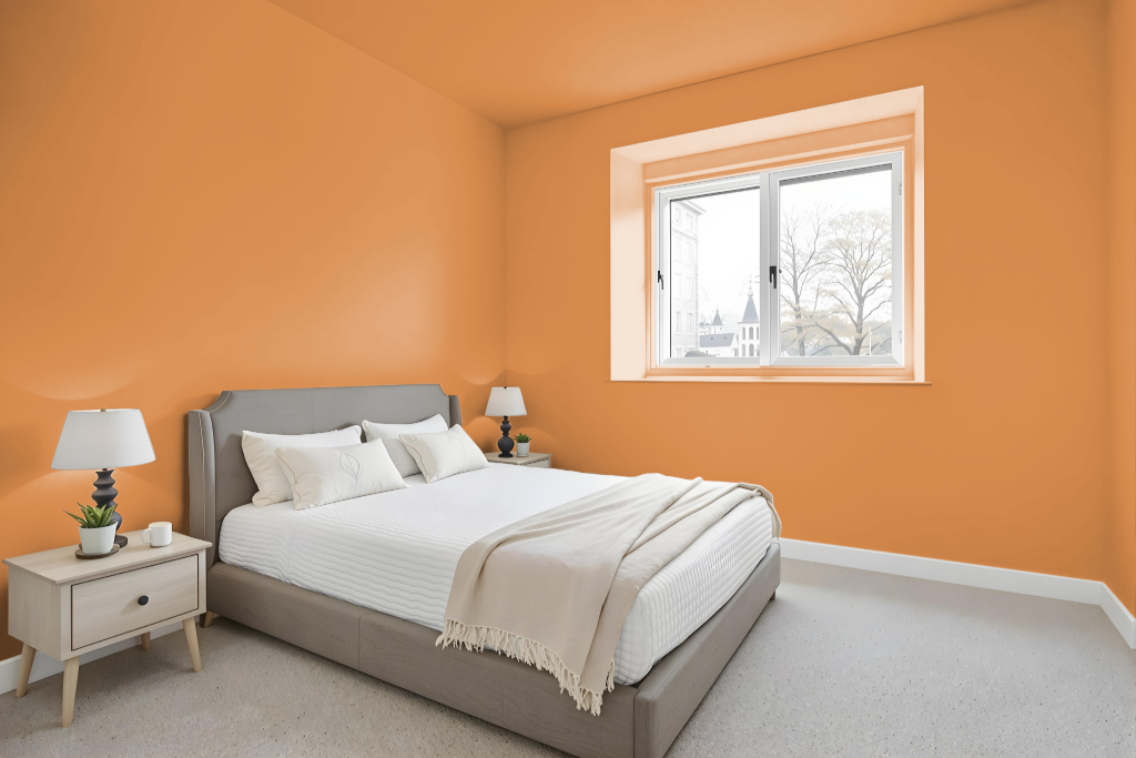
For a bedroom color scheme, Sherwin Williams Serape SW 6656 offers a warm and inviting foundation that creates an intimate atmosphere, ideal for a relaxing space. Paired with soft neutrals like crisp white and light gray, this hue maintains a harmonious balance while its medium light reflection makes the room feel cozy.
To add depth and a pop of color, it can also be complemented by rich navy or deep forest green accents. Whether following a monochromatic, analogous, or complementary approach, this color supports a thoughtful design that enhances the overall ambiance of the bedroom.
Kitchen
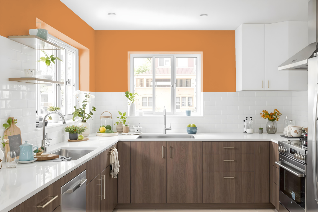
For a kitchen design, Sherwin-Williams Serape SW 6656 introduces warmth and charm, ideal for creating a welcoming culinary space. Its inviting appeal is enhanced when paired with soft neutrals like clean white and light gray, which maintain a harmonious and balanced atmosphere.
Alternatively, for those seeking a more dramatic aesthetic, incorporating deeper hues such as rich blue or forest green adds striking visual depth. The medium light reflectance value of this shade ensures that the space stays bright yet cozy, supporting both functionality and style in the kitchen.
Living Room
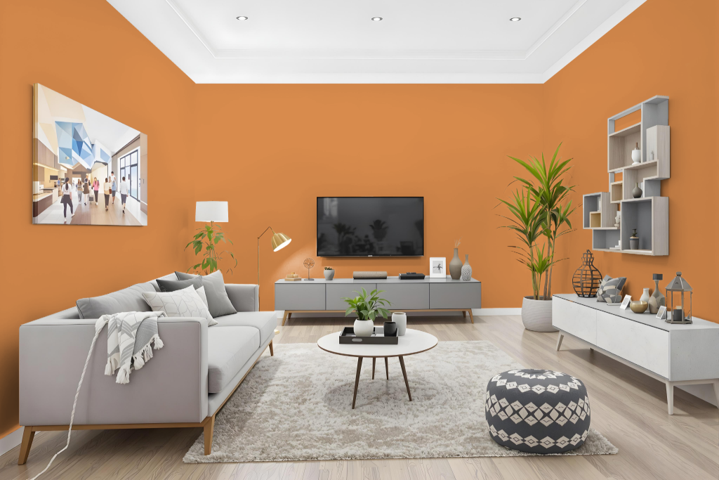
In the living room, Sherwin Williams Serape sets a warm tone that creates a cozy and inviting atmosphere. With a light reflectance value that falls in the medium to darker range, it lends an intimate feel to the space while serving as a striking design foundation.
This rich hue pairs beautifully with soft neutrals such as crisp white and light gray for balance, or with deeper shades like navy and forest green to make a bold statement. It works well in various settings including dining rooms and bedrooms, making it a thoughtful choice for a harmonious overall design.
Outdoor
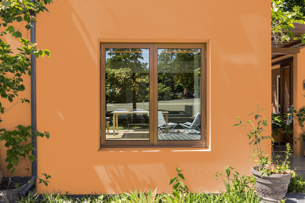
Sherwin Williams Serape SW 6656 is a home outdoor color designed to enhance exterior projects with its enduring appeal. It is engineered to perform on surfaces such as masonry, plaster, steel, and wood, and offers different sheens to highlight architectural details—using a high-gloss finish for accentuating windows and doors or a satin finish to achieve a deeper, more refined look.
The paint is celebrated for its excellent durability and resistance to weather and sunlight, making it well-suited for sustained outdoor use. It seamlessly integrates with various design schemes, allowing homeowners to create both harmonious and dynamic exterior color compositions.