Tikkurila Calcite K487, characterized by its RGB values of 164, 160, 151, embodies the soothing elegance of a classic Taupe hue. This particular shade is renowned for its versatility, seamlessly complementing both modern and traditional interiors with its balanced blend of undertones. Whether used in a cozy living room or a serene bedroom, this color imparts a sophisticated ambiance that is both calming and timeless.
Color Description
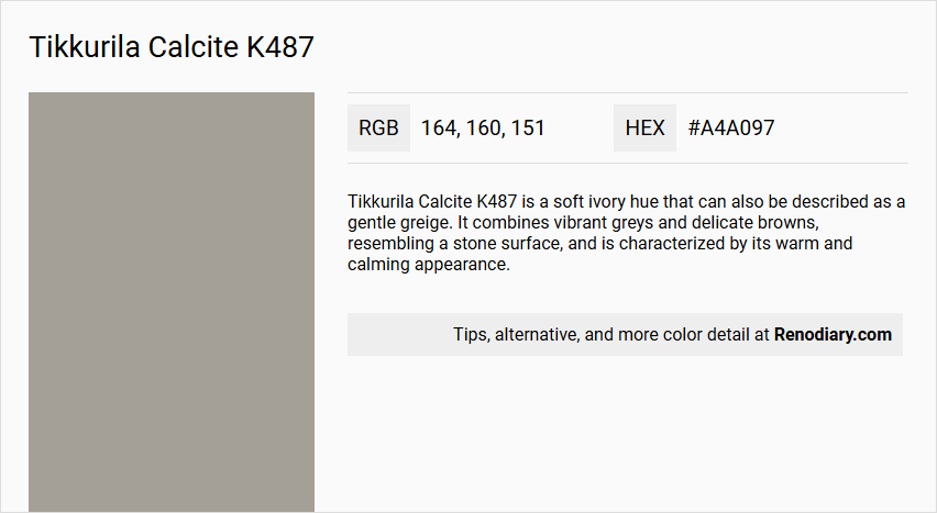
Tikkurila Calcite K487 is a soft ivory hue that can also be described as a gentle greige. It combines vibrant greys and delicate browns, resembling a stone surface, and is characterized by its warm and calming appearance.
Undertones
The undertone of Calcite K487 is a red hue, which is evident when isolating the pure hue and eliminating any tints, tones, and shades.
Color Values
- HEX value: #A4A097
- RGB value: 164, 160, 151
- LAB values: 66, 67; 0, 35; 4, 51
- NCS reference: 3803-Y12R
- HSL code: 42deg, 7%, 62%
Usage
Calcite K487 is suitable for various interior design applications, including statement walls and home details. It is versatile and can be used in kitchens, living rooms, bathrooms, and hallways to create a welcoming atmosphere. It pairs well with other colors like Tikkurila G486 Misty Green and Tikkurila Y484 Whitewood for a harmonious color scheme.
Atmosphere
This color radiates warmth and calmness, making it ideal for creating a tranquil atmosphere in any space. It contributes to a cozy and inviting environment, particularly in larger spaces, and is suitable for enhancing the aesthetic of various interior design styles such as Victorian, Scandinavian, or Modern.
Tikkurila Calcite K487 Color Alternative
Tikkurila Calcite K487 offers a unique starting point for projects where creativity and precision in color play a crucial role. An intriguing alternative range includes Dulux Dusted Heather 90RR 35/060, Dulux Night Jewels 4 00NN 37/000, and Dulux Highland Mist 37GY 38/050, each contributing its own distinct flair. These variations provide designers with the flexibility to experiment and achieve a balanced aesthetic while staying true to the original intent of Tikkurila Calcite K487.
Bathroom
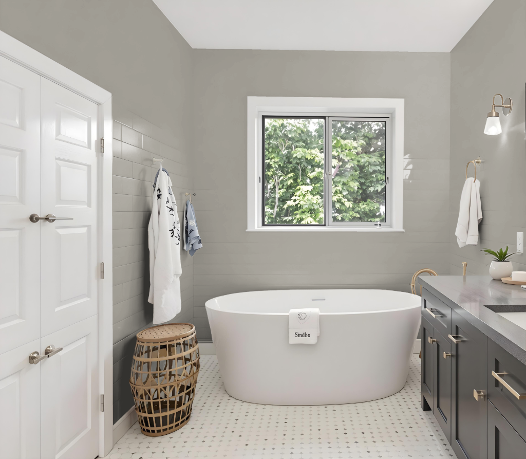
Tikkurila Calcite K487 serves as an excellent bathroom color, offering a practical appeal with its subtle red undertone that provides a touch of warmth to the space. Its appearance is influenced by the surrounding lighting and surface textures, meaning that the same shade can look distinct on rough walls compared to smooth cabinetry.
For a cohesive design, this color pairs well with complementary tones such as those found in Tikkurila Amethyst, as well as other subtle hues like Tikkurila Misty Green and Tikkurila Whitewood. Paying careful attention to these elements will ensure a consistent and pleasing final result in your bathroom.
Bedroom
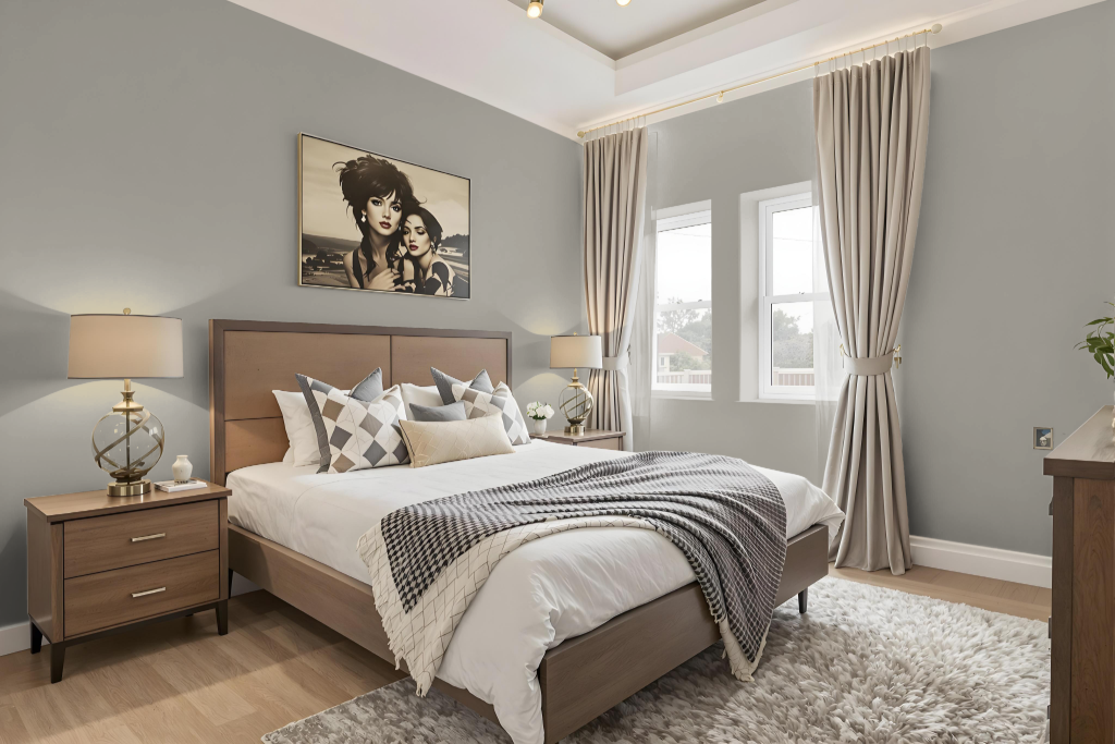
For a bedroom color scheme, Tikkurila Calcite K487 establishes a calming and inviting foundation paired with gentle tones such as Misty Green and Whitewood to create a refined and balanced environment. Accents of Arctic Sky bring added serenity while hints of blue undertones from complementary hues like Amethyst introduce a refreshing contrast.
Enhancing the overall ambiance, the inclusion of neutral shades like browns and taupes adds depth and warmth, resulting in a cocooning feel ideal for relaxation. This thoughtfully curated palette provides a harmonious blend of tranquility and subtle vibrancy, perfect for transforming a bedroom into a serene retreat.
Kitchen
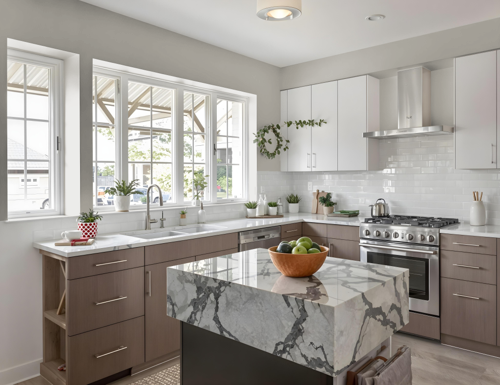
In the kitchen, Tikkurila Calcite K487 brings a calm and balanced atmosphere, pairing naturally with subtle shades like Tikkurila G486 Misty Green and Tikkurila Y484 Whitewood. Its warm undertones also provide an opportunity for contrast with blue hues such as Tikkurila Amethyst, adding visual energy to the space.
By incorporating cooler accents like Tikkurila S482 Arctic Sky, the overall ambiance is enhanced with a touch of serenity. This color's adaptability across various surfaces—from walls to cabinets and furniture—makes it an appealing option for a cohesive and engaging kitchen design.
Living Room
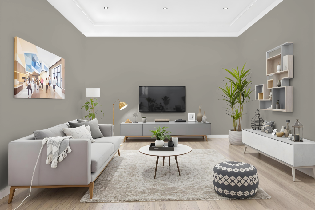
Living room color Tikkurila Calcite K487 brings warmth and balance to interior spaces. It pairs beautifully with soft hues like Misty Green and Whitewood while subtle touches of Arctic Sky add a serene accent, creating a harmonious and inviting environment.
This dynamic paint choice effortlessly complements various settings, from bedrooms to kitchens, with its nuanced undertones setting a tranquil atmosphere throughout the space. Its coordinated use with other gentle shades makes it ideal for achieving a peaceful, well-integrated design scheme.
Outdoor
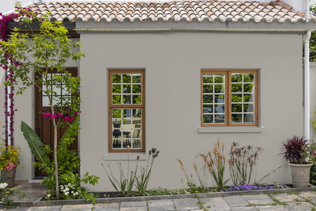
Tikkurila Calcite K487 is a home outdoor color that brings a refined aesthetic to residential exteriors. This paint is recognized for its durability and impressive wash and wet scrub resistance, making it a reliable option for high-traffic surfaces and areas requiring frequent cleaning.
Although primarily designed for indoor spaces, its robust qualities can extend its use outdoors if proper precautions are taken. For outstanding performance in extreme weather, dedicated exterior lines may offer enhanced weather resistance; however, if opting for Calcite K487 on outdoor surfaces, it is advisable to test the color in situ and consider how natural light and surface conditions may influence its final appearance.