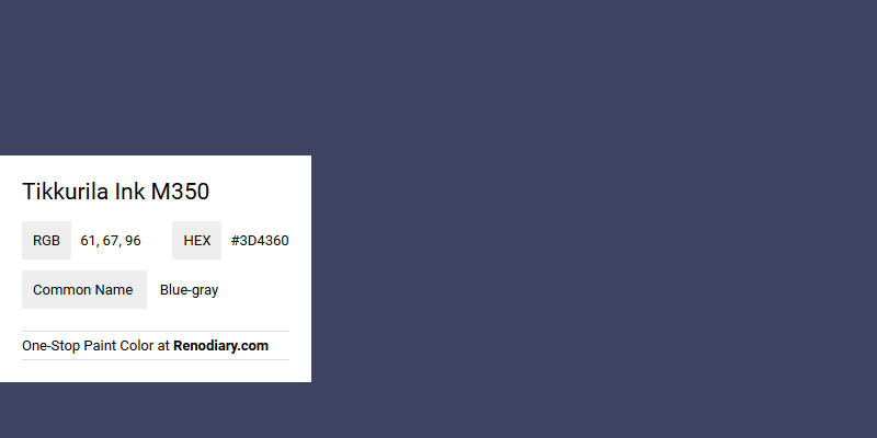
Tikkurila Ink M350, characterized by its RGB values of (61,67,96), embodies a serene and sophisticated Blue-gray hue. This particular shade merges the calming qualities of blue with the neutral undertones of gray, making it an excellent choice for creating tranquil and balanced spaces. Often used in interiors to evoke a sense of peace and modernity, Blue-gray can seamlessly blend with other colors to enhance a room's aesthetic appeal.
Color Description
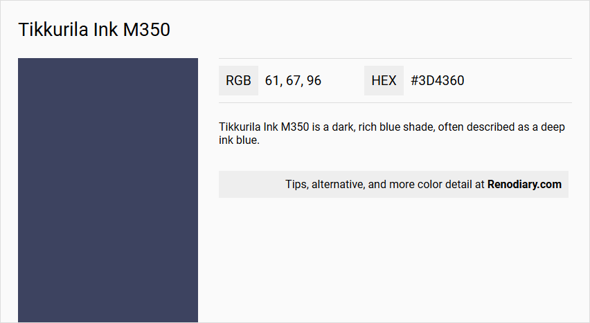
Tikkurila Ink M350 is a dark, rich blue shade, often described as a deep ink blue.
Undertones
This color has undertones that are predominantly blue, but it can also exhibit slight grey or black undertones, which contribute to its deep and intense appearance.
Color Values
The HEX code for Tikkurila Ink M350 is #3d4360. This translates to RGB values of approximately (61, 67, 96) and CMYK values that reflect its deep blue hue.
Usage
Ink M350 is versatile and can be used in various rooms to create different atmospheres. It is particularly suitable for:
- Bathrooms: Creates a dramatic and luxurious look when paired with white or gold accents.
- Kitchens: Adds a moody ambiance when combined with neutral colors.
- Living Rooms: Creates a cozy and inviting space, especially when paired with light colors or warm furnishings.
- Bedrooms: Fosters a serene and relaxing environment.
Atmosphere
This color creates a calming, yet dramatic and luxurious atmosphere. It can make a room feel cozy and inviting, especially when used in bedrooms or living rooms. The deep, bold hue helps to establish a sense of serenity and tranquility, making it ideal for spaces where relaxation is key. When paired with crisp light colors or warm accents, it can also add a touch of glamour and sophistication.
Tikkurila Ink M350 Color Alternative
Tikkurila Ink M350 can be effectively compared to other sophisticated shades on the market, offering a range of aesthetic alternatives. Dulux Oxford Blue (Heritage) and Benjamin Moore Stunning 826 provide distinctive yet equally compelling options that can smoothly substitute for Ink M350 in various design schemes. Additionally, Behr Very Navy M500-7 stands out for its deep, dramatic tone, giving designers further flexibility in achieving a refined look without compromising on quality.
Bathroom
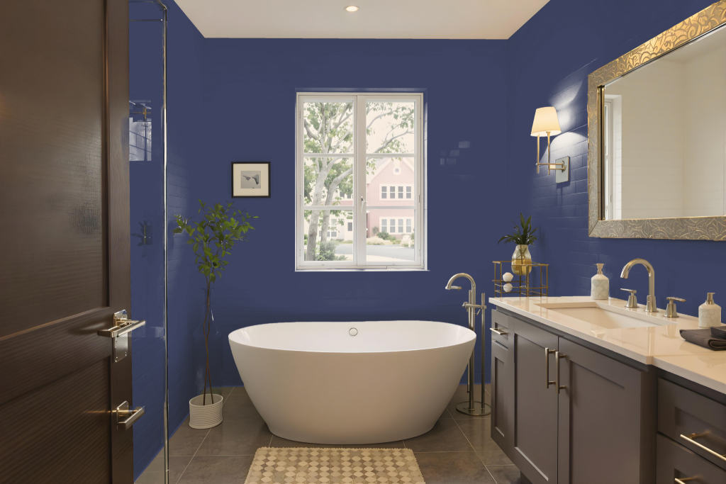
For a bathroom, Tikkurila Ink M350 can be a dramatic and sophisticated choice. However, while it offers a refined look, it is not specifically engineered for environments with high moisture and traffic.
For best results in a bathroom, consider products from Tikkurila’s other ranges that are designed to withstand moisture and facilitate easy cleaning. If you choose Ink M350, be sure to prepare the walls meticulously by cleaning them, patching any cracks, and applying a primer enhanced with mildewcide to reduce the risk of mould.
Bedroom
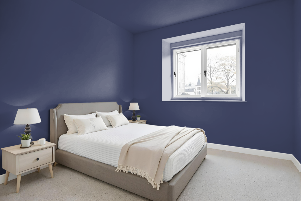
In the bedroom, Tikkurila Ink M350 creates a chic and sophisticated foundation. Pairing it with soft taupe shades adds a touch of elegance that elevates the overall design while maintaining a refined atmosphere.
Combining this deep tone with brighter white hues introduces a luminous contrast that enlivens the space, highlighting the true character of the ink. The result is a dreamy, inviting ambiance that transforms the bedroom into a cozy and relaxing retreat.
Kitchen
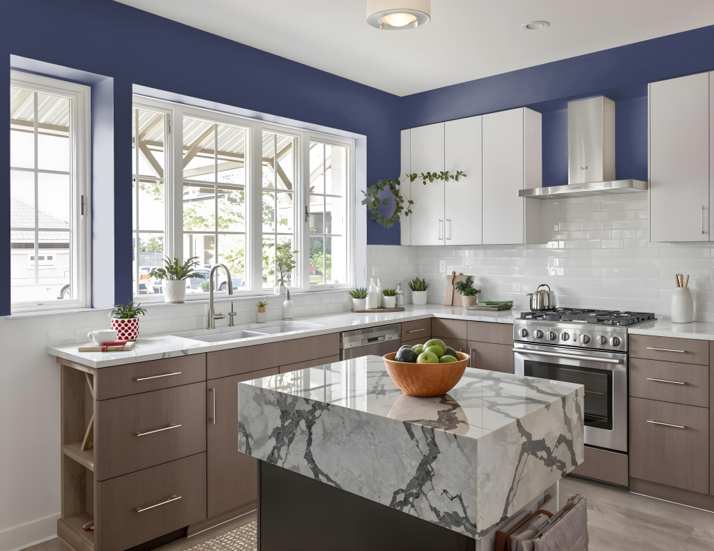
For a kitchen color scheme, Tikkurila Ink M350 exudes dramatic sophistication, setting a bold tone throughout the space. Pairing this deep hue with bright complements, such as vivid white accents, not only uplifts the atmosphere but also creates a striking contrast that highlights the dark, rich character of the ink shade.
To achieve a chic and balanced environment, integrate softer neutral tones like warm taupe and muted shades from the Mulberry family. Using Ink M350 selectively—on cabinets, an island, or a feature wall—further adds depth and visual intrigue, ensuring the overall look remains dynamic yet harmonious.
Living Room
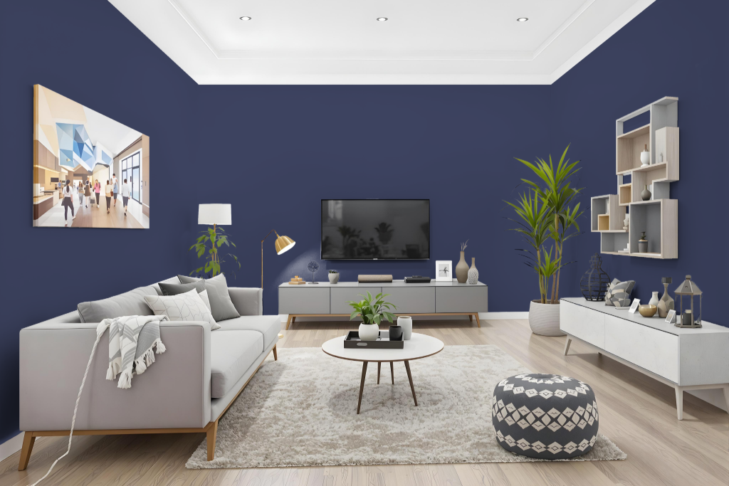
In a living room, Tikkurila Ink M350 creates a striking, dramatic atmosphere when paired with crisp white accents that illuminate its deep tone. This bold color works well to set an inviting mood while serving as a refined backdrop that enhances the room's character.
In a bedroom, combining Ink M350 with soft taupe shades or warm neutrals can produce a chic, sophisticated look perfect for unwinding. In spaces like a study or home office, the richness of Ink M350 fosters an environment of intelligence and creativity, although testing the color under different lighting and finishes is advised to ensure the desired effect.
Outdoor
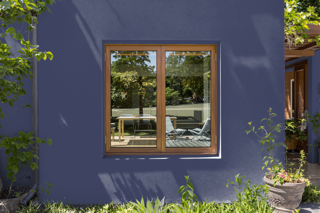
The home outdoor color Tikkurila Ink M350 makes a bold statement on exterior surfaces while imparting dramatic appeal to interior settings such as studies, home offices, living rooms, and bedrooms. Its distinctive tone provides a strong foundation that enhances both communal and personal spaces, embracing an air of sophistication.
Paired with soft taupe shades or contrasted with vibrant white accents, this color creates a harmonious balance that draws attention to architectural features. Its flat coating is designed for high wash and wet scrub resistance, ensuring a durable, low-maintenance finish that supports both lasting style and practical performance.