Benjamin Moore's Barren Plain 2111-60, commonly referred to as Greige, offers a sophisticated blend of gray and beige tones, creating a versatile neutral palette. Its RGB composition of 211, 208, 201 reflects a perfect balance of warmth and coolness, making it an ideal choice for both contemporary and traditional interior designs. This subtle hue effortlessly complements a wide range of color schemes, enhancing the aesthetic appeal of any space it graces.
Color Description
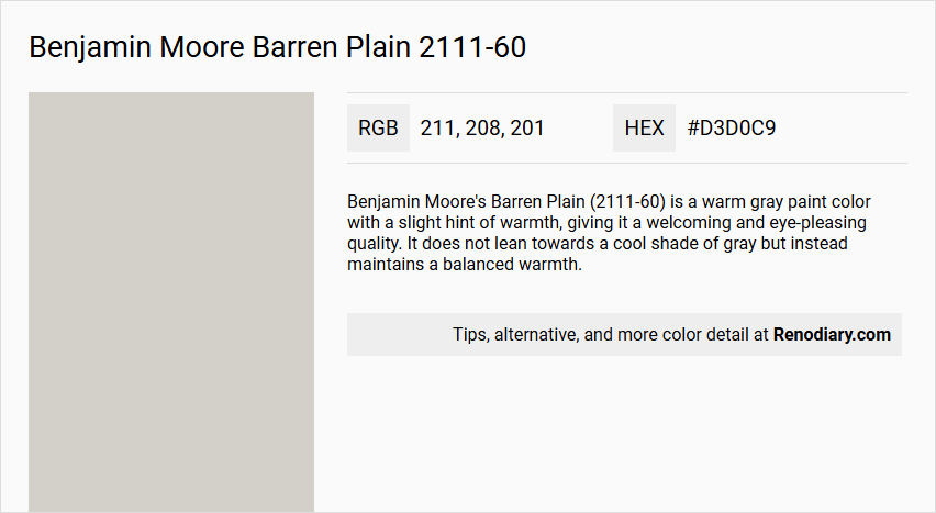
Benjamin Moore's Barren Plain (2111-60) is a warm gray paint color with a slight hint of warmth, giving it a welcoming and eye-pleasing quality. It does not lean towards a cool shade of gray but instead maintains a balanced warmth.
Undertones
Barren Plain has a slightly warm purple undertone, which is less pronounced than some other grays but still noticeable. This undertone makes it less likely to appear purple-pink, especially compared to other colors like Abalone.
Color Values
- LRV (Light Reflectance Value): 62.12
- Hex Color Code: #D3D0C9
- RGB Color Code: RGB(211, 208, 201)
- CMYK Values: 0.0%, 1.4%, 4.7%, 17.3%
Usage
Barren Plain is versatile and can be used in various lighting conditions. It works well with north-facing light, where it may appear cooler, and with south-facing or western light, where it leans slightly warmer. It pairs well with graywashed oak flooring and can complement wood stains, especially those with red or pink undertones. For trim and cabinets, cleaner white colors like Chantilly Lace or Oxford White are recommended to avoid clashing with the purple undertones.
Atmosphere
This color creates a welcoming and airy atmosphere due to its light LRV. It makes a room feel more spacious and can contribute to a cozy yet open feel, especially when paired with the right wood finishes and lighting conditions.
Benjamin Moore Barren Plain 2111-60 Color Alternative
Benjamin Moore Barren Plain 2111-60 finds its distinct alternatives in a palette designed to refresh and redefine any space. Tikkurila Mulberry H484 stands out with a bold and invigorating presence, while Tikkurila Median X486 and Tikkurila Piazza Y487 offer complementary options that evoke both subtle sophistication and dynamic energy. Each color alternative reflects meticulous design intent, ensuring that each hue brings its own unique character to create a balanced yet lively atmosphere.
Bathroom
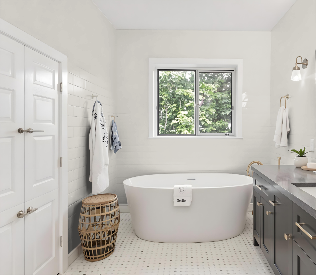
Benjamin Moore Barren Plain 2111-60 is an excellent bathroom color choice designed specifically for high-humidity spaces. Its specialized formulation features a mildew-resistant and fade-resistant finish that ensures long-lasting vibrancy even in demanding environments.
The paint offers a luxurious matte finish that adds a soft contrast to hard surfaces like tile, mirrors, and metal fixtures while incorporating advanced technology that maintains its depth and richness. Easy-to-clean properties further enhance its suitability for bathrooms, where both functionality and aesthetic appeal are essential.
Bedroom
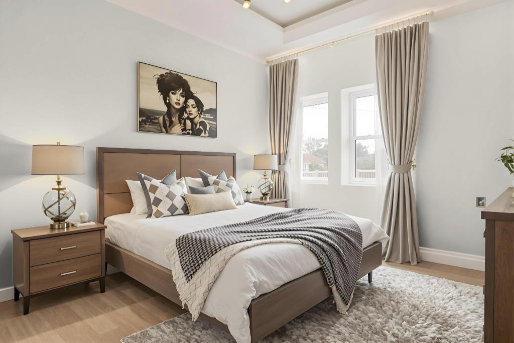
For a bedroom color scheme, Benjamin Moore's Barren Plain 2111-60 delivers a serene and elegant foundation. It pairs beautifully with rich navy blues, soft blush pinks, and warm earth tones to create an atmosphere that is both modern and inviting. Accents in metallic gold or matte black add a contemporary twist, while a monochromatic approach also works well with this color.
Layering complementary hues such as Normandy or Feather Gray can introduce a dynamic visual effect, enhancing the overall balance of the space. Coordinated shades for trim and furniture, including options like Chantilly Lace, Cloud Cover, and Eagle Rock, help bind the design together, and similar tones such as Abalone and Nimbus further contribute depth and sophistication to the room.
Kitchen
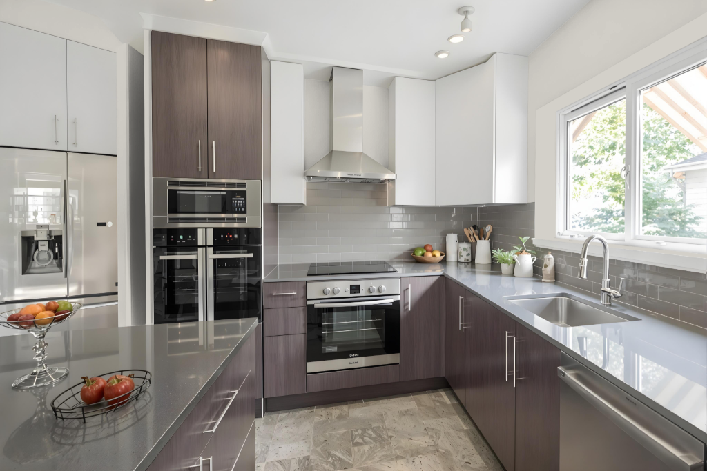
For a kitchen color scheme, Benjamin Moore's Barren Plain 2111-60 sets a refined tone. This hue creates a cohesive and elegant look when paired with rich navy blues, soft blush tones, and warm earth hues. It can be applied to walls and enhanced with metallic gold or matte black accents to evoke a modern and sophisticated ambiance.
For a monochromatic design approach, varying the intensity with lighter or darker shades from the same family maintains a consistent feel across the space. Complementing the primary color with white or off-white trim adds depth and dimension while reinforcing a clean and balanced aesthetic throughout the kitchen.
Living Room
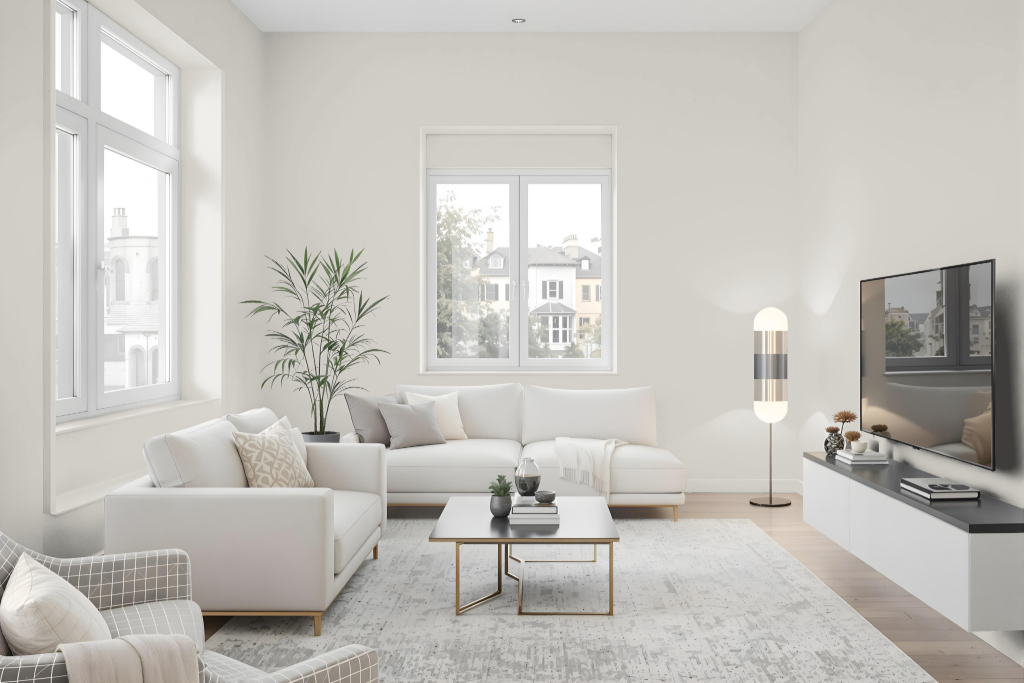
Benjamin Moore Barren Plain 2111-60 creates a modern and elegant living room atmosphere. The soft neutral tone enriches the space when blended with deep navy, gentle blush, and warm earth hues, while accents in metallic gold or matte black further add to the refined aesthetic.
The color also works harmoniously within monochromatic or complementary schemes, especially when paired with shades like Benjamin Moore Normandy and Feather Gray, resulting in a vibrant and dynamic visual effect that elevates the overall décor.
Outdoor
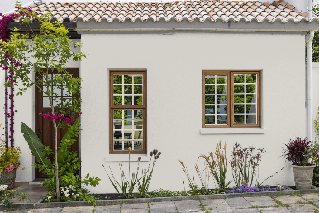
For home outdoor use, Benjamin Moore's Barren Plain 2111-60 offers an appealing option when applied with the appropriate exterior product. The color, while largely known for interior applications, can perform well outdoors provided it is paired with a paint system specially engineered for exterior conditions.
When planning its use outside, it is important to select a paint that withstands harsh weather environments, such as wind-driven rain and high humidity, and that includes a powerful mildewcide to block moisture. This exterior product is formulated with a robust acrylic resin to ensure strong adhesion, prevent peeling and cracking, and maintain reliable performance even in lower temperatures and rapid moisture exposure.