Dulux Muted Blush 60YR 64/038, a sophisticated hue often referred to as "Greige," masterfully combines the warmth of beige with the cool elegance of grey. This balanced shade, reflected by its precise RGB values of 213, 203, 198, offers a neutral yet inviting atmosphere, perfect for any contemporary space. Its subtlety ensures a timeless aesthetic that can seamlessly complement a diverse range of interior design styles.
Color Description
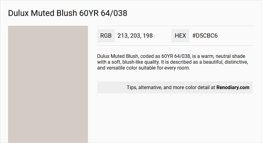
Dulux Muted Blush, coded as 60YR 64/038, is a warm, neutral shade with a soft, blush-like quality. It is described as a beautiful, distinctive, and versatile color suitable for every room.
Undertones
The undertone of Muted Blush is predominantly red, as indicated by its color space in the 60YR range.
Color Values
- L*ab: Not specifically provided for this exact shade, but it falls within the 60YR range.
- RGB: Approximately #d5cbc6 (199, 203, 198 in RGB).
- LRV (Light Reflectance Value): Similar colors in the range have an LRV around 64, indicating a moderate light reflectance.
Usage
Muted Blush is versatile and can be used in various rooms. It pairs well with neutrals, and its warm tone makes it suitable for creating a cozy and inviting atmosphere. It can be combined with other colors such as robust burgundies for a striking tone-on-tone effect or with lighter shades for a softer look.
Atmosphere
The color Muted Blush creates a warm and inviting atmosphere. It is gentle and feminine, making it suitable for spaces where a soothing and tranquil ambiance is desired. It can add a touch of elegance and sophistication to any room.
Dulux Muted Blush 60YR 64/038 Color Alternative
Dulux Muted Blush 60YR 64/038 achieves a refined, soft presence, and its color alternatives offer equally elegant expressions with distinct personalities. Tikkurila Mulberry H484 provides a nuanced twist with its luxurious depth, Tikkurila Median X486 serves as an ideal midtone balance, and Tikkurila Piazza Y487 introduces an inviting warmth that can effortlessly transform a space. These alternatives enable designers to select a color that maintains the sophisticated legacy of Dulux Muted Blush 60YR 64/038 while embracing a fresh, modern perspective.
Bathroom
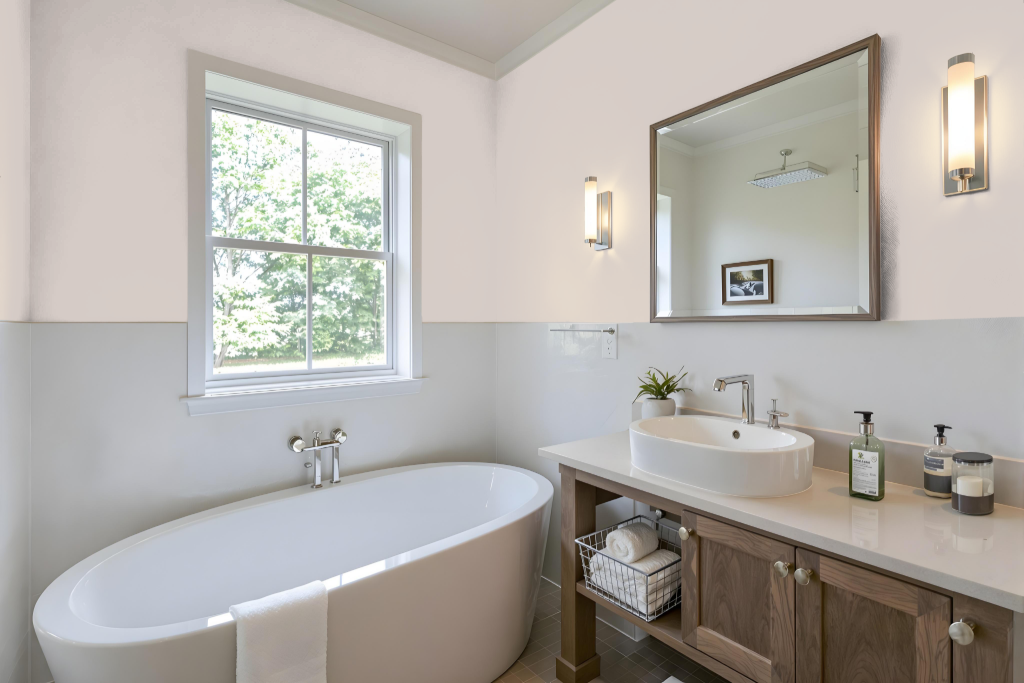
For a bathroom, Dulux Muted Blush is a choice that works best when its red undertones are aligned with the tones of your tile, flooring, and fixtures. It’s important to test samples in natural light to ensure the color harmonizes with the space and avoids an unbalanced or muddy look.
When painting over a darker background, using an undercoat can help achieve a smoother finish with this lighter shade. Additionally, combining Muted Blush with complementary hues—such as those with a green tint—can create an engaging and dynamic visual effect in your bathroom design.
Bedroom
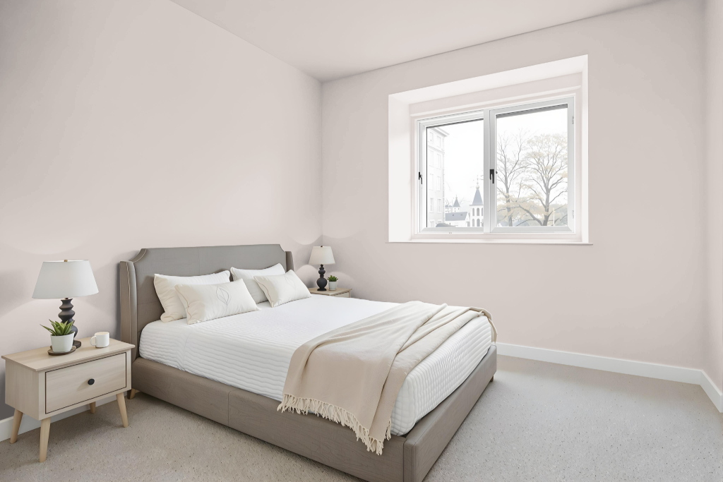
For a bedroom color scheme, Dulux Muted Blush creates a unique and inviting atmosphere with its soft, calming hue. It works beautifully when used throughout a monochromatic palette that employs a variety of shades, tints, and tones to maintain interest without overwhelming the space.
Pairing this color with complementary tones—such as green-inspired accents—or balancing it with warm neutrals and deep grey elements introduces contrast and depth. Incorporating it into strategic features like accent walls, furniture, or trim further enhances key areas and elevates the overall decor of the room.
Kitchen
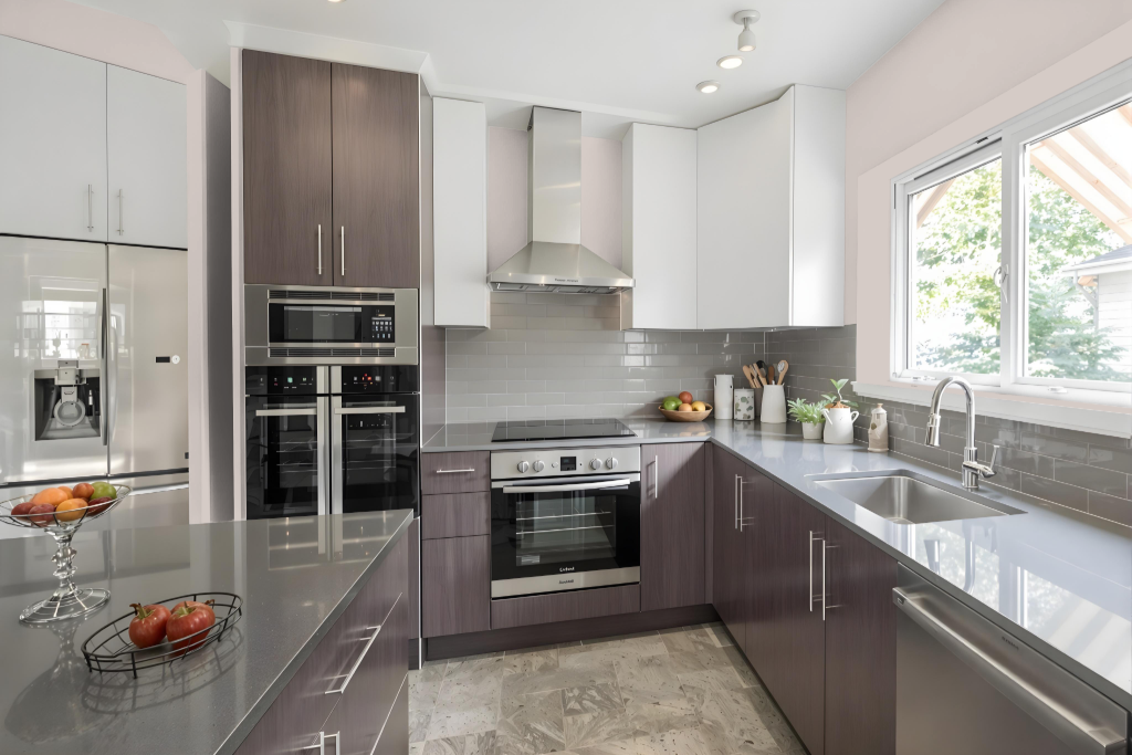
For a kitchen color scheme, Dulux Muted Blush brings a warm and inviting feel to the space. It works beautifully when applied to cabinets—be it on an island or the lower cabinetry—and pairs harmoniously with neutral tones like taupe or grey alongside pared-back splashbacks and white work surfaces.
The color also provides an excellent opportunity for contrast when accented with darker handles and accessories, adding a more masculine touch to the overall design. Additionally, Muted Blush can be incorporated subtly through decorative elements like vases, plant pots, utensils, and crockery, or even extended to appliances and splashbacks for a striking burst of color.
Living Room
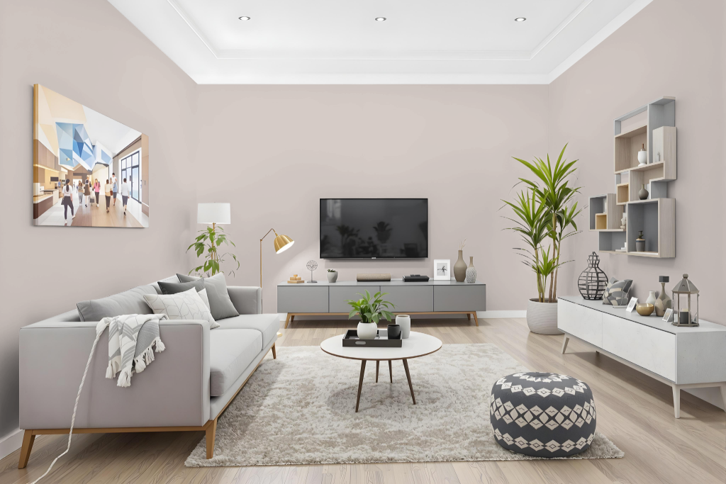
For living rooms, Dulux Muted Blush creates a unique and inviting space when applied to walls or as an accent color, establishing a warm and welcoming ambiance. It pairs seamlessly with neutral shades or contrasted with complementary tones to add visual interest and energy to larger areas.
The color’s warm undertones also make it an excellent choice for kitchens, bathrooms, and bedrooms, creating a consistent and stylish look throughout the home. Additionally, using it on furniture and trim helps maintain a unified aesthetic across different living spaces.
Outdoor
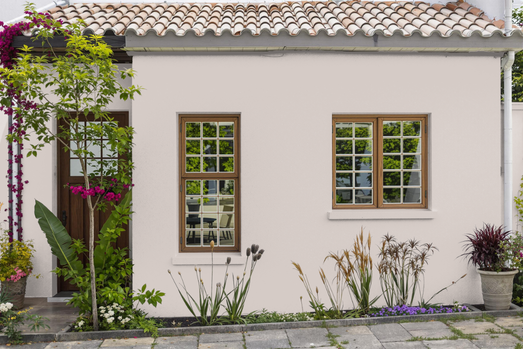
Dulux Muted Blush is a home outdoor color that enhances exterior spaces with its subtle charm and distinctive appeal. When applied on different surfaces such as rough walls or smooth fixtures like cabinets, its appearance can vary, making it essential to test the finish under real conditions and to use a suitable primer to secure optimal results.
Enhancements like UV protection and odor control can be added to increase its durability and performance, while the choice of finish—from matt to gloss—allows for customization that meets diverse weather challenges and aesthetic desires. Complementary tones, particularly those with green hues, can be paired with Muted Blush to create a dynamic contrast or a cohesive, monochromatic look that elevates the overall design.