Sherwin Williams Front Porch SW 7651, characterized by its RGB values of 204, 204, 197, is a versatile shade known as greige. This unique blend of gray and beige offers a neutral palette that seamlessly enhances various design aesthetics. Its understated elegance makes it a popular choice for creating calming and inviting living spaces.
Color Description
Sherwin Williams Front Porch SW 7651 is a light gray color. It is often described as a true gray with a slight hint of undertones but does not lean heavily towards other colors like brown, green, or purple.
Undertones
The undertones of Front Porch can be described as having a slight yellow or bluish/purple hint, although these undertones are subtle and do not dominate the overall gray appearance.
Color Values
- HEX value: #CCCCC5
- RGB code: 204, 204, 197
- Light Reflectance Value (LRV): Approximately 60
- Lab values: L* 81.9, a* -0.94, b* 3.5
Usage
Front Porch is versatile and can be used in various interior spaces. It pairs well with white trim, dark floors, and accents in metallic tones like gold or bronze. It is suitable for living rooms, hallways, stairs, and ceilings, and can create a balanced look between classic and contemporary vibes.
Atmosphere
This color exudes a sense of timeless elegance and sophistication. It creates a calm and soothing atmosphere, making it ideal for rooms that need a neutral backdrop. It works well in both naturally lit and low-light areas, providing a consistent and elegant look.
Sherwin Williams Front Porch SW 7651 Color Alternative
Sherwin Williams Front Porch SW 7651 exudes a distinctive charm that makes it an appealing choice for both traditional and contemporary design schemes. Tikkurila Median X486, Tikkurila Shawl Y467, and Tikkurila Sea Smoke X447 offer excellent color alternatives that capture a similar essence while introducing subtle variations in tone and finish. By selecting one of these alternatives, designers and homeowners can maintain the inviting character of Sherwin Williams Front Porch SW 7651 while exploring new possibilities for unique, personalized aesthetics.
Bathroom
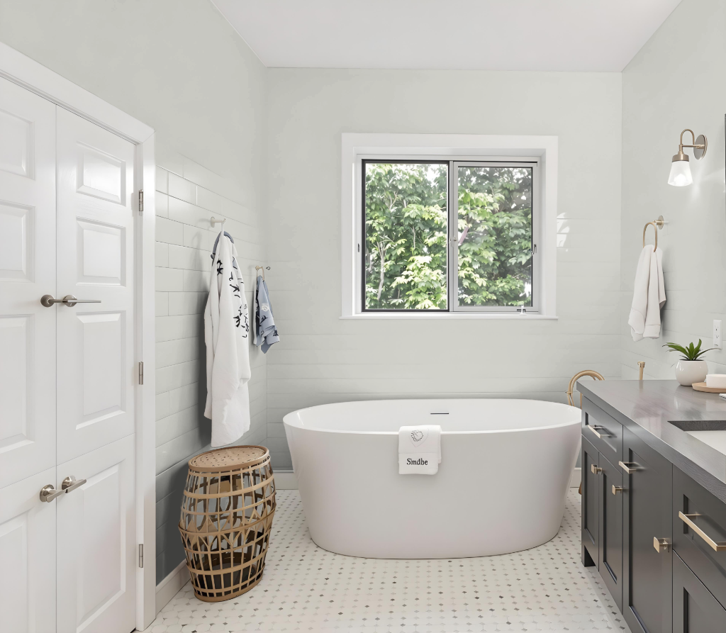
For a bathroom, Sherwin Williams Front Porch is an elegant choice that pairs beautifully with warm neutrals like Dover White and Accessible Beige to achieve a balanced and timeless atmosphere. Cooler shades such as Cityscape and North Star can be used to create a striking contrast, while gold or bronze metallic accents add depth and warmth to the overall design.
Though it might not be as frequently suggested for bathrooms compared to lighter alternatives, Front Porch offers a unique and sophisticated ambiance when combined with the right decor and lighting elements. This approach allows the space to feel both modern and inviting, ensuring a refined look that stands out.
Bedroom
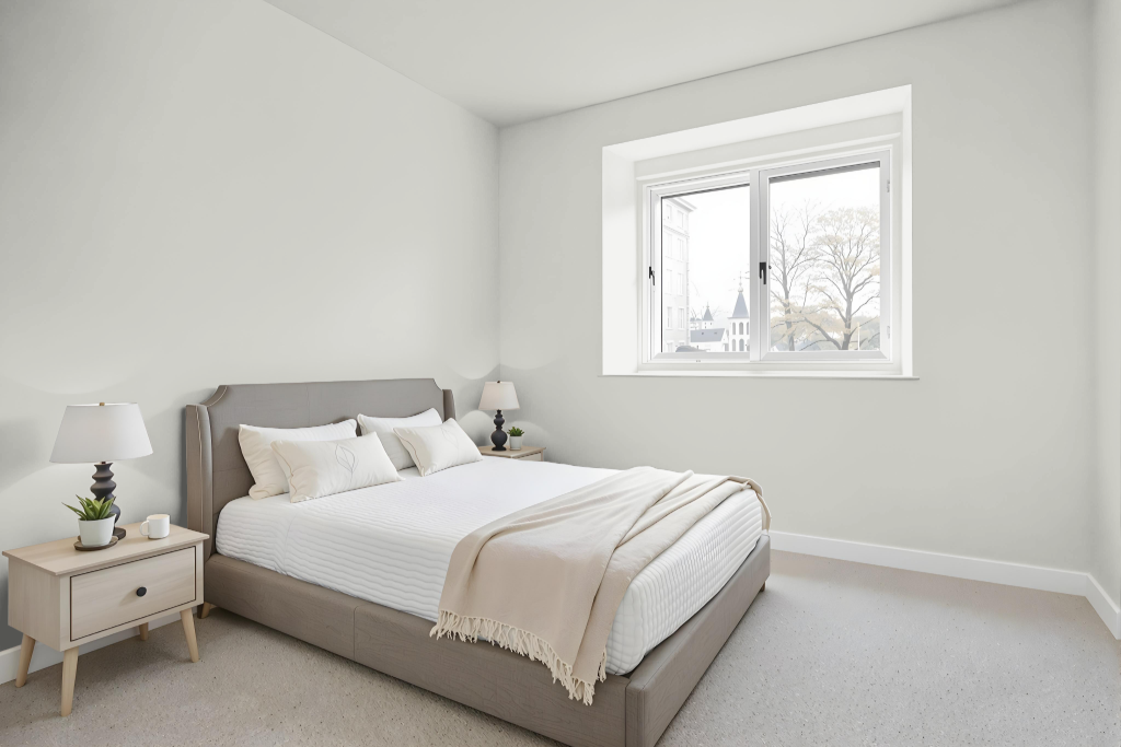
For a bedroom color scheme, Sherwin Williams Front Porch SW 7651 creates a serene atmosphere with a calming effect. It pairs well with warm neutrals like Dover White SW 6385 and Accessible Beige SW 7036 while providing a striking contrast when combined with cooler shades such as Cityscape SW 7067 or North Star SW 6246.
This hue harmonizes with dark wood furniture and its light tone can visually expand smaller spaces. It adapts effectively to various lighting conditions, enhancing the overall balance and inviting feel of the bedroom.
Kitchen
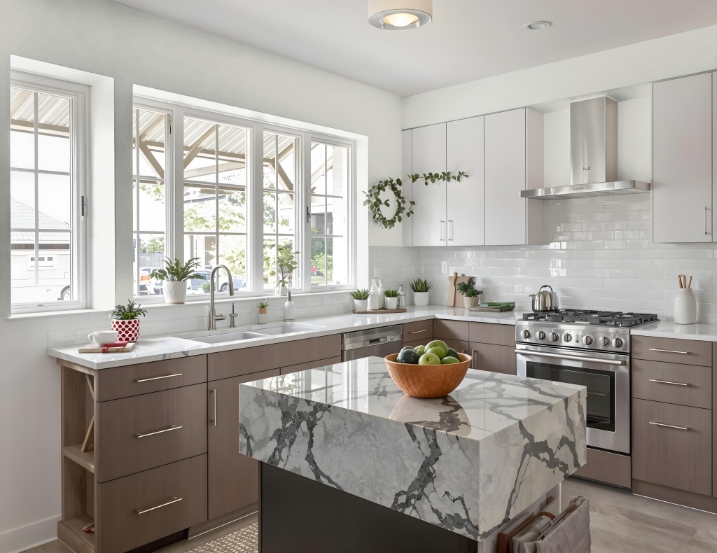
For a kitchen, Sherwin-Williams Front Porch SW 7651 creates an elegant and inviting atmosphere. It blends smoothly with warm neutrals like Dover White and Accessible Beige, while cooler shades such as Cityscape or North Star introduce a striking contrast that maintains balance throughout the space.
Enhancing the overall design, matching trim, walls, and doors with cabinet colors—notably warm off-whites—reinforces a cohesive appearance. Accents in gold or bronze further enrich the ambiance, adding depth and a touch of luxury to the kitchen environment.
Living Room
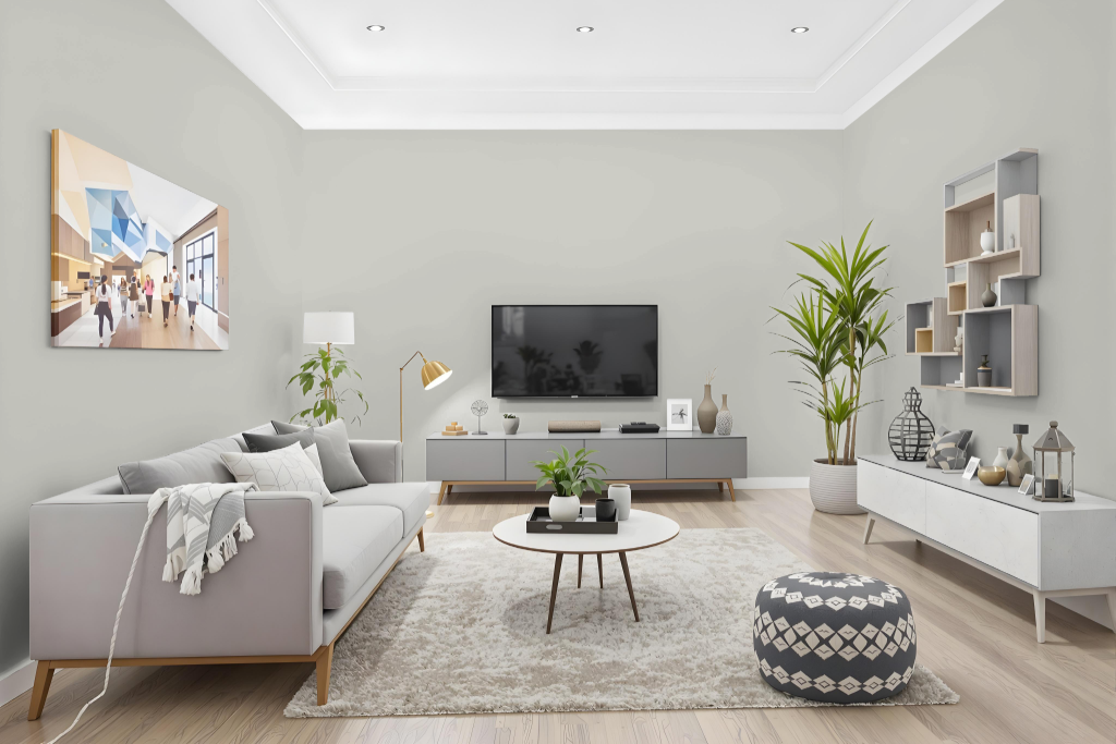
In the living room, Sherwin Williams Front Porch infuses the space with a rich and inviting hue. This color pairs seamlessly with warm neutrals like Dover White and Accessible Beige, creating a balanced environment that feels both cozy and sophisticated. For those looking to energize the room, cool shades such as Cityscape and North Star provide a striking counterpoint that adds depth and intrigue.
Combining the main color with complementary metallic accents in gold or bronze further elevates the space, introducing an element of refinement. Whether used in a monochromatic scheme or as part of a broader color palette, the integration of these tones ensures a dynamic and engaging living room atmosphere.
Outdoor
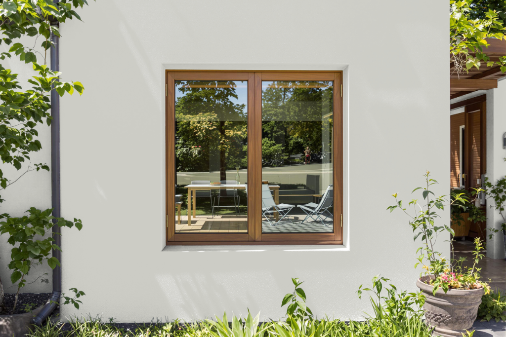
For outdoor use, Sherwin Williams Front Porch SW 7651 is a captivating home exterior color that creates a harmonious ambiance when combined with warm neutrals like Dover White and Accessible Beige. It also makes a striking statement when contrasted with cooler shades such as Cityscape and North Star, offering a well-rounded approach to exterior styling.
With its impressive light reflectance performance and neutral undertone, this color adapts gracefully to varying lighting conditions and architectural styles. It's advisable to test the color with a sample and observe it in different settings before making a final decision.