Benjamin Moore’s Cappuccino 2096-50, characterized by its RGB values of (202,175,161), embodies the serene and cozy shades of Pale Taupe. This versatile color adds a warm and understated elegance to interiors, complementing both modern and traditional design aesthetics. Its subtle blend of earthy tones creates a soothing atmosphere, making it an ideal choice for living spaces that aim to evoke comfort and tranquility.
Color Description
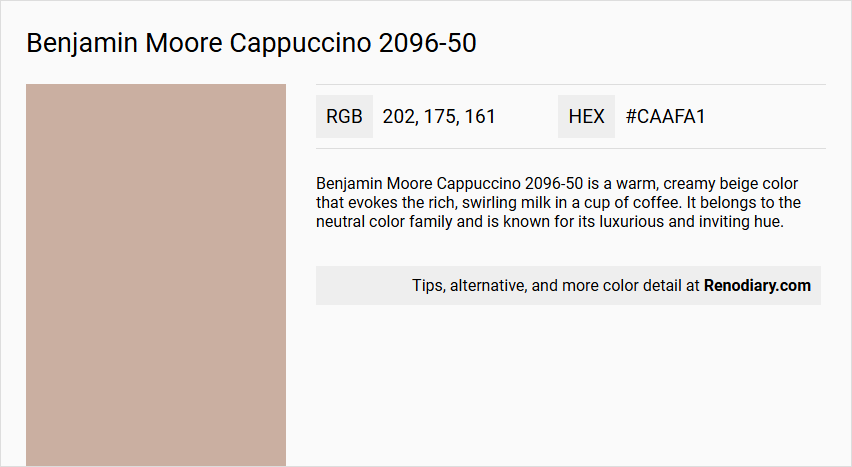
Benjamin Moore Cappuccino 2096-50 is a warm, creamy beige color that evokes the rich, swirling milk in a cup of coffee. It belongs to the neutral color family and is known for its luxurious and inviting hue.
Undertones
The undertone of Cappuccino 2096-50 can be accurately described as a Red hue. This red undertone is evident when isolating the pure hue and eliminating any tints, tones, and shades.
Color Values
- HEX Value: #CAAFA1
- RGB Code: RGB(202, 175, 161)
- CMYK Values: 0.0%, 13.4%, 20.3%, 20.8%
- Light Reflective Value (LRV): 44.81
Usage
Cappuccino 2096-50 is versatile and suitable for various rooms, including living rooms, bedrooms, and home offices. It works well in both traditional and modern interiors, adding a touch of elegance and depth to any space.
Atmosphere
This color creates a cozy and inviting atmosphere, making it ideal for spaces where warmth and sophistication are desired. It can make a room feel intimate and cozy due to its moderate LRV value.
Benjamin Moore Cappuccino 2096-50 Color Alternative
The Benjamin Moore Cappuccino 2096-50 can be refreshed with a twist by exploring impressive alternatives such as Tikkurila H467, which brings a distinct yet equally warm feeling to any space. Little Greene Light Peachblossom 3 offers a soft and inviting option, while Little Greene China Clay - Dark 178 provides a bolder, more dramatic complement to classic interiors. Each of these alternatives presents a unique interpretation that retains the inviting character inherent to Benjamin Moore Cappuccino 2096-50 for those seeking subtle variations in color schemes.
Bathroom
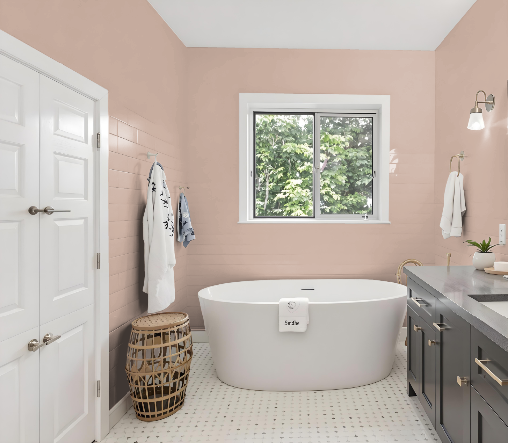
For bathroom paint design, Benjamin Moore Cappuccino 2096-50 creates an elegant atmosphere with its rich, inviting tone. It pairs beautifully with finishes designed for high-humidity areas, ensuring a durable, mildew-resistant surface that maintains a refined aesthetic.
This color adapts well under varying light conditions and can be effectively complemented by lighter hues for trim and accents. Choosing a smooth satin or pearl finish further enhances moisture resistance and ease of maintenance, culminating in a stylish and long-lasting bathroom design.
Bedroom
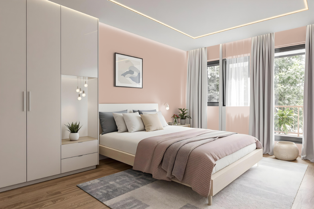
Benjamin Moore's Cappuccino 2096-50 is an excellent choice for a bedroom color scheme, offering a warm, inviting backdrop that pairs beautifully with complementary shades like Atrium White, Gardenia, Peau de Soie, and Harvest Brown for trim, accents, or adjacent spaces. This curated selection ensures an engaging interplay of tones, creating a balanced environment that mixes softer hues with richer contrasts.
Additional hues such as Soul Mate, Just Beige, Cedar Ridge, and Vintage help reinforce a cohesive, harmonious palette throughout the room. With a light reflectance value that ensures a pleasant equilibrium between brightness and coziness, this color environment is designed to suit spaces that require both comfort and visual appeal.
Kitchen
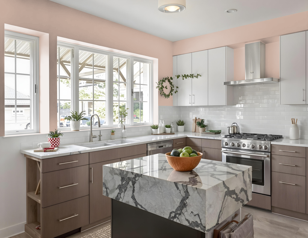
Cappuccino 2096-50 is a striking kitchen color that brings elegance and warmth to the space. Its balanced light reflectance ensures the area feels comfortably illuminated, making it suitable for a variety of design themes while remaining inviting and sophisticated.
Pairing Cappuccino with green-toned accents, such as Aegean Teal or Blue Lace, creates a high-contrast dynamic that catches the eye. For a more harmonious feel, consider complementing it with softer hues like Atrium White, Gardenia, or Harvest Brown to achieve a cohesive and welcoming kitchen atmosphere.
Living Room
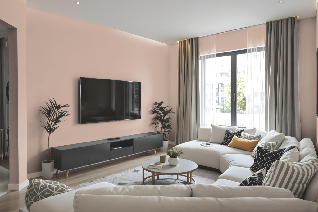
In the living room, Benjamin Moore Cappuccino 2096-50 brings a warm, inviting atmosphere with its deep saturation and balanced light reflection. This rich shade works harmoniously with soft accent tones such as Atrium White, Gardenia, and Harvest Brown to create a coordinated and impactful design.
Complementary hues with green undertones add a refreshing contrast to the robust base, offering a dynamic interplay of color throughout the space. Its application in different finishes—from understated flat to more polished semi-gloss—ensures both aesthetic appeal and practical durability in various areas of the home.
Outdoor
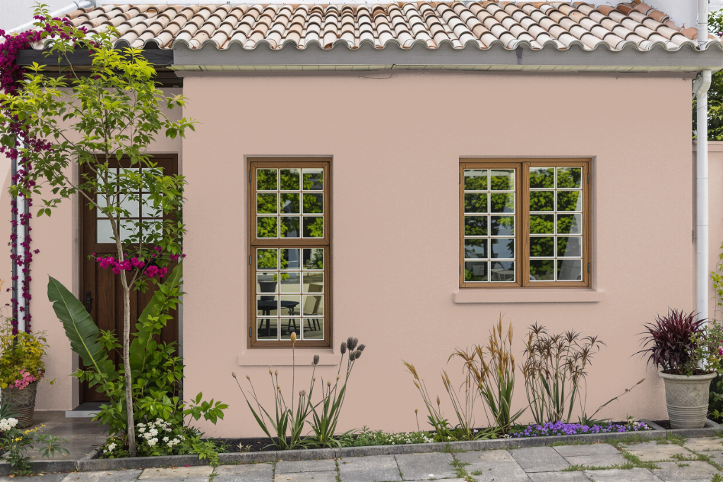
Home outdoor color Benjamin Moore Cappuccino offers a warm and inviting tone that can add a distinctive touch to your home's exterior when properly formulated for outdoor conditions. Although it originates from an interior collection, its rich, amber hue can complement a wide range of architectural styles when paired with exterior-specific paint formulations.
For best results, ensure you select a paint line engineered for outdoor durability that incorporates advanced technologies for adhesion, weather resistance, and mold prevention. Taking into account its characteristic red undertones, it’s advisable to test performance under real environmental conditions to maintain its visual appeal over time.