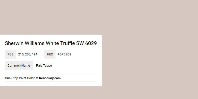
Sherwin Williams White Truffle SW 6029, often referred to as Pale Taupe, exudes a warm and inviting ambiance with its subtle blend of earthy tones. Its RGB composition of 215, 200, 194 creates a soft yet sophisticated hue, perfect for creating serene and balanced spaces. Ideal for both modern and traditional interiors, this color complements a variety of design elements, enhancing the overall aesthetic with its understated elegance.
Color Description
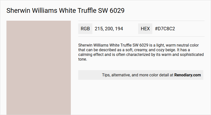
Sherwin Williams White Truffle SW 6029 is a light, warm neutral color that can be described as a soft, creamy, and cozy beige. It has a calming effect and is often characterized by its warm and sophisticated tone.
Undertones
The undertones of White Truffle are predominantly red-violet, with hints of gray, beige, and a slight dash of purple. This red-violet undertone gives the color a hint of rosiness.
Color Values
- HEX value: #D7C8C2
- RGB code: 215, 200, 194
Usage
White Truffle is versatile and suitable for various rooms, including bedrooms, living rooms, and nurseries. It pairs well with earthy tones like Balanced Beige (SW 7037) and Eider White (SW 7744), and can be complemented by accents in Dromedary Camel (SW 9085) and Rock Bottom (SW 7062).
Atmosphere
This color creates a warm, cozy, and sophisticated atmosphere, reminiscent of a rustic cabin retreat. It is soothing and calming, making it ideal for spaces where a relaxing ambiance is desired.
Sherwin Williams White Truffle SW 6029 Color Alternative
Sherwin Williams White Truffle SW 6029 is celebrated for its sophisticated balance of warm undertones that provide a graceful, neutral backdrop for any décor. Tikkurila Median X486, Tikkurila Shawl Y467, and Tikkurila Mirage G481 serve as excellent alternatives, each offering their own unique twist while maintaining a complementary aesthetic to White Truffle. These options empower designers to create harmonious environments where the interplay of light and color accentuates both modern and traditional spaces.
Bathroom
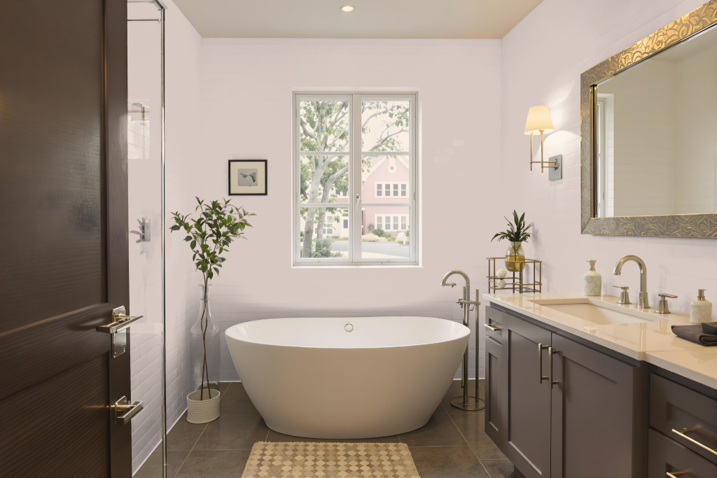
Sherwin Williams White Truffle sets a distinctive tone in a bathroom, establishing a cozy yet refined ambiance. It pairs beautifully with deep-toned tiles, white fixtures, silver metallic accents, and warm walnut vanities, while also harmonizing with chrome, black, or brushed nickel accents.
The hue's subtle purple nuances shift with the light, offering either a neutral or warmly accented feel. It also complements rich red wood tones and crisp white furnishings, creating a balanced and inviting atmosphere.
Bedroom
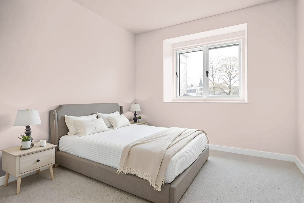
For a serene bedroom design, Sherwin Williams White Truffle SW 6029 creates a calming and cozy ambiance that adapts to changes in lighting, appearing cooler under crisp light and revealing a more distinct purple nuance in warmer settings. It pairs beautifully with both warm-toned colors as well as crisp white, cool grays, and blue greens to create a cohesive and inviting atmosphere.
For added contrast, trim in a clean white finish enhances the overall look, while the color complements red wood tones in flooring or furniture, and matches well with bright white furnishings. This design approach makes the color an excellent choice for bedrooms, nurseries, or master bedrooms seeking a gentle, feminine touch.
Kitchen
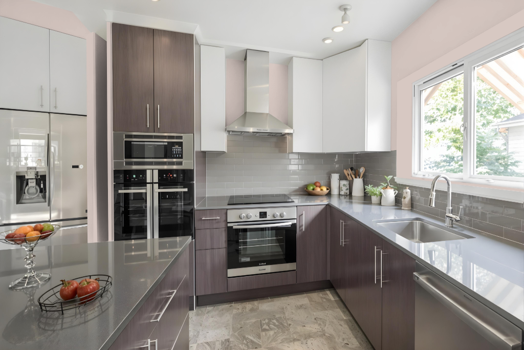
For a kitchen color scheme, Sherwin Williams White Truffle SW 6029 offers a warm and inviting atmosphere that enhances any culinary space. Paired with earthy tones and natural materials like warm wood cabinets or flooring, it creates an ambiance that is both cozy and refined. Crisp whites for trim and accents provide a clean contrast, while complementary hues add depth and harmony to the overall design.
Keep in mind that White Truffle carries distinct red and purple undertones, which might overpower a kitchen seeking a bright, neutral backdrop. Evaluating the color with various lighting conditions and surrounding elements such as countertops and fixtures is essential to ensure the finished look meets your desired aesthetic.
Living Room
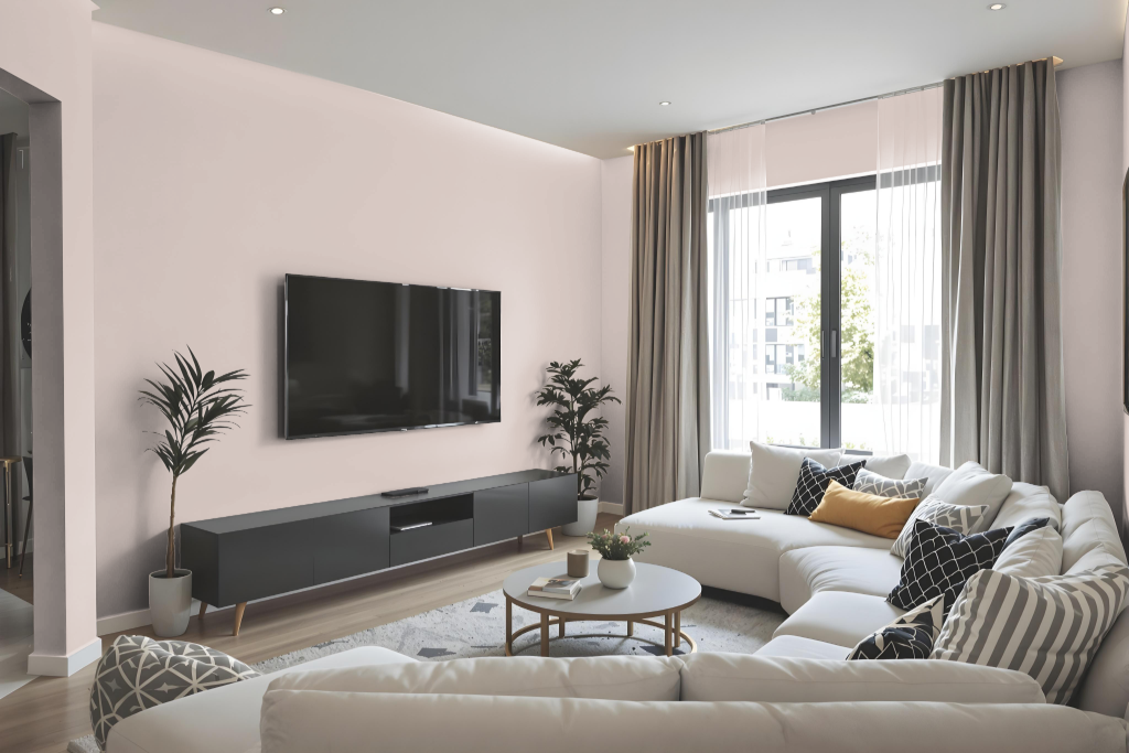
Sherwin Williams White Truffle SW 6029 offers a warm paint color that enhances the living room’s ambiance. It adapts beautifully to different lighting environments, shifting from a more subtle appearance in cooler settings to a richer, feminine hue in warmer light.
The color pairs well with a range of neutrals and accent shades, creating a cozy and inviting space. It can be effectively complemented by earthy tones and crisp contrasting colors to achieve a balanced, elegant look.
Outdoor
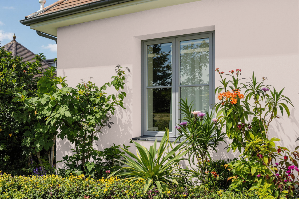
Sherwin Williams White Truffle brings a distinctive appeal to home exteriors when considered as an inspiration, though it is primarily designed for indoor applications. Best known for creating cozy, sophisticated atmospheres in spaces like bedrooms, nurseries, and living rooms, this color is appreciated for the inviting ambiance it imparts within interior environments.
For outdoor projects, it is recommended to opt for specially formulated exterior paints that are engineered to handle harsh weather, resist fading, peeling, and mildew growth, and deliver lasting performance under challenging conditions. These exterior options ensure the durability and longevity needed to maintain a beautiful finish on your home.