Sherwin Williams Temperate Taupe SW 6037 is a soothing shade that belongs to the pale taupe category, characterized by its muted and earthy tones. With an RGB composition of (191, 177, 170), this color offers a balanced blend of warmth and subtle elegance, making it ideal for creating a calm and inviting atmosphere in any space. Its versatility allows it to complement a wide range of interior styles, from contemporary to traditional, by providing a soft and neutral backdrop.
Color Description
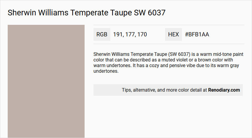
Sherwin Williams Temperate Taupe (SW 6037) is a warm mid-tone paint color that can be described as a muted violet or a brown color with warm undertones. It has a cozy and pensive vibe due to its warm gray undertones.
Undertones
The undertones of Temperate Taupe are predominantly red, although it also exhibits warm gray undertones.
Color Values
- HEX Code: #BFB0A9 or #BFB1AA
- RGB Decimal: 191, 176, 169
- RGB Float: 0.749, 0.69, 0.663
- CMYK Percentage: 0, 8, 12, 25
- Light Reflective Value (LRV): 44.99%
Usage
Temperate Taupe is versatile and can be used in various rooms such as bedrooms and bathrooms. It pairs well with warm shades like Roycroft Rose to create an inviting palette. It can also be part of a monochromatic or complementary color scheme, and it works well in the Liveable Luxe color collection.
Atmosphere
This color creates a cozy and pensive atmosphere, making it ideal for spaces where a relaxed and refined elegance is desired. It adds a warm and inviting feel to the room, making it suitable for creating a gentle and soothing environment.
Sherwin Williams Temperate Taupe SW 6037 Color Alternative
Sherwin Williams Temperate Taupe SW 6037 inspires a range of color alternatives that maintain its elegant and neutral vibe while offering distinct nuances. Tikkurila Driftwood V484 and Tikkurila Cloister V487 deliver unique takes on warmth and subtle sophistication, balancing earthy and refined elements. Additionally, Tikkurila Deco Grey 1927 provides a cooler twist that can complement modern and traditional spaces alike with its understated charm.
Bathroom
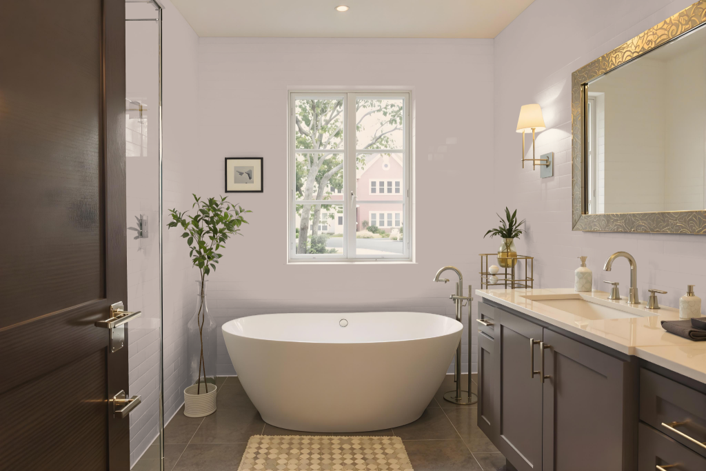
For a bathroom, Sherwin Williams Temperate Taupe SW 6037 creates a warm, inviting atmosphere that adapts well to areas with limited natural light. Its balanced medium tone harmonizes the room by ensuring the space remains neither too dark nor too bright, setting the stage for a relaxing environment.
Paired with complementary hues like Roycroft Rose, this color enhances a cozy palette and works beautifully with fixtures and finishes such as countertops, tiles, and cabinets featuring neutral or warm accents. The thoughtful balance in lighting and depth fosters a harmonious bathroom setting perfect for unwinding.
Bedroom
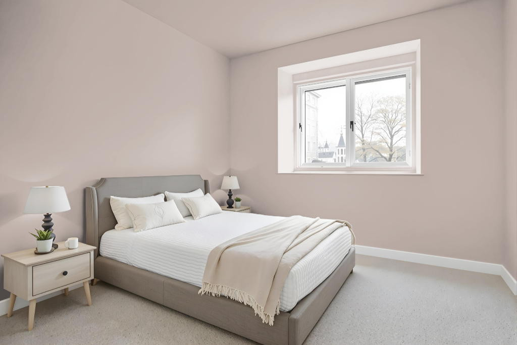
For a bedroom color scheme, Sherwin Williams Temperate Taupe SW 6037 can be integrated in several ways to create a cozy and inviting atmosphere. This warm neutral pairs beautifully with accents like Roycroft Rose to weave elegance and comfort into a unified look through a monochromatic approach or layered tints and shades.
For added visual interest, incorporating complementary hues such as greener shades creates a dynamic contrast while retaining a harmonious feel. Whether applied to walls, furniture, or decorative accents, this color serves as a calming foundation for a sophisticated and inviting bedroom retreat.
Kitchen
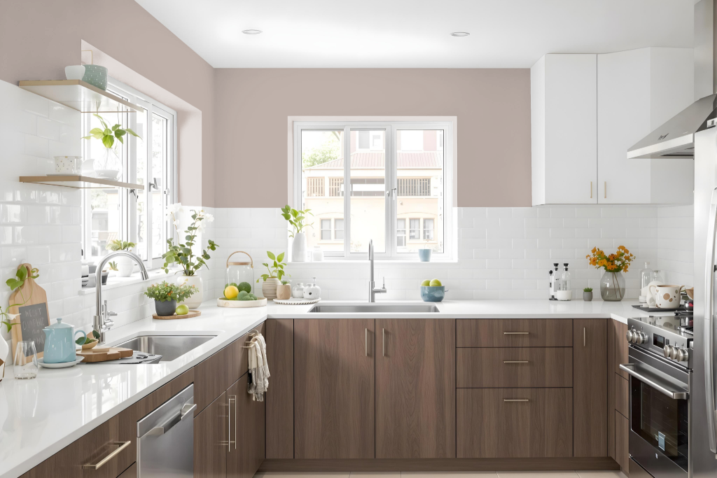
For a kitchen color scheme, Sherwin Williams Temperate Taupe sets an inviting tone that enhances warm cabinetry and countertops, creating a welcoming atmosphere. It works harmoniously with various design elements to establish a balanced and cozy environment.
Pairing this color with hues that introduce hints of green can add a vibrant visual effect without overwhelming the space, while a monochromatic arrangement using different shades and tints of Temperate Taupe achieves cohesion. Incorporating accent details with warmer tones, such as those reminiscent of Roycroft Rose, further enriches the overall palette.
Living Room
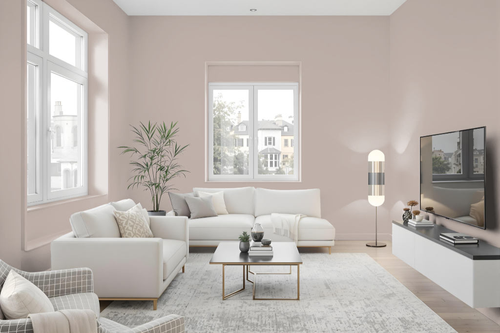
Sherwin-Williams Temperate Taupe SW 6037 makes an excellent living room color, setting a balanced and appealing backdrop that naturally extends into other spaces. In bedrooms, it fosters a cozy, inviting environment when paired with warm shades like Roycroft Rose, contributing to an atmosphere of comfort and refined elegance.
In bathrooms, this mid-tone enriches the space with a relaxed, sophisticated feel that harmonizes with diverse decor styles. It also integrates well into both single-hued and contrasting color schemes when combined with complementary accents such as Niebla Azul and Silver Lake. Viewing physical samples is recommended to ensure the color meets expectations in person.
Outdoor
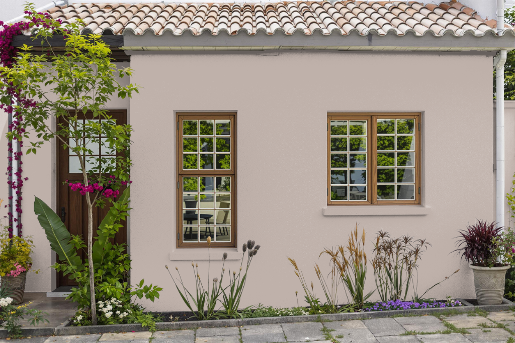
For home outdoor color, Sherwin-Williams Temperate Taupe presents a balanced mid-tone finish that works well in various lighting conditions. This color, with its characteristic light reflectance value of around 46, offers a harmonious interplay between light absorption and reflection, ensuring it neither appears too bright nor too dark on exterior surfaces.
When selecting this shade for outdoor applications, it is important to verify the color in person by testing paint samples or using color cards on site. This approach helps to confirm the appearance under different natural lighting scenarios, ensuring the final result aligns with your home’s design vision.