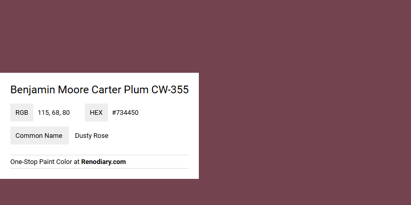
Benjamin Moore's Carter Plum CW-355 might be referred to as Dusty Rose due to its muted, sophisticated undertone that blends deep mauve with hints of rosy warmth. With a specific RGB composition of 115, 68, 80, this shade offers a rich and balanced color that is perfect for creating an inviting and elegant atmosphere in a variety of settings. Its versatile hue makes it an excellent choice for accent walls or statement furniture pieces, adding a touch of timeless elegance to both traditional and modern interiors.
Color Description
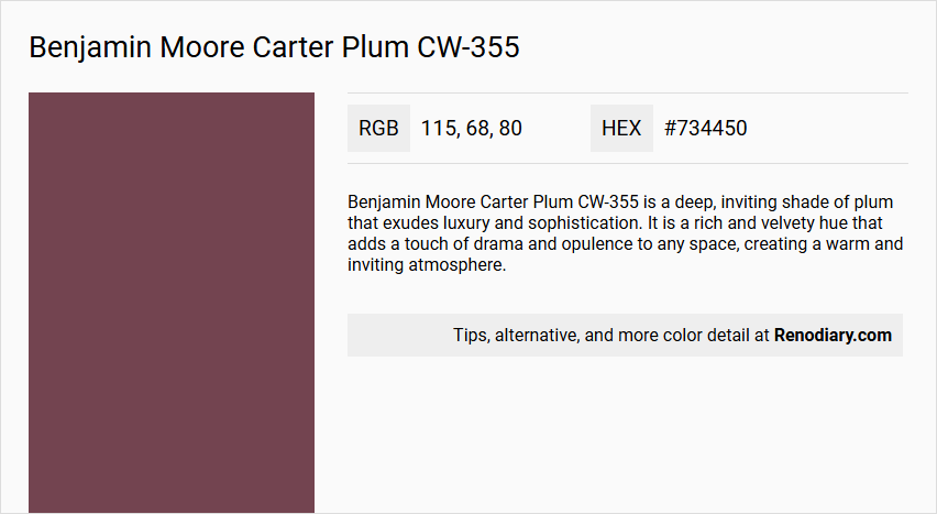
Benjamin Moore Carter Plum CW-355 is a deep, inviting shade of plum that exudes luxury and sophistication. It is a rich and velvety hue that adds a touch of drama and opulence to any space, creating a warm and inviting atmosphere.
Undertones
The undertone of Carter Plum can be accurately described as a red hue. This is evident from the color space analysis, which isolates the pure hue and eliminates any tints, tones, and shades to determine its undertone.
Color Values
- HEX Value: #734450
- RGB Code: 115, 68, 80
- RGB Float: 0.439, 0.267, 0.318
- LRV (Light Reflectance Value): 10.07
Usage
Carter Plum is versatile and can be used in various rooms such as living rooms, dining areas, and bedrooms. It is also suitable for bathroom renovations, adding a touch of elegance and grandeur to the space.
Atmosphere
This color creates a warm and inviting atmosphere, making any room feel luxurious and sophisticated. It adds a sense of grandeur and style, transforming the space into a haven of glamour and allure.
Benjamin Moore Carter Plum CW-355 Color Alternative
Benjamin Moore Carter Plum CW-355 is a distinctive shade known for its rich and dramatic character that adds depth to any environment. For those looking to explore color alternatives with a similar allure, Tikkurila Rooibos M476 provides a nuanced alternative that maintains the sophisticated spirit of Carter Plum. Additionally, Tikkurila N470 and Little Greene Arras 316 offer complementary variations, each capturing unique elements while preserving the essence of Benjamin Moore Carter Plum CW-355.
Bathroom
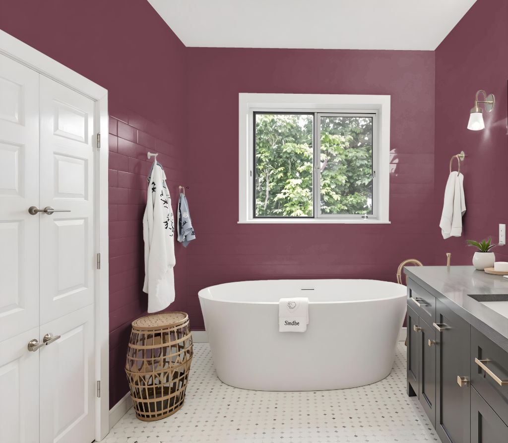
Benjamin Moore Carter Plum CW-355 is a rich and elegant bathroom color that may not perform best in humid environments. Its refined appeal contrasts with the specialized needs of a bathroom setting, where paint must resist conditions that promote mildew and mold growth.
For spaces prone to high moisture, it is advisable to select painted finishes specifically engineered for such environments. These formulations offer benefits like mildew resistance, easy stain removal, and enhanced durability, ensuring a long-lasting and hygienic finish in the bathroom setting.
Bedroom
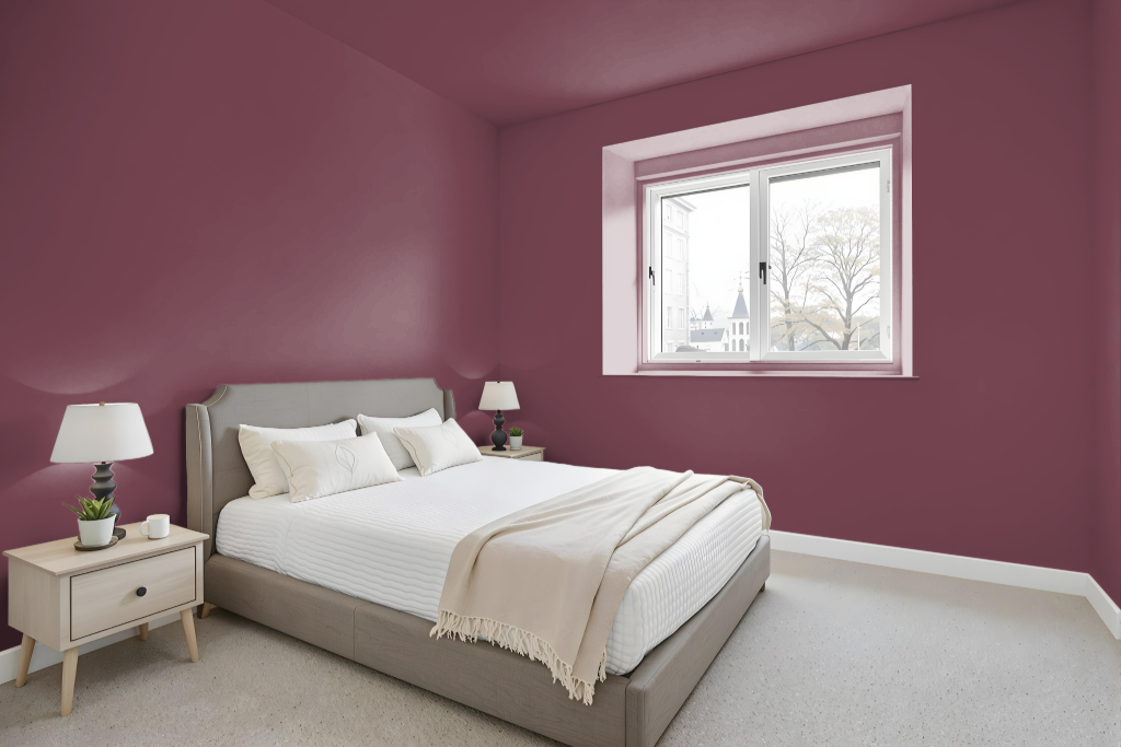
For a bedroom color scheme, Benjamin Moore's Carter Plum CW-355 offers a deep, rich tone that can serve as the focal point in creating an inviting environment. This hue can be paired with lighter or darker shades within its own family to create a layered monochromatic effect, while strategically incorporating accent decor to break the uniformity.
Alternatively, the striking appeal of Carter Plum can be enhanced by incorporating complementary hues with greenish undertones to inject a vibrant, dynamic contrast. To achieve a balanced look, consider integrating coordinating shades that mirror the room’s overall ambiance, ensuring that the bold nature of Carter Plum is both celebrated and harmonized within the space.
Kitchen
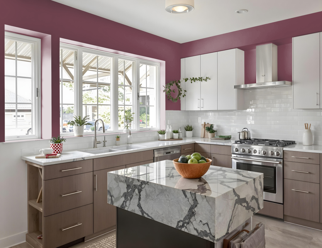
For a kitchen color scheme, Benjamin Moore's Carter Plum CW-355 adds drama and elegance as an unexpected accent. Its rich tone works well for detailing areas like a kitchen island or an accent wall, defining spaces and contributing to an inventive interior design.
Pair this deep hue with tones that bring balance and vibrancy to the space. Complementary shades with a green tint, along with lighter or darker variations within the family and neutral options, can soften the intensity while preserving a dynamic and inviting atmosphere.
Living Room
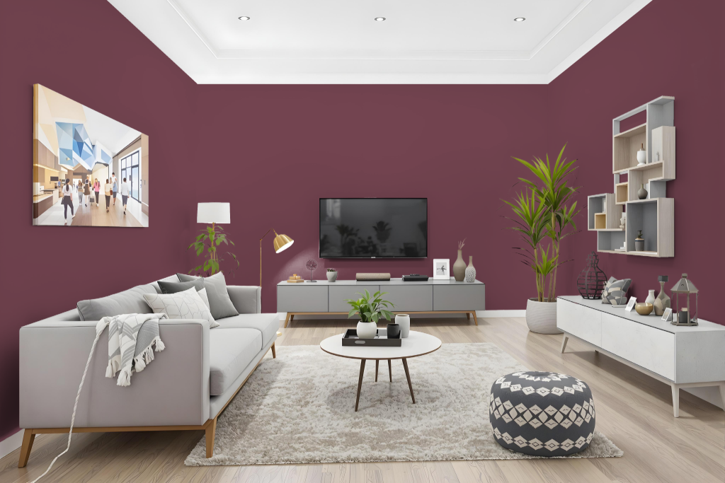
Benjamin Moore's Carter Plum CW-355 is an exceptional living room color that sets a warm and inviting atmosphere with its deep, rich tone. With a low light reflectance value, this dark shade adds an element of sophistication to spaces, creating a cozy ambiance that is ideal for gathering areas.
The hue pairs beautifully with complementary green tones and balanced neutral shades, enabling homeowners to craft a coordinated and refined interior design. Its robust finish is engineered to endure everyday wear and tear, making it a reliable option for maintaining a polished look over time.
Outdoor
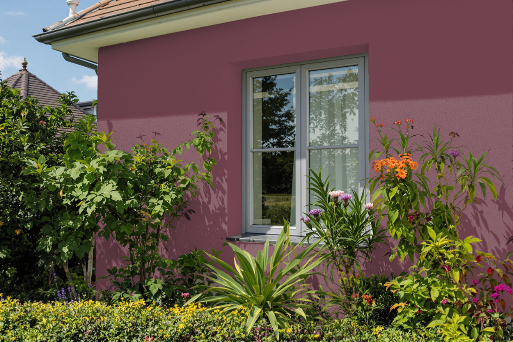
Home outdoor color Benjamin Moore Carter Plum CW-355 is intended for interior use, with its range of finishes primarily designed for indoor environments rather than exterior applications. The paint is formulated for interior aesthetics and does not provide the necessary durability to withstand sun exposure and varied weather conditions on home exteriors.
For outdoor projects, it is advisable to opt for a product specifically developed for exterior surfaces, ensuring superior protection against the elements. While a sample may help envision how the hue might complement outdoor settings, it should not be used as a final finish for exterior applications.