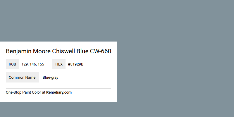
Benjamin Moore's Chiswell Blue CW-660 is a sophisticated hue that seamlessly blends elements of blue and gray, creating an elegant and calming atmosphere. The RGB values of 129, 146, 155 reflect a balanced mixture of these tones, making it an ideal choice for contemporary and classic interiors alike. This versatile color can enhance any room with its tranquil and adaptable nature, offering a subtle yet refined aesthetic.
Color Description
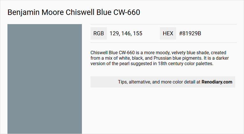
Chiswell Blue CW-660 is a more moody, velvety blue shade, created from a mix of white, black, and Prussian blue pigments. It is a darker version of the pearl suggested in 18th century color palettes.
Undertones
The color has undertones of black and white, which contribute to its moody and rich appearance, while the Prussian blue pigment gives it a deep, blue hue.
Color Values
The hex code for Chiswell Blue CW-660 is #81929b, indicating a medium to dark blue shade.
Usage
This color complements well with neutral tones such as warm beige and crisp white, creating a balanced and timeless color palette. It is suitable for both traditional and modern looks, depending on the accompanying colors and decor.
Atmosphere
Chiswell Blue CW-660 creates a sophisticated and elegant atmosphere, suitable for rooms where a moody, yet refined ambiance is desired. The velvety texture of the paint adds to the luxurious feel of the space.
Benjamin Moore Chiswell Blue CW-660 Color Alternative
Benjamin Moore Chiswell Blue CW-660 offers a strikingly balanced tone that appeals to fans of classic yet contemporary hues. Its color alternatives, Dulux Denim Drift 87BG 27/077, Dulux Smoke Grey 90BG 30/073, and Farrow and Ball Selvedge 306, each capture distinctive aspects of this refined look, providing varied options for different design preferences. Selecting one of these alternatives allows designers and homeowners to maintain the sophisticated essence of Benjamin Moore Chiswell Blue CW-660 while exploring fresh perspectives in interior color palettes.
Bathroom
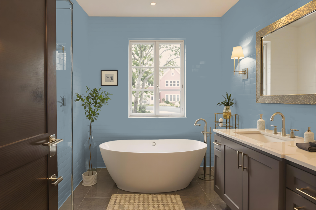
For a bathroom, Benjamin Moore’s Chiswell Blue offers a striking option with a broad range of luxury paint finishes suited for high-humidity environments. Specially formulated options provide a matte finish that resists fading and color rub-off, while finishes like pearl or satin help create a smooth, easy-to-clean surface ideal for moisture-prone and high-traffic areas.
Before finalizing your choice, testing a sample applied in an eggshell finish over a small area is recommended to assess its appearance under varying lighting conditions. To complete the design, coordinating the blue with neutral shades such as Parish White, White Dove, or Bracken Cream can establish a balanced and harmonious bathroom color scheme.
Bedroom
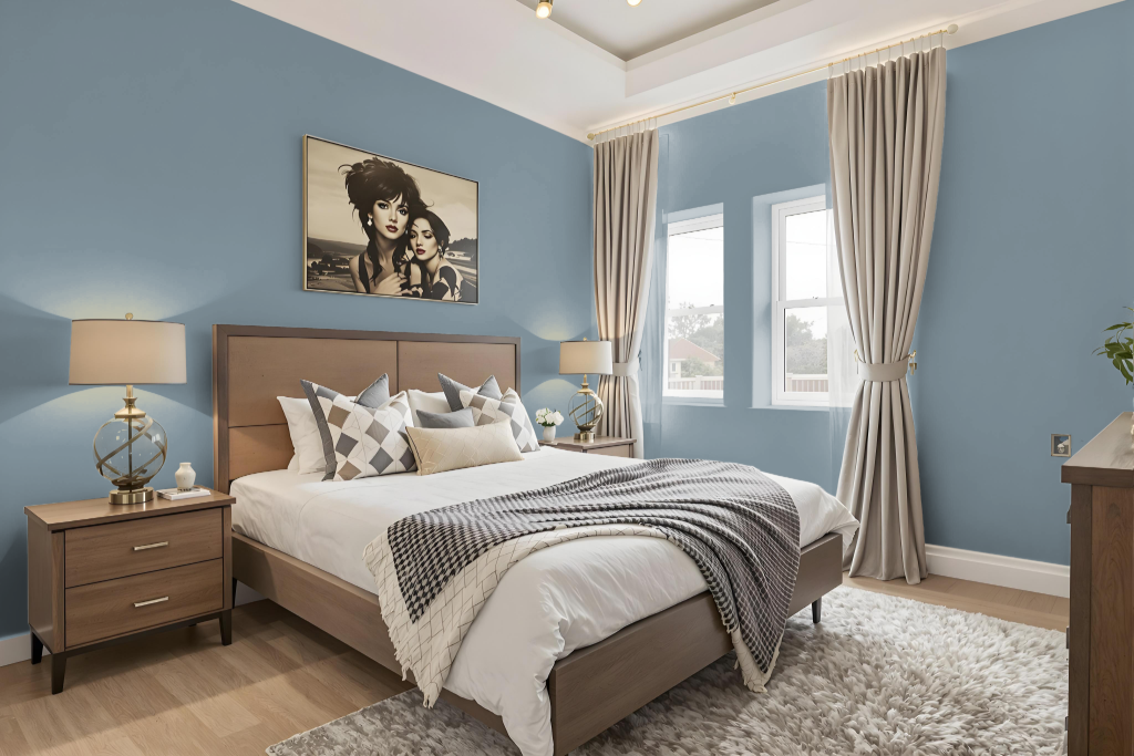
For a bedroom color scheme, Chiswell Blue sets a calming yet energizing foundation when paired with light and neutral tones such as Parish White, White Dove, and Bracken Cream. Its deep, soothing hue is further accentuated by contemporary touches like charcoal gray or metallic silver, complemented by natural elements including wood and wicker that enhance the serene atmosphere.
Additional light shades can be layered in to develop a monochromatic feel, while integrating complementary accents like Quietly Violet introduces a dynamic visual interest. This thoughtfully curated mix of colors and materials creates a cohesive, inviting space that balances modern flair with classic charm.
Kitchen
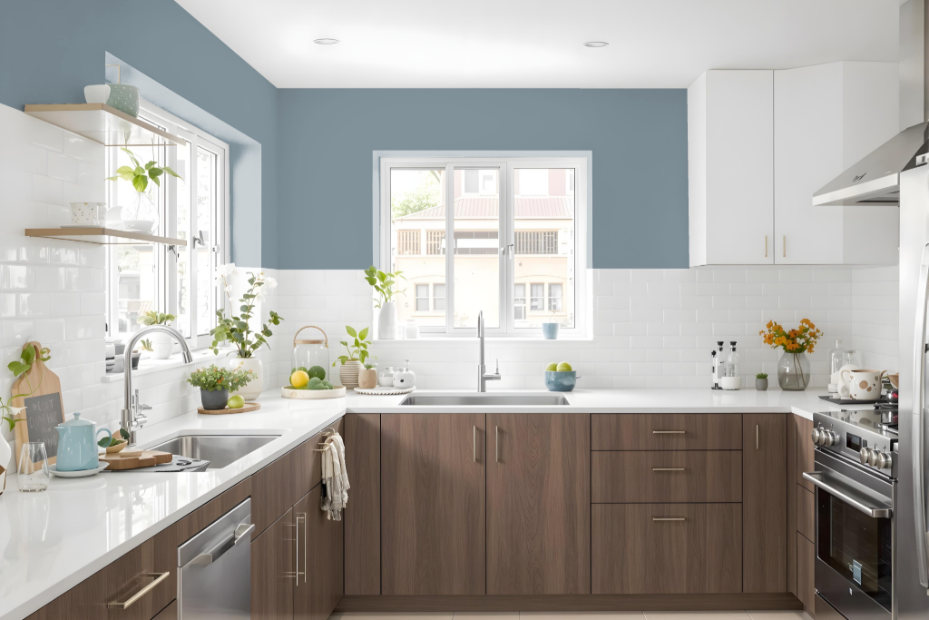
Benjamin Moore's Chiswell Blue CW-660 sets a bold foundation for a kitchen, creating a cool, sophisticated backdrop that transforms the space. Balanced with warm neutrals for trim and ceilings, this deep blue is complemented by subtle accents in soft creams and lighter tones throughout adjacent areas.
Utilizing a pearl or satin finish ensures an easy-to-clean, smooth surface in this high-traffic area. Integrating natural elements like wood and wicker further enriches the environment, adding depth and a welcoming warmth to the overall design.
Living Room
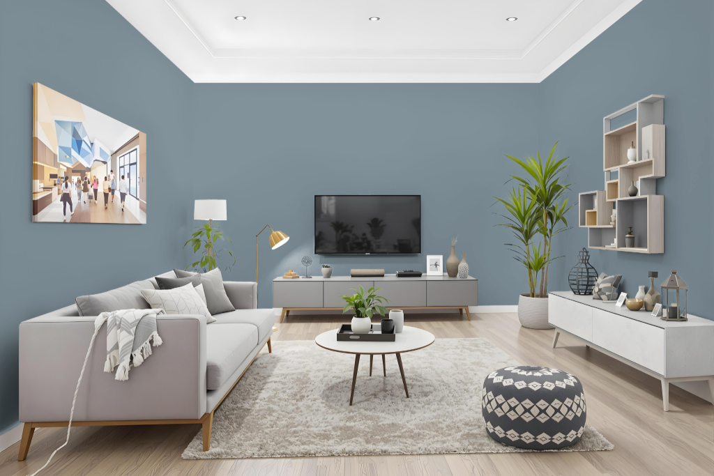
Benjamin Moore's Chiswell Blue CW-660 brings a refreshing balance to living rooms when paired with warm beige and crisp white accents, creating an inviting and timeless atmosphere. Drawing inspiration from Colonial America, this hue sets the stage for an interior that channels both heritage and understated sophistication.
Enhancing the modern appeal of the space, it pairs beautifully with charcoal gray accents or subtle touches of metallic silver for added depth and contrast. The color also harmonizes with natural materials like wood or wicker, while finishes such as eggshell, pearl, or satin offer the perfect blend of style and practicality.
Outdoor
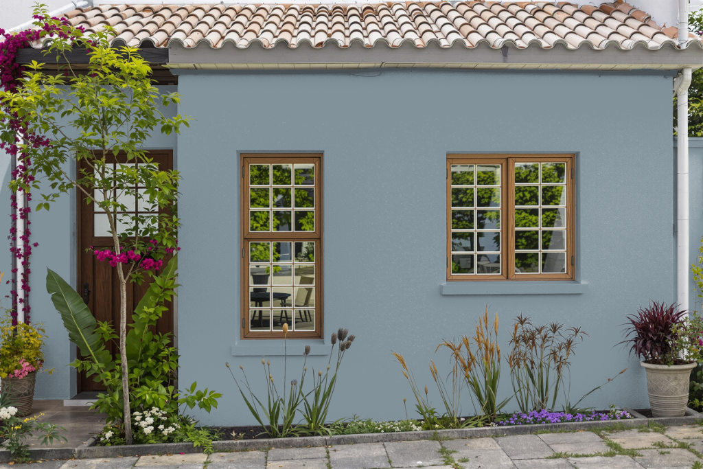
For home outdoor color, Benjamin Moore's Chiswell Blue is a stylish option for evaluating exterior color schemes even though it was primarily designed for interior use. Its hue offers a refreshing accent that can inspire a complete home's aesthetic when experimenting with color.
When considering Chiswell Blue for actual outdoor applications, it's important to assess the durability and weather resistance of the paint formulation. To ensure long-lasting performance under harsh conditions, exploring dedicated exterior paint lines, which incorporate high-performance resins and advanced colorants, is recommended for optimal protection and longevity.