Benjamin Moore Galt Blue CW-560 is a versatile color that evokes a sense of calm and tranquility, resembling the soothing hues of gentle sea waves. With its RGB composition of 190, 214, 205, it captures a delicate balance between blue and green, making it an ideal choice for creating serene interior spaces. Often referred to as Seafoam Green, this shade adds a refreshing touch to any room, enhancing its ambiance with an understated elegance.
Color Description
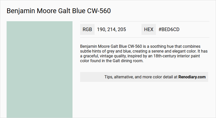
Benjamin Moore Galt Blue CW-560 is a soothing hue that combines subtle hints of grey and blue, creating a serene and elegant color. It has a graceful, vintage quality, inspired by an 18th-century interior paint color found in the Galt dining room.
Undertones
The undertone of Galt Blue CW-560 can be accurately described as a green hue. This is evident from the color space analysis, which isolates the pure hue and eliminates any tints, tones, and shades.
Color Values
- HEX value: #BED6CD
- RGB code: 190, 214, 205
- LRV (Light Reflectance Value): 64.02
Usage
Galt Blue CW-560 is ideal for creating a peaceful atmosphere in bedrooms and bathrooms. It is versatile and can be used in various spaces to evoke a sense of calm and tranquility.
Atmosphere
This color creates a serene and tranquil atmosphere, making it perfect for relaxation and rejuvenation. It adds a touch of understated elegance to any room, transforming it into a stylish oasis of calm and sophistication.
Benjamin Moore Galt Blue CW-560 Color Alternative
Benjamin Moore Galt Blue CW-560 has a number of color alternatives that provide unique yet complementary aesthetics. Dulux Mint Macaroon 90GG 64/088 and Little Greene Brighton 203 offer vibrant choices that echo the appeal of Benjamin Moore Galt Blue CW-560 while introducing slight nuances in tone. Furthermore, Little Greene Aquamarine - Mid 284 serves as an intriguing option for those who admire subtle depth and balance in their color schemes.
Bathroom
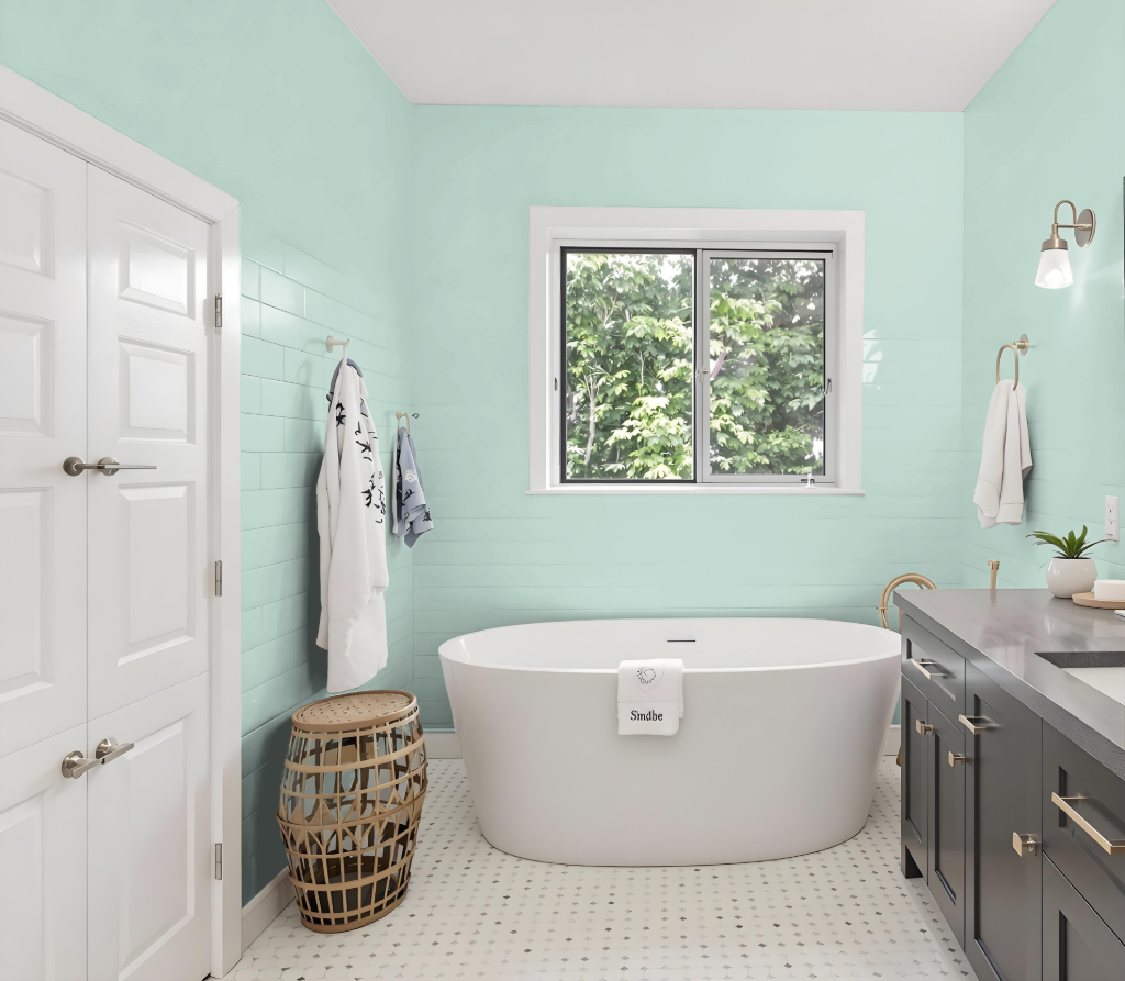
Benjamin Moore Galt Blue CW-560 is an excellent bathroom color, renowned for its calming ambiance and soothing effect. Inspired by an 18th-century interior paint from the Galt dining room, this hue brings a graceful, vintage quality that creates a peaceful atmosphere ideal for a space centered around relaxation.
Its high light-reflective quality keeps the room bright and airy, setting the perfect backdrop for detailed design. Coordinating tones like Harwood Putty, Steam, and Etiquette further enhance the elegant look, adding depth and cohesion to the overall aesthetic.
Bedroom
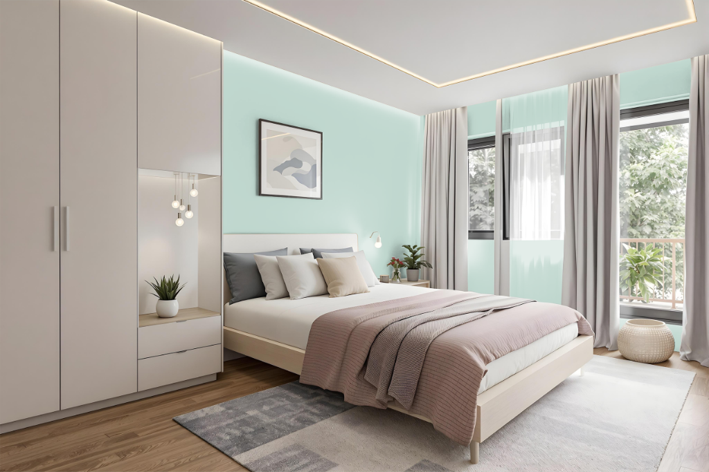
In the bedroom, Benjamin Moore's Galt Blue CW-560 sets a sophisticated tone inspired by an 18th century dining room aesthetic. This refined hue lends a historic charm while offering a fresh, modern appeal that harmonizes effortlessly with other coordinating colors.
Enhanced with innovative technology for smooth application, this classic blue complements a palette featuring calming neutrals and gentle contrasts. Its adaptable quality makes it an excellent choice for creating a cohesive and serene retreat.
Kitchen
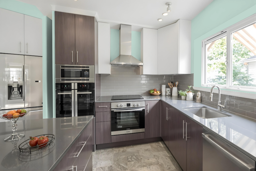
For a kitchen color scheme, Benjamin Moore Galt Blue CW-560 offers an intriguing blend of nostalgic charm inspired by 18th-century interior hues, lending a distinct vintage appeal to the space. Its inclusion in the Williamsburg Paint Color Collection highlights historical influences, creating a sense of elegance and character that can redefine the atmosphere of a modern kitchen.
When integrating this rich hue into a kitchen setting, careful thought is needed regarding its interaction with cabinetry, countertops, and appliances. Its green undertones and deeper value make it well-suited as an accent, perfect for highlighting areas like a kitchen island or a feature wall, especially when paired with complementary hues such as Harwood Putty, Steam, and Etiquette to achieve a balanced and harmonious look.
Living Room
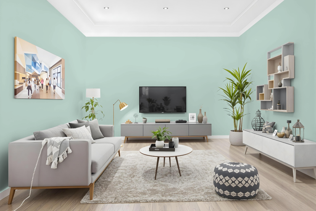
Benjamin Moore Galt Blue CW-560 is an excellent choice for living areas, offering a calming and sophisticated presence that embodies a vintage charm rooted in an 18th‐century interior aesthetic. Its balanced brightness makes it particularly suited for rooms where a graceful yet modern feel is desired.
This refined color pairs beautifully with other shades such as Harwood Putty, Steam, Etiquette, and Williamsburg Wythe Blue to create a harmonious and elegant atmosphere. The history behind the shade and its curated complementary colors ensure a distinctive and evocative environment.
Outdoor
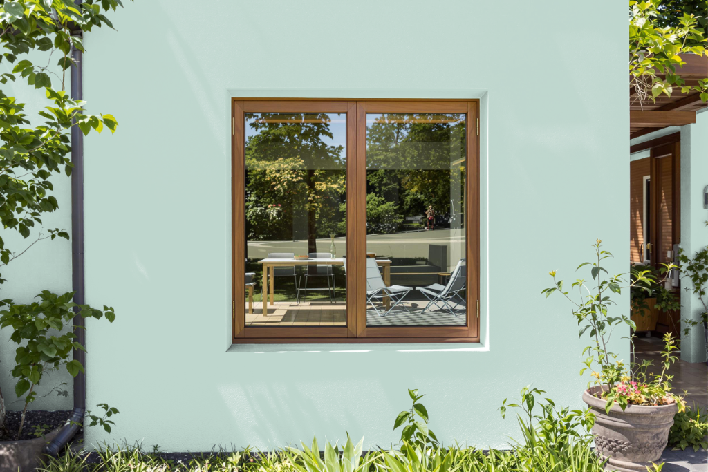
Home outdoor color Benjamin Moore Galt Blue creates a serene and elegant accent, ideal for enhancing exterior spaces when applied with an exterior-specific formulation. Its soothing and calming character, appreciated in indoor contexts, can extend to outdoor areas if weather-resistant products are used.
When considering this hue for an outdoor setting, it is important to address its performance under changing lighting conditions, as its reflective properties may influence its appearance. Selecting a formulation designed for exterior use will help maintain the color's enduring beauty while providing the necessary weather resistance.