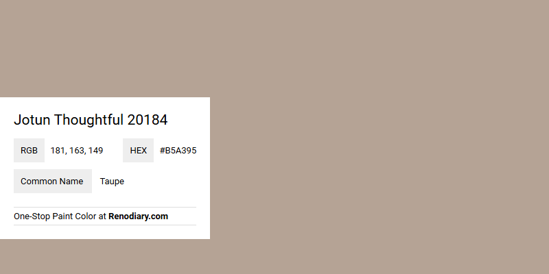
Jotun's color, Thoughtful 20184, is a soft and neutral taupe with an RGB composition of 181, 163, 149. This shade of taupe exudes a warm and inviting ambience, making it an ideal choice for creating cozy and sophisticated interiors. Its understated elegance seamlessly complements both modern and traditional decor styles, effortlessly enhancing the overall aesthetic appeal of any space.
Color Description
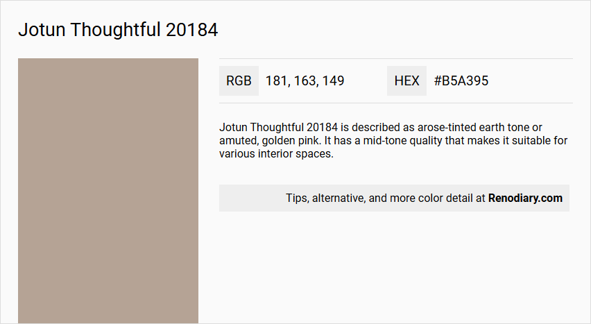
Jotun Thoughtful 20184 is described as a rose-tinted earth tone or a muted, golden pink. It has a mid-tone quality that makes it suitable for various interior spaces.
Undertones
The undertone of Jotun Thoughtful 20184 is a red hue, which is evident from its color space and NCS Code: 3408-Y54R.
Color Values
- HEX value: #B5A395
- RGB code: 181, 163, 149
Usage
This color is versatile and can be used in bedrooms, living rooms, and creative spaces. It is also suitable for painting furniture, storages, dressers, hallways, stairs, and ceilings.
Atmosphere
Jotun Thoughtful 20184 creates a caring and calming atmosphere. It offers a cheerful and inviting ambiance, making spaces feel cozy and vibrant.
Jotun Thoughtful 20184 Color Alternative
Jotun Thoughtful 20184 presents a refined and versatile option that enhances both modern and traditional settings. For those considering alternatives, Tikkurila Tamarix K480 and Tikkurila Granulite K484 offer closely matched tones that maintain a similar level of sophistication and character. Additionally, Dulux Arcadia House 50YY 43/103 stands as a compelling choice for anyone seeking a unique twist while still capturing the essence of Jotun Thoughtful 20184.
Bathroom
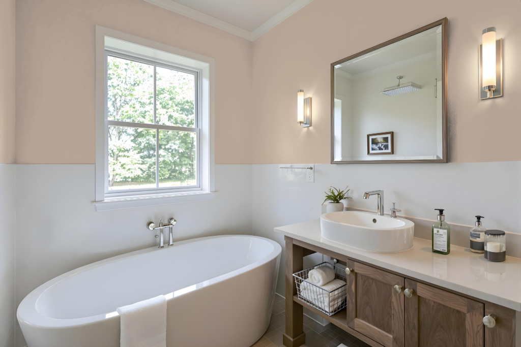
For a bathroom, Jotun Thoughtful 20184 creates a unique, inviting space with its warm, red-tinged hue. It inherently offers a cozy ambience that benefits from careful pairing with complementary colors like green and blue for a dynamic, eye-catching effect.
In addition to the balanced color pairing, using a monochromatic scheme with variations of the same tone helps maintain cohesion while accent decor brings depth and character. Incorporating mixed metal fixtures further softens the overall look, resulting in a harmonious and thoughtfully designed bathroom space.
Bedroom
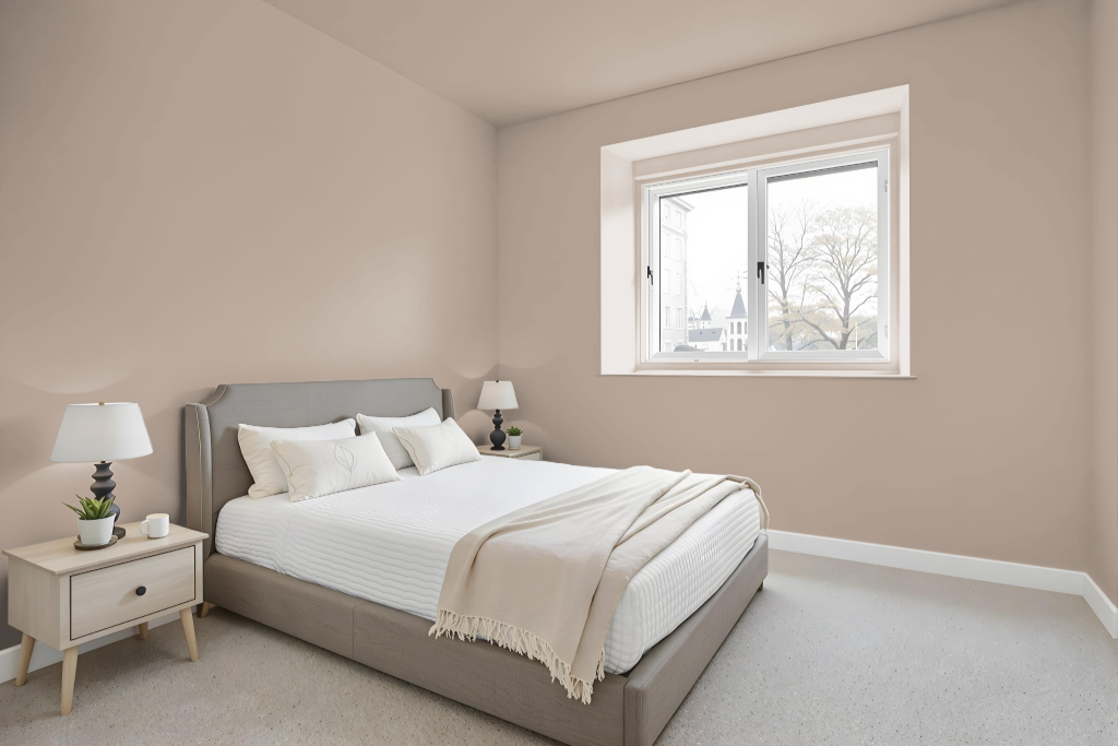
For a bedroom color scheme, Jotun's "Thoughtful" is a calming choice that brings a sense of tranquility and comfort to the space. Its gentle tone creates an atmosphere conducive to relaxation and promotes a peaceful ambiance ideal for unwinding after a long day.
Paired with neutral furnishings and soft textiles, this color enhances the room’s serene environment while harmonizing with earthy accents from natural materials like wood and linen. The result is a cozy setting that fosters restful sleep and a welcoming retreat from the everyday hustle.
Kitchen
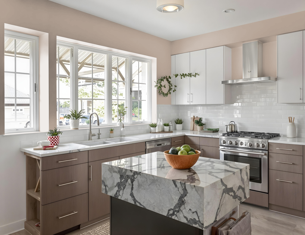
For a kitchen color scheme, Jotun Thoughtful 20184 provides a calming, modern touch. In a monochromatic design scheme, using various shades and tones can create a cohesive look, while accent decor helps to break up any monotony.
Pairing Thoughtful with colors that carry a green hue produces a vibrant, dynamic visual impact. When combined with complementary hues and transitions across spaces like a living room that connects to the kitchen and dining area, the result is a warm atmosphere that remains both subtle and inviting.
Living Room
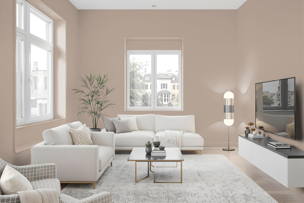
Jotun Thoughtful 20184 is an inviting paint color that brings warmth and sophistication to any living room. It creates an engaging ambiance whether used in a setup that explores various shades of a single hue or paired with complementary tones that introduce a striking contrast.
This color adapts to different surfaces and textures, offering a finishing touch that reflects the unique character of each space. With the option of applying a specialized topcoat designed for high humidity, it is well-suited for areas where moisture resistance is needed.
Outdoor
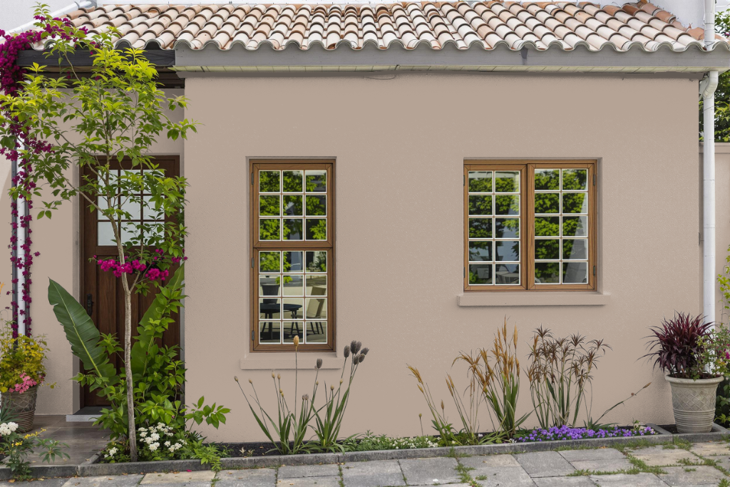
For home outdoor color use, Jotun Thoughtful 20184 offers an elegant option that can enhance exterior spaces when applied with care. Originally designed for interior settings, its effectiveness on exterior surfaces is influenced by several factors, including the substrate, finish, and ambient lighting conditions.
When considering this hue for outdoor applications, it is essential to evaluate the durability and weather resistance required for long-lasting performance. Checking compatibility with available exterior formulations and understanding how environmental conditions might alter its appearance are key steps to achieving a satisfactory finish.