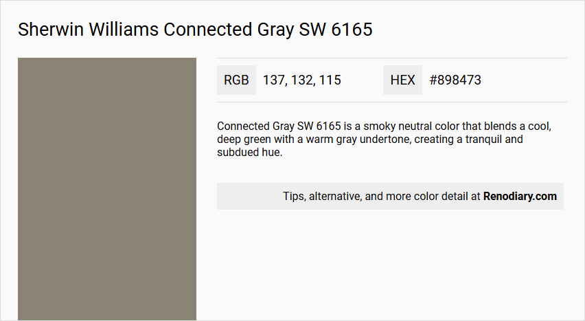
Sherwin Williams Connected Gray SW 6165 is a sophisticated hue that elegantly blends elements of gray and beige, often identified as taupe. With an RGB composition of (137,132,115), it exhibits a harmonious balance that can add warmth and versatility to interior spaces. Its neutral undertone makes it a popular choice for creating a calm and cohesive ambiance in both modern and traditional settings.
Color Description
Connected Gray SW 6165 is a smoky neutral color that blends a cool, deep green with a warm gray undertone, creating a tranquil and subdued hue.
Undertones
The color has a mix of cool deep green and warm gray undertones, giving it a versatile and balanced appearance.
Color Values
- Red: 138
- Green: 136
- Blue: 118
Usage
This color pairs well with most other colors, making it suitable for various interior design schemes. It can be used for walls, trim, and accents to create a cohesive and harmonious look.
Atmosphere
Connected Gray SW 6165 contributes to a calm and serene atmosphere, making it ideal for spaces where a peaceful and balanced ambiance is desired.
Sherwin Williams Connected Gray SW 6165 Color Alternative
Sherwin Williams Connected Gray SW 6165 is a refined neutral shade that sets a balanced backdrop in both modern and traditional spaces. For those looking for alternatives, options such as Dulux Urban Walk 40YY 25/074, Farrow and Ball Treron 292, and Sherwin Williams Mountain Road SW 7743 provide subtle variations that maintain an air of sophistication. Each of these colors, while distinct, complements the timeless nature of Sherwin Williams Connected Gray SW 6165, ensuring a versatile palette for any design project.
Bathroom
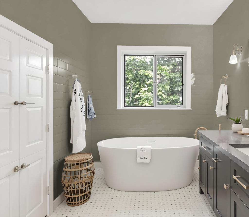
For a bathroom, Sherwin Williams Connected Gray SW 6165 creates a sophisticated foundation that blends seamlessly with a variety of design elements. Its balanced tone works beautifully when paired with complementary hues, allowing you to set a warm or clean ambiance depending on your choice of accent colors.
Enhance its character by incorporating warmer furnishings or decor in creamy shades, or opt for soft whites to evoke a light and airy feel. Additionally, coordinating with other shades from the same collection—whether lighter or darker—ensures a cohesive and stylish bathroom design that satisfies modern, relaxing, or timeless aesthetics.
Bedroom
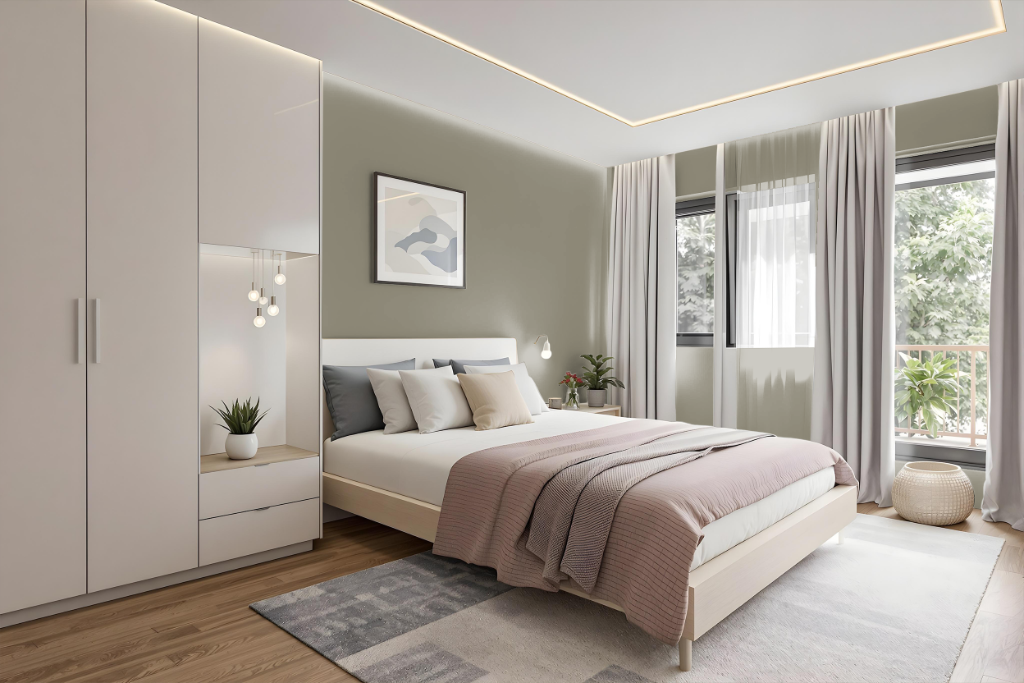
For a bedroom color scheme, Sherwin-Williams Connected Gray creates a balanced and elegant atmosphere. Pair it with soft white accents that provide a clean, airy feel and add warmth through cream tones in furniture or decor.
Layer your design with complementary approaches by choosing monochromatic shades that range from lighter nuances to deeper tones, or introduce blue accents that offer a vibrant, dynamic visual effect.
Kitchen
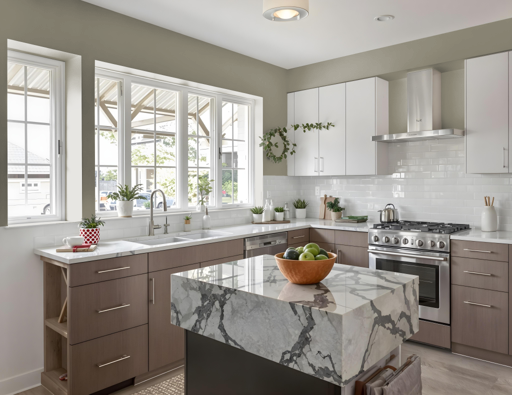
For a kitchen color scheme, Sherwin-Williams Connected Gray SW 6165 presents an elegant choice that sets a refined backdrop. Paired with soft whites like SW 7005 Pure White, the space gains a clean and airy feel, while touches of warmth from accents in SW 7012 Creamy further enhance the inviting atmosphere.
This sophisticated foundation also supports a layered monochromatic design, blending lighter tones such as SW 9593 Lauriston Stone with deeper hues like SW 9126 Honed Soapstone to create depth and interest. Alternatively, introducing complementary blues reminiscent of deep sea or twilight brings a dynamic contrast that enriches the overall visual appeal.
Living Room
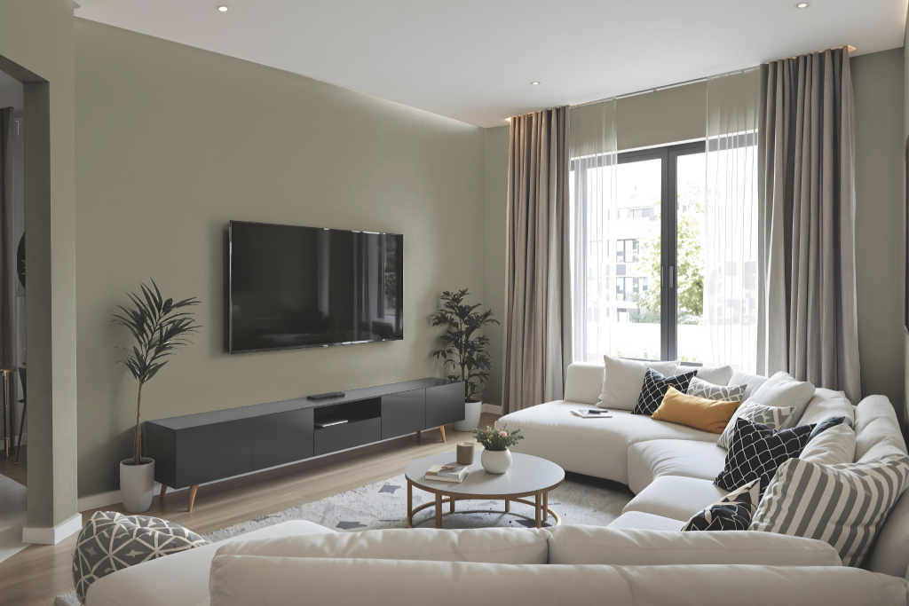
In the living room, Connected Gray sets a sophisticated backdrop that creates an inviting and refined atmosphere. Pairing it with soft white accents and warm creamy tones generates a clean, airy feel while establishing an elegant foundation for any design approach.
This neutral base harmonizes well with both lighter shades for a monochromatic appeal and darker tones for striking contrast. It also complements blue-hued accents, infusing the space with dynamic energy and balance.
Outdoor
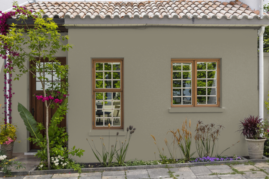
For outdoor use, Sherwin Williams Connected Gray SW 6165 is a great choice for home exteriors, offering a medium-dark appearance that minimizes light reflection to help reduce glare and heat absorption. Although it is often associated with interior spaces, its application outdoors requires careful attention to the specific characteristics of exterior surfaces.
When applying this color on your home’s exterior, ensuring that the paint withstands weather extremes is essential for long-term durability. Using a high-quality exterior formulation will help maintain the integrity of the finish, as natural light and texture variations can influence the final appearance compared to indoor applications.