Powder Blue, identified in the RAL Effect collection as RAL 190-5 and represented by the RGB values of 212, 229, and 231, is a soft, soothing hue. This gentle color evokes a sense of calmness and tranquility, making it ideal for interior design applications that aim to create a serene atmosphere. Its delicate blend of blue and subtle undertones can complement various design elements, enhancing both modern and classic aesthetics.
Color Description
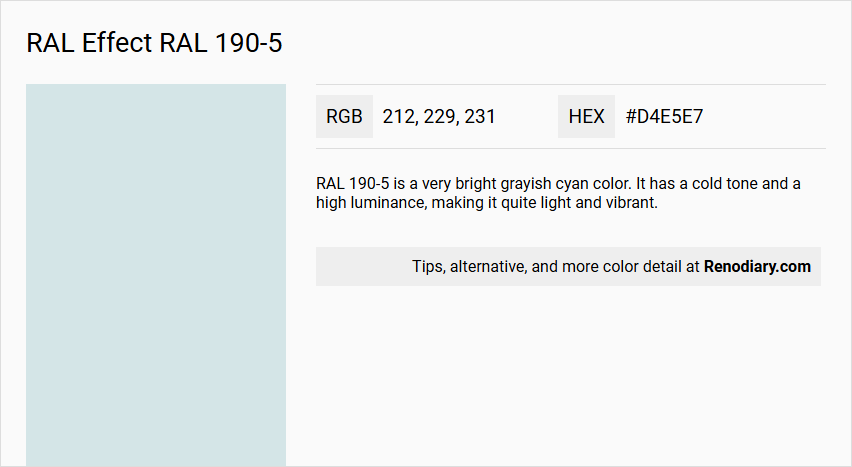
RAL 190-5 is a very bright grayish cyan color. It has a cold tone and a high luminance, making it quite light and vibrant.
Undertones
The color has a slight cyan undertone, which is evident from its hue value of around 184deg, indicating a cool and calming shade.
Color Values
- RGB: (209, 224, 225) or (214, 232, 237) depending on the source.
- HEX: #d1e0e1 or #d6e8ed.
- HSL: (183.8, 21.1%, 85.1%) or (193deg, 10%, 93%).
- HSV: (183.8, 7.1%, 88.2%).
Usage
RAL 190-5 is commonly used in design for its bright and calming properties. It can be seen in various applications such as interior design, vehicle coatings, and other industrial uses where a light, cool color is desired.
Atmosphere
The color creates a calm and serene atmosphere due to its cool and light nature. It can contribute to a sense of clarity and freshness in the spaces where it is used.
RAL Effect RAL 190-5 Color Alternative
RAL Effect RAL 190-5 is known for its distinctive appearance and versatile application in various design contexts. A range of color alternatives, including Tikkurila F362, Tikkurila G358, and Dulux Blueberry White 29BB 75/065, provide comparable vibrancy and consistency for those seeking options close to the original shade. These alternatives have been chosen for their quality and compatibility, ensuring that designers and architects can confidently integrate this color profile into contemporary and traditional projects.
Bathroom
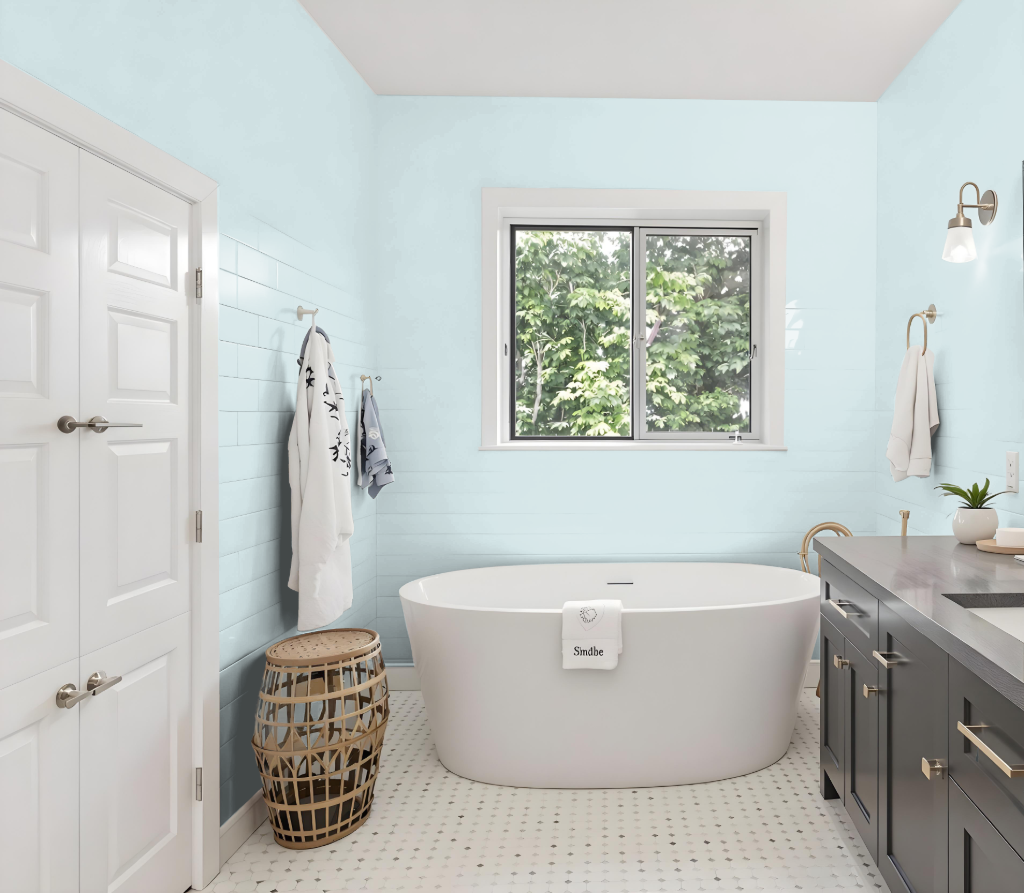
For a bathroom, RAL Effect RAL 190-5 establishes a calming aesthetic that works beautifully on walls, trims, and cabinets, harmonizing the overall look of the space. Its light-enhancing quality optimizes environments filled with natural light, making the room appear more open and inviting.
This color effortlessly complements a range of fixtures and tile selections by adding a touch of cool elegance. For accurate color representation, it is recommended to consult a physical sample instead of relying solely on digital displays.
Bedroom
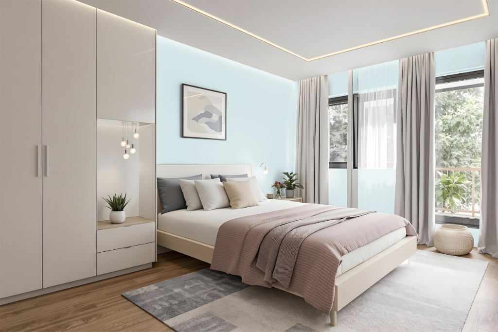
For a bedroom color scheme, RAL Effect RAL 190-5 is a calming choice that sets a serene backdrop for rest and relaxation. This hue works well when paired with softer pastel tones or deeper shades, creating a balanced, soothing atmosphere that elevates the overall design.
Rooted in an extensive color system, this shade can serve as a primary wall finish or as a subtle accent to add sophistication and elegance. When combined with natural materials and minimalist decor, it enhances the sense of tranquility, transforming the room into a peaceful retreat.
Kitchen
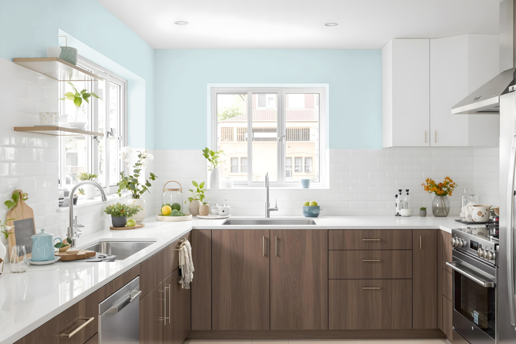
For a kitchen color scheme that embodies calmness, RAL 190-5 offers a serene backdrop for design elements. It pairs elegantly with backsplashes featuring materials like white or light-gray granite, marble, or ceramic tiles to create a harmonious and clean look, while neutral-toned countertops in beige, cream, or light wood amplify the cool ambiance.
Combining this soft hue with metallic-finished hardware enhances the modern, sleek accents throughout the space. The understated tone supports a range of kitchen styles—from contemporary to traditional—and helps create an airy feel, especially when complemented by ample natural light or strategically placed lighting fixtures.
Living Room
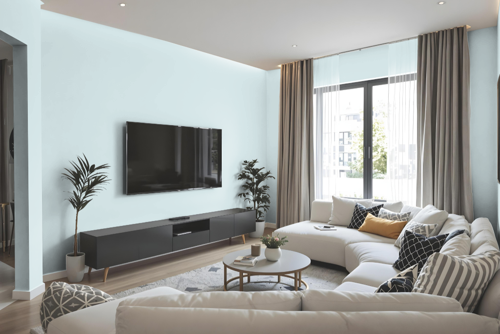
In the living room, RAL Effect RAL 190-5 creates a calm and serene atmosphere with its capacity to balance brightness and coziness. Its high light reflectance value makes it ideal for application on walls, trims, and cabinets while providing a neutral backdrop that adapts well to various furniture and décor styles.
When incorporated into a design scheme, this color pairs well with hues such as medium jungle green, liver, or dim gray to enhance its visual appeal. Its ability to be applied seamlessly in both interior and exterior settings contributes to a unified aesthetic throughout the home.
Outdoor
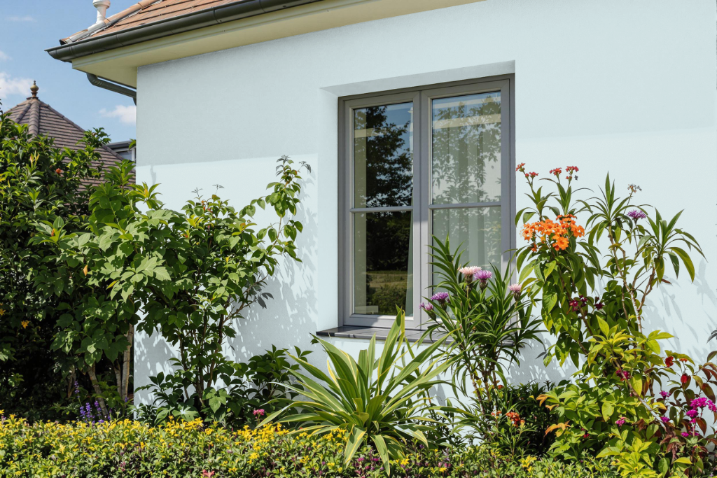
Home exteriors gain a refined finish with RAL Effect RAL 190-5, a paint designed to endure outdoor conditions while delivering lasting performance. Its formulation allows for a range of finish options, catering to different gloss levels—from a subtle full matt to a striking full gloss—ensuring a tailored appearance for each project.
Offered in various packaging formats such as aerosol cans, litre tins, and touch-up pots or pens, this paint meets diverse application needs. Enhanced with add-ons like deodorisers, UV protection, and high-resistance additives, it provides reliable coverage even in high-traffic areas when used with an appropriate primer for optimal top coat adhesion.