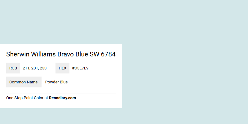
Sherwin Williams Bravo Blue SW 6784, with its RGB values of 211, 231, and 233, exudes a serene and calming atmosphere reminiscent of powder blue. This shade is ideal for creating tranquil spaces, whether in a coastal-themed living room or a peaceful bedroom retreat. Its subtle blend of blue and light gray hues makes it a versatile choice for both contemporary and traditional decor styles.
Color Description
Sherwin Williams Bravo Blue (SW 6784) is a light, pastel blue color. It is described as a hint of blue that can make a space feel light and airy, adding a touch of drama and elegance.
Undertones
The undertone of Bravo Blue is predominantly blue, with no significant other undertones noted.
Color Values
- Hex Color Code: #D3E7E9
- RGB Color Code: RGB(211, 231, 233)
- CMYK Values: 9.4%, 0.9%, 0.0%, 8.6%
Usage
Bravo Blue can be used as a statement wall color or throughout an entire room. It pairs beautifully with warm neutrals like beige and tan to create a cozy and inviting atmosphere. For a more modern look, it can be combined with crisp white accents or bold pops of gold or mustard yellow.
Atmosphere
This color adds a sense of lightness and airiness to a room, creating a clean and crisp atmosphere. It can also contribute to a cozy and inviting feel when paired with appropriate neutrals, making the space feel sophisticated and elegant.
Sherwin Williams Bravo Blue SW 6784 Color Alternative
Sherwin Williams Bravo Blue SW 6784 is celebrated for its rich, appealing hue that brings character and depth to any design project. Alternatives like Tikkurila F362, Tikkurila G358, and Dulux Blueberry White 29BB 75/065 provide comparable sophistication while offering subtle variations to cater to different design sensibilities. Each of these color choices has been carefully developed to ensure they complement modern aesthetics, allowing designers to achieve a cohesive and dynamic look.
Bathroom
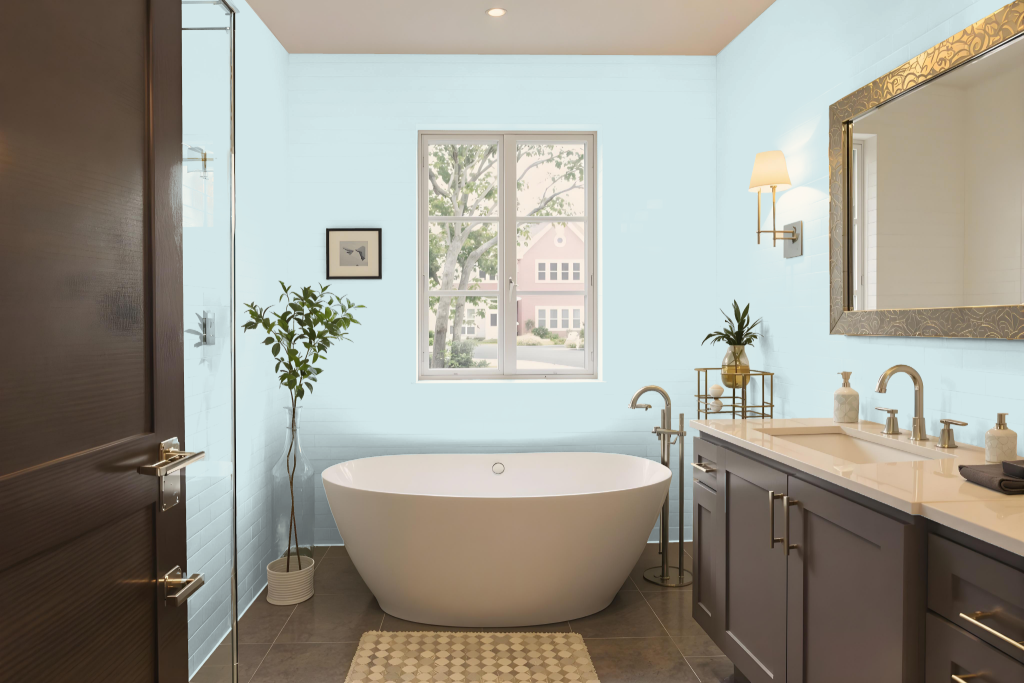
Sherwin Williams Bravo Blue SW 6784 makes an excellent choice for a bathroom color, exuding elegance whether paired with warm neutrals like beige and tan for a cozy feel or with crisp white accents and bold touches of gold and mustard yellow for a modern statement. This hue works well within a thoughtful design palette that embraces both classic and contemporary elements.
For best results in a bathroom setting, it's important to use high-quality paint products that provide durability and withstand moisture. Selecting a satin or semi-gloss finish enhances cleanability and moisture resistance, ensuring the stunning look of Bravo Blue holds up against the challenges of a humid environment.
Bedroom
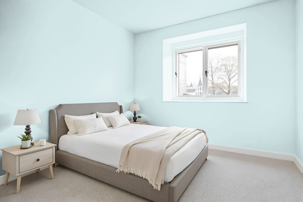
For a bedroom color scheme, Bravo Blue delivers an inviting ambiance that pairs beautifully with warm neutrals like beige and tan to create a cozy retreat. It also works strikingly with crisp white accents and bold touches of gold or mustard yellow to introduce a modern flair, and can be applied effectively as a statement wall or throughout the entire room for added depth.
This color also harmonizes seamlessly with hues in the red spectrum, such as soft mauve tones, to produce a dynamic and vibrant visual effect. By incorporating a range of its varying tones alongside complementary shades, Bravo Blue helps tailor an interior that is both engaging and full of personality.
Kitchen
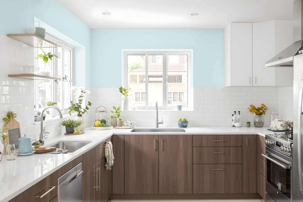
For a kitchen, Sherwin Williams Bravo Blue SW 6784 creates an appealing and bold statement when used as the primary color. It pairs harmoniously with warm neutrals such as beige and tan to evoke a cozy ambiance, while crisp white accents add a clean, modern touch. Accents in gold or mustard yellow introduce vibrant contrast and a dynamic element to the overall design.
When incorporating Bravo Blue in a kitchen, it's essential to account for natural light, as rooms with limited sunlight may not fully capture the depth of the color. Additionally, the finish of the surfaces plays a significant role in its appearance—rough walls can present a different look compared to smoother finishes like those found on cabinets.
Living Room
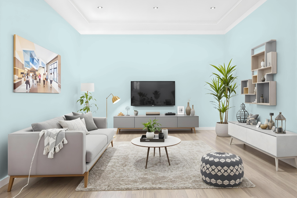
In the living room, Sherwin Williams Bravo Blue delivers a distinctive touch that fosters an inviting atmosphere when paired with warm neutrals such as beige and tan. This depth of hue enhances spaces by working harmoniously with complementary accents like crisp white or bold pops of gold and mustard yellow to create a fresh, dynamic visual experience.
Beyond the living area, Bravo Blue adapts seamlessly to dining rooms, bedrooms, kitchens, and bathrooms, allowing each space to showcase a curated ambiance. Given that the appearance of this color can vary across different materials and lighting, testing small samples ensures an ideal match for your overall decor scheme.
Outdoor
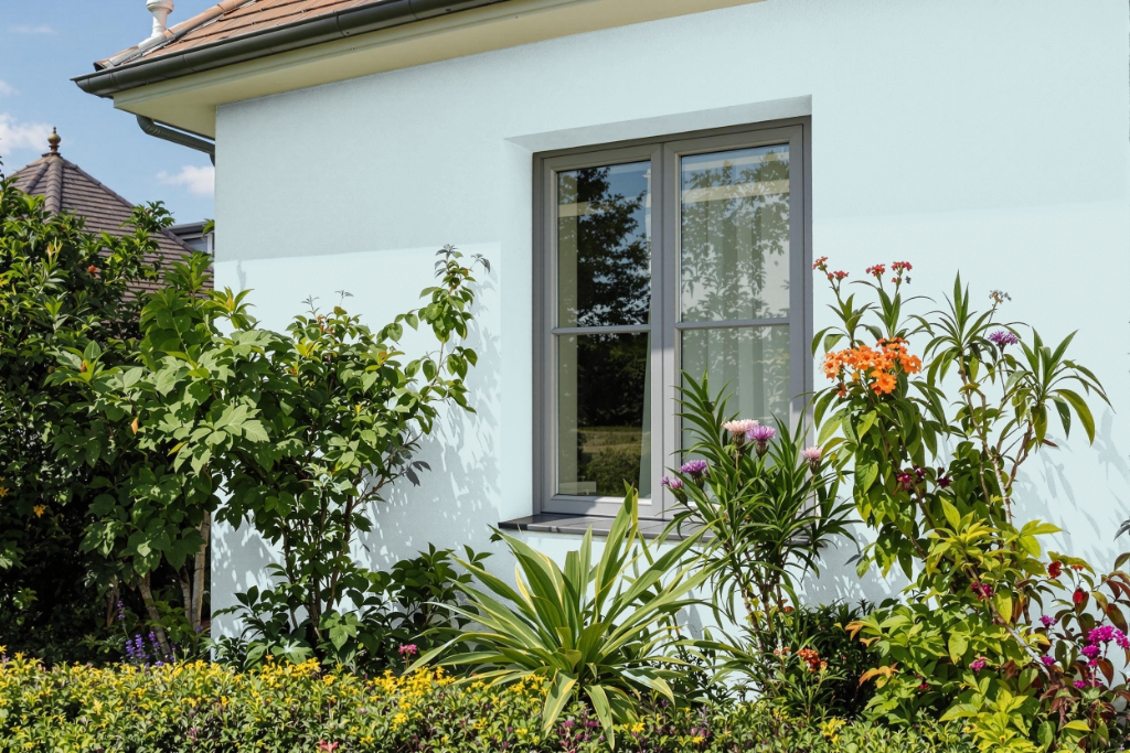
For outdoor home applications, Bravo Blue brings a soft, light tone to exterior spaces that can create a calming and airy atmosphere. While its gentle, pastel hue offers an appealing aesthetic, it may present challenges with durability and color retention when subjected to environmental elements.
To enhance its performance outdoors, it is recommended to use specialized exterior coatings that are engineered to resist fading, peeling, and blistering under sun and heat exposure. These high-performance finishes also improve moisture resistance and maintain their integrity in low-temperature conditions, ensuring that your home's exterior remains both attractive and well-protected.