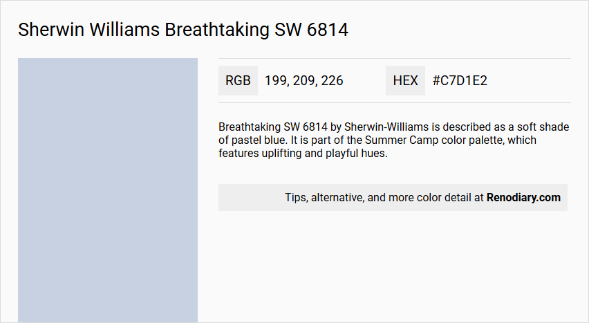
Sherwin Williams' Breathtaking SW 6814 is a serene hue, akin to the gentle, airy essence of Powder Blue, bringing a sense of calm and tranquility to any space. Its RGB composition of 199, 209, 226 contributes to its soft, muted appearance, making it an ideal choice for creating a soothing ambience in living rooms or bedrooms. Transform your interior into a peaceful retreat with this delicate shade, effortlessly complementing a variety of design styles and color palettes.
Color Description
Breathtaking SW 6814 by Sherwin-Williams is described as a soft shade of pastel blue. It is part of the Summer Camp color palette, which features uplifting and playful hues.
Undertones
The color has a calm and light quality without strong undertones, maintaining a soft blue appearance.
Color Values
- Red: 202
- Green: 208
- Blue: 228
Usage
This color is suitable for various interior and exterior paint projects. It works well in rooms with plenty of natural light, such as kitchens or bedrooms, to create a fun and fresh atmosphere. It can be used as a dominant room color or as an accent color paired with other hues from the Summer Camp palette, like Honeydew or Fresh Zest.
Atmosphere
Breathtaking SW 6814 contributes to a light, airy, and playful atmosphere, reminiscent of carefree summer days. It adds a cheerful and calming element to any room, making it ideal for creating a summery and uplifting interior design.
Sherwin Williams Breathtaking SW 6814 Color Alternative
Sherwin Williams Breathtaking SW 6814 inspires creativity with its unique and versatile essence. Color alternative selections such as Tikkurila G436, Dulux Mineral Mist 01BB 69/098, and Dulux Amethyst Showers 4 03RB 63/122 provide designers with distinctive nuances that align with modern aesthetic trends. Each offered hue maintains a dialogue with the main color, ensuring that whichever alternative is chosen, a harmonious yet innovative look is achieved.
Bathroom
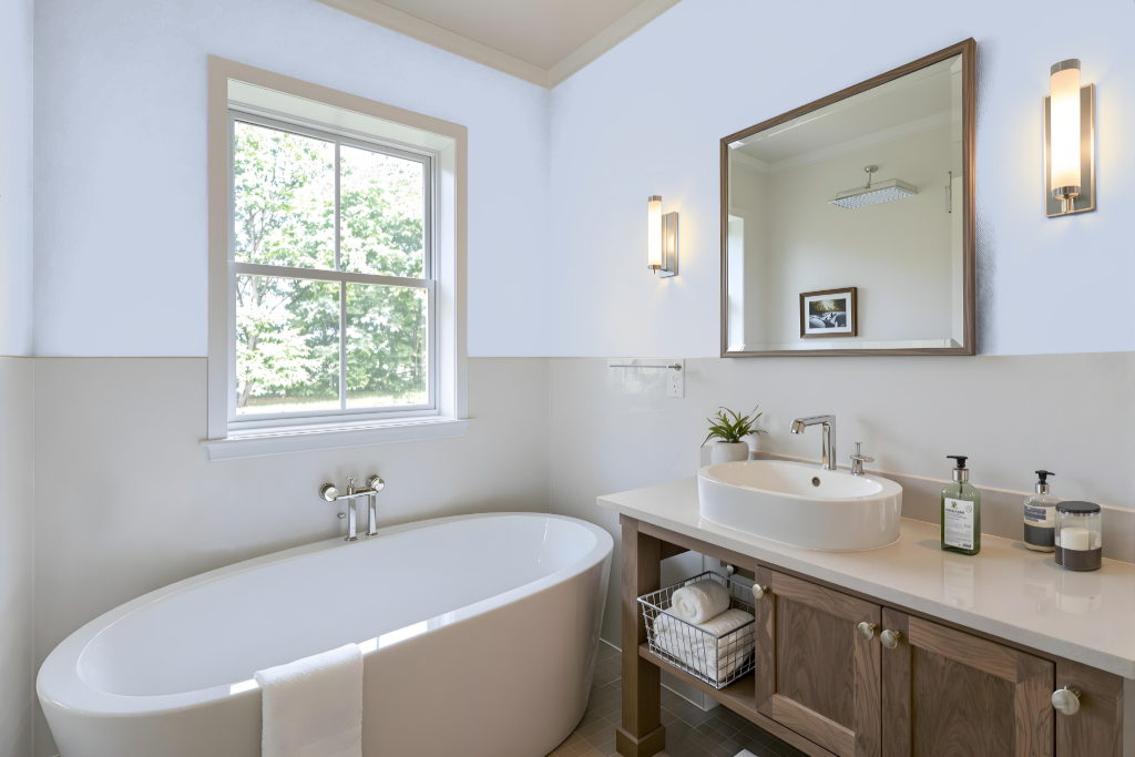
For a bathroom, Sherwin Williams Breathtaking SW 6814 creates a unique and inviting atmosphere, especially in spaces flooded with natural light. The soft and airy quality of this color elevates the overall feel, making the room appear spacious and welcoming.
To enhance its effect, consider pairing it with neutral accents like cream or taupe to maintain a calming backdrop, or introduce contrasting darker tones such as charcoal gray or navy blue for accent features. This approach not only adds depth but also brings a dynamic visual appeal to the space.
Bedroom
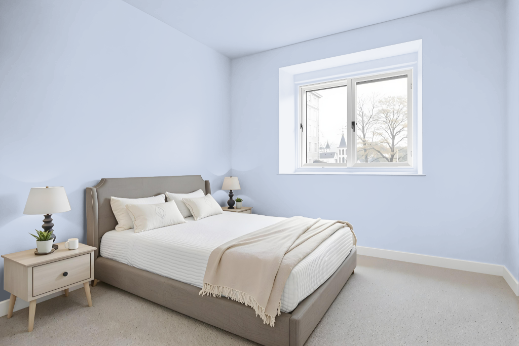
In a bedroom setting, Sherwin Williams Breathtaking SW 6814 serves as a calming foundation that sets the tone for a soothing retreat. It pairs harmoniously with neutral shades like cream and taupe to add warmth and coziness, while deeper accents such as charcoal gray or navy provide striking contrast and visual interest.
Expanding the palette further, a monochromatic approach using varying shades, tints, and tones of Breathtaking can lend subtle depth without overwhelming the space, especially when complemented by carefully selected decor touches. Alternatively, incorporating complementary hues such as orange or warm neutrals introduces an energetic dynamic that enhances the overall ambiance.
Kitchen
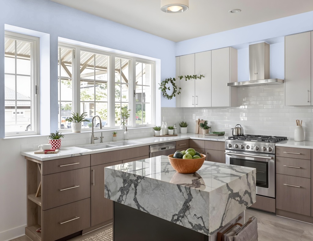
For a kitchen color scheme, Sherwin Williams Breathtaking SW 6814 sets a fresh tone that enhances the space with its light and airy appearance. It harmonizes beautifully with neutral accents such as cream and taupe, creating a warm, welcoming environment, while bold contrasts with charcoal gray or navy blue add contemporary interest.
In addition, this color complements softer pastels from the Summer Camp palette, offering playful touches when paired with shades like Fresh Zest or Aleutian. To achieve a balanced look, it is best showcased in rooms with ample natural light, allowing its luminous quality to shine through and elevate the overall design.
Living Room
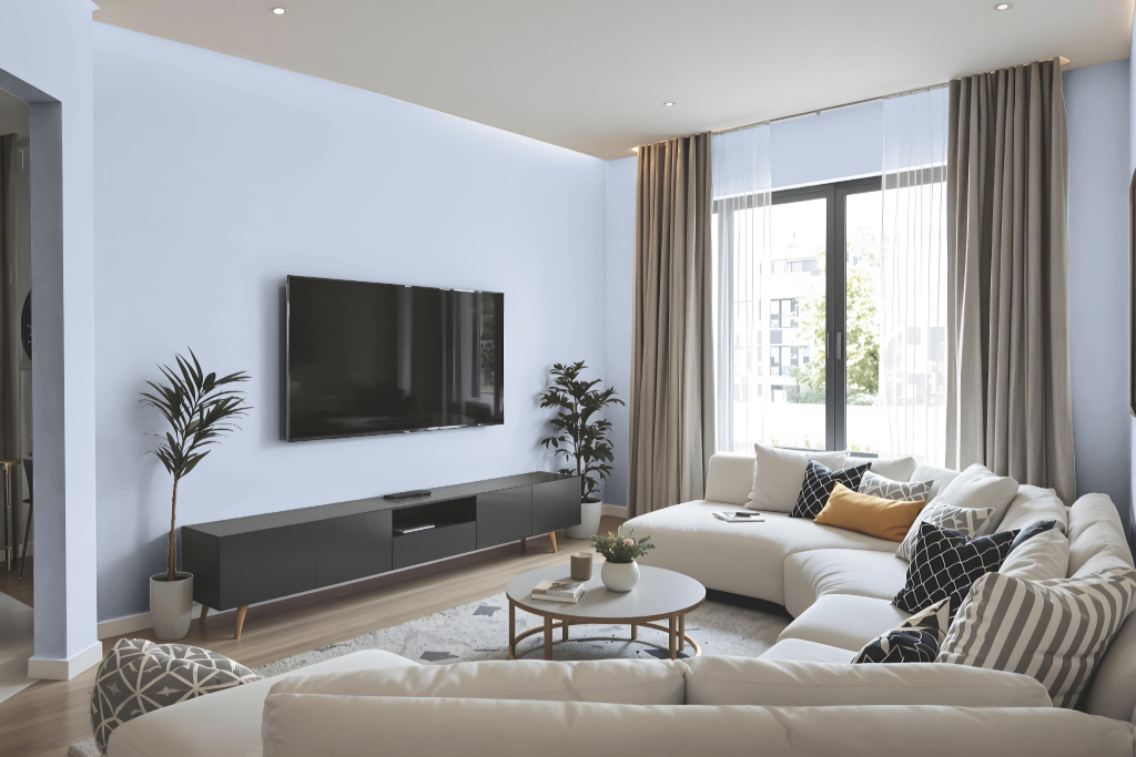
Sherwin Williams Breathtaking SW 6814 is a warm and inviting hue perfect for living rooms, creating an atmosphere that feels both welcoming and refined. It pairs effortlessly with neutral tones like cream and taupe while offering a contemporary twist when combined with darker accents such as charcoal gray or navy blue.
Beyond its appeal in living areas, this color works beautifully in spaces such as dining rooms and bedrooms, lending balance and sophistication to a variety of environments. It can be applied across different surfaces—walls, ceilings, furniture, and cabinets—ensuring a cohesive and dynamic aesthetic that harmonizes with complementary shades for a striking visual effect.
Outdoor
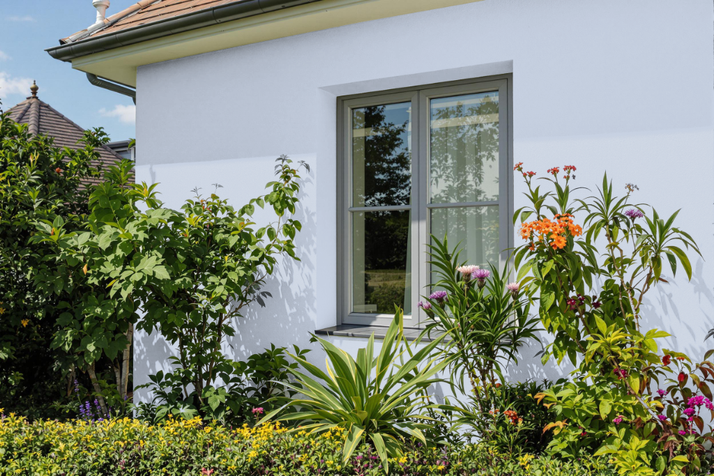
Sherwin Williams Breathtaking SW 6814 is an excellent home outdoor color known for its durability. As part of the ABC's and 123's and Living Well collections, it caters to diverse design themes and enhances curb appeal with a dynamic visual impact when paired with warm, orange-toned accents.
This color is offered in several formats, including peel-and-stick samples that allow for testing on different surfaces before committing to a full application. Its inclusion in both monochromatic and complementary design schemes underlines its ability to adapt and elevate a variety of exterior styles.