Sherwin Williams' Quench Blue SW 6785, with its RGB composition of 180, 224, and 231, envelops spaces with a serene and refreshing ambiance reminiscent of tranquil ocean waves. Its delicate hue closely resembles that of Powder Blue, offering a perfect balance of vitality and calmness suitable for both modern and traditional design settings. This versatile shade can harmoniously integrate into various color schemes, enhancing the aesthetic appeal of interiors while evoking a sense of peaceful elegance.
Color Description
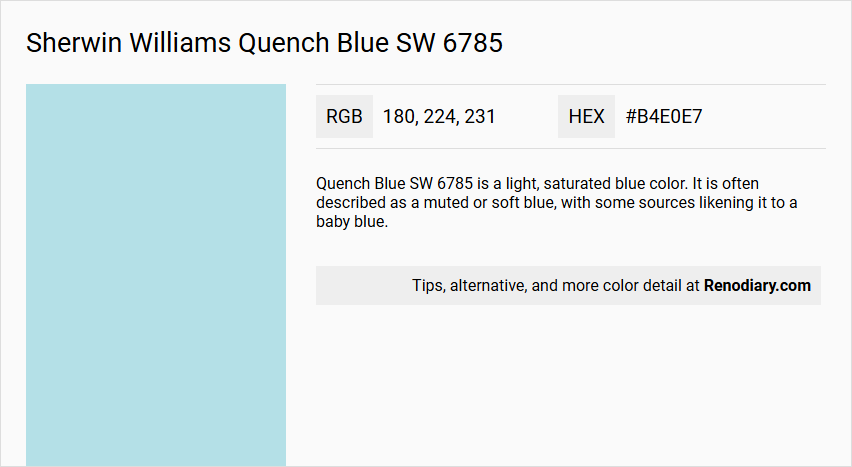
Quench Blue SW 6785 is a light, saturated blue color. It is often described as a muted or soft blue, with some sources likening it to a baby blue.
Undertones
This color has cool turquoise undertones, which contribute to its refreshing and calming appearance.
Color Values
The RGB values for Quench Blue SW 6785 are 180, 224, 231. It also has a Light Reflective Value (LRV) that indicates it is a relatively light color.
Usage
Quench Blue can be paired with midtone blues for a bold effect or used in various room settings to create a soothing atmosphere. It is versatile and can be used in different design schemes to evoke a sense of calmness.
Atmosphere
The color evokes feelings of lounging poolside under a bright morning sky, creating a serene and refreshing atmosphere. It brings a muted softness to any room, making it an easy-to-use finish that feels neither too grey nor too blue.
Sherwin Williams Quench Blue SW 6785 Color Alternative
Sherwin Williams Quench Blue SW 6785 has several impressive alternatives that bring a fresh approach to spaces requiring a balanced pop of color. Dulux Summer Medley 4, Benjamin Moore Ocean Breeze 2058-60, and Behr Basin Blue M470-2 each offer their unique charm while reflecting the vibrant energy originally conveyed by Quench Blue SW 6785. Selecting one of these alternatives guarantees a modern twist that enhances both interior and exterior design schemes.
Bathroom
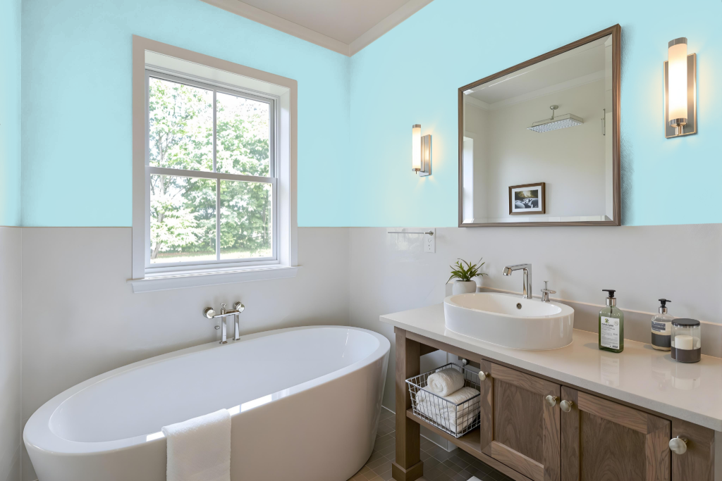
Sherwin Williams Quench Blue SW 6785 is an ideal bathroom color that creates a bright and airy ambiance by reflecting a generous amount of light. Its moderate light reflectance ensures that the space feels open and well-lit, contributing to a welcoming atmosphere.
When paired with crisp white trim and fixtures, this blue fosters a fresh and timeless aesthetic. Incorporating accents of warm taupe adds a grounding sophistication, while touches of rich charcoal gray introduce a modern and dramatic flair for a well-balanced design.
Bedroom
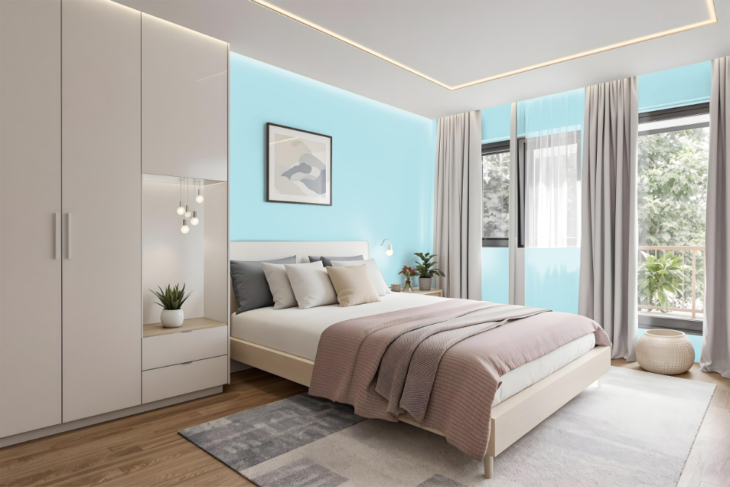
For a bedroom color scheme, Sherwin Williams Quench Blue SW 6785 serves as a calming yet bold foundation that pairs impeccably with crisp white accents for a fresh, modern feel. Incorporating warm taupe embellishments can offer a grounding sophistication, while rich charcoal gray details add a contemporary, dramatic touch that complements the inherent vibrancy of the hue.
Layering multiple shades and tones of Quench Blue itself can create depth, though additional decor elements may be needed to prevent monotony. Alternatively, introducing complementary shades with subtle red hues can yield an engaging, dynamic visual effect that enlivens the overall space.
Kitchen
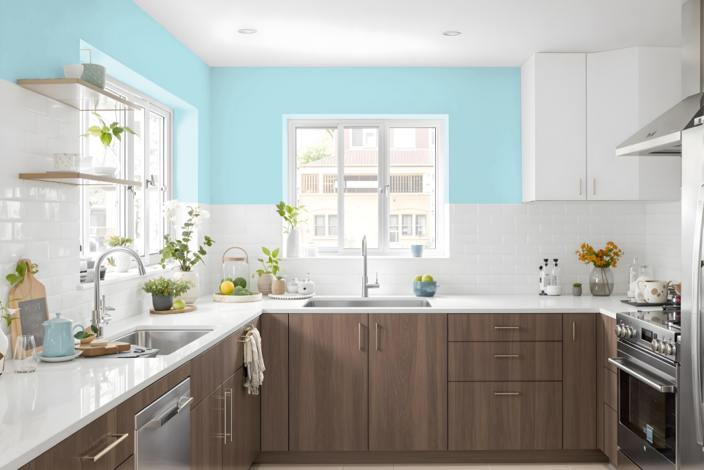
For a kitchen color scheme, Sherwin Williams Quench Blue SW 6785 sets a calm and inviting tone. It pairs gracefully with crisp white accents to create a fresh, timeless atmosphere, while warm taupe elements add grounding sophistication and hints of rich charcoal gray introduce a modern, dramatic touch.
Adding in accents with subtle red hues—such as those found in selections like Sherwin Williams Rosaline Pearl and Cracked Pepper—creates a striking interplay that balances the blue's vibrancy. This well-considered blend of shades brings together contemporary flair and classic appeal for a dynamic, visually engaging kitchen environment.
Living Room
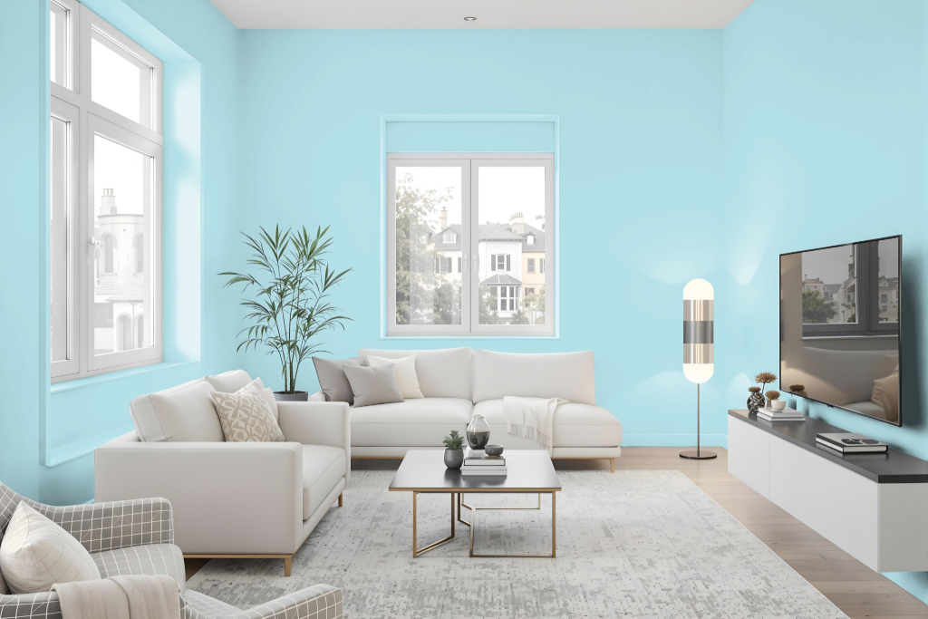
Sherwin Williams Quench Blue is an inviting living room color that brightens spaces and creates a sense of spaciousness. Its naturally light quality reflects ample illumination, making interiors feel larger and more open, while pairing with crisp white establishes a fresh and timeless aesthetic enhanced further by warm taupe accents.
For a modern twist, hints of deep charcoal gray add a dramatic and contemporary contrast that grounds the overall design. This thoughtfully curated shade from the Living Well collection is well-suited for both interior and exterior applications, offering a balanced blend of clarity and sophistication.
Outdoor
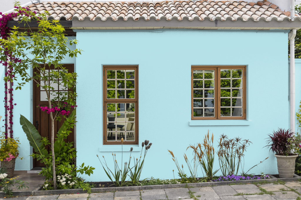
For a home outdoor color, Sherwin-Williams Quench Blue SW 6785 offers an attractive and durable option that enhances exterior walls, ceilings, and other surfaces with a fresh and timeless aesthetic. Its clean, light hue sets a strong foundation for creating dynamic visual effects when paired with complementary shades such as Rosaline Pearl and Cracked Pepper, while also providing an elegant backdrop when combined with warm taupe and rich charcoal gray.
The paint’s smooth satin finish, as showcased in Samplize samples, underlines a professional appearance that endures the elements. This quality finish and the color’s inherent charm make it an excellent choice for homeowners looking to add a distinctive yet enduring touch to outdoor spaces.