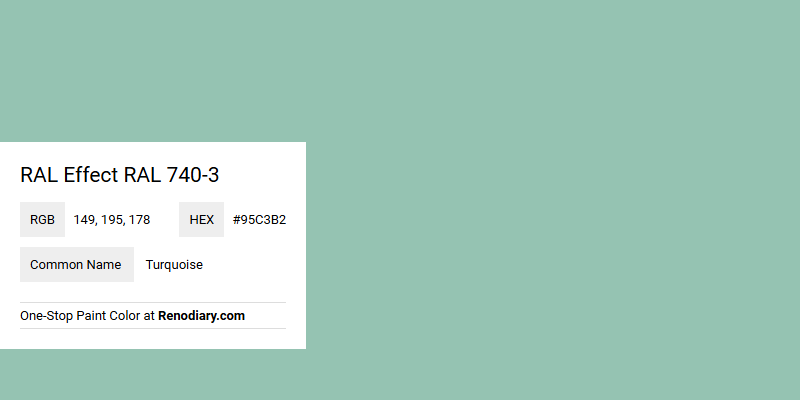
Turquoise, represented by the RAL Effect code RAL 740-3 and RGB values of 149, 195, 178, is a tranquil and soothing color that often evokes the serene qualities of tropical seas. This particular shade seamlessly blends the calming tones of both blue and green, creating an inviting and refreshing aesthetic. Ideal for spaces aiming to inspire relaxation and creativity, Turquoise can uplift any environment with its subtle vibrancy and evoke a sense of beautiful tranquility.
Color Description
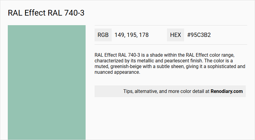
RAL Effect RAL 740-3 is a shade within the RAL Effect color range, characterized by its metallic and pearlescent finish. The color is a muted, greenish-beige with a subtle sheen, giving it a sophisticated and nuanced appearance.
Undertones
The color has undertones of green and beige, with a slight metallic sheen that adds depth and complexity to its overall appearance.
Color Values
- HEX: #95c3b2
- RGB: Approximately (149, 195, 178)
- L*ab and HLC values: These specific values are not provided in the sources, but they can be obtained from detailed color charts or official RAL color libraries.
Usage
RAL Effect RAL 740-3 is often used in design and architecture where a unique, metallic finish is desired. It can be applied to various surfaces such as car bodies, industrial products, and interior design elements to add a touch of elegance and sophistication.
Atmosphere
The color creates a calm and serene atmosphere, suitable for environments where a balanced and harmonious aesthetic is required. The metallic sheen adds a modern and sleek element, making it versatile for both contemporary and traditional settings.
RAL Effect RAL 740-3 Color Alternative
RAL Effect RAL 740-3 offers a unique visual appeal that is perfectly complemented by its color alternatives, including Dulux River Valley 50BG 44/094, Sherwin Williams Aquaverde SW 9051, and Sherwin Williams Festoon Aqua SW 0019. These alternatives provide designers with consistent quality and comparable vibrancy, ensuring that the desired aesthetic is maintained across different brands. The availability of such diverse options allows for greater flexibility in achieving specific effects while still staying true to the original RAL Effect RAL 740-3 standard.
Bathroom
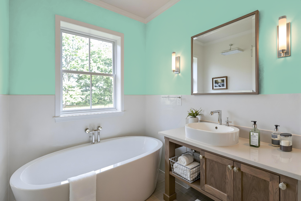
When applying RAL 740-3 to a bathroom, testing the hue in that specific setting is essential, as differences in lighting, material finish, and gloss can significantly alter its appearance from initial digital impressions. This precaution helps ensure that the final outcome reflects the intended atmosphere in your space.
Using a physical color fan or sampling the paint on a small area is a practical step before committing to the full application. Additionally, examining photos of real interiors featuring this color can offer valuable insights into how it interacts with diverse lighting and surroundings.
Bedroom
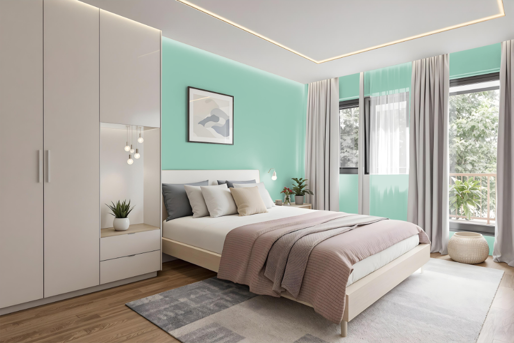
In bedroom design schemes, RAL Effect RAL 740-3 delivers a harmonious and visually appealing aesthetic. This color is part of a design-oriented collection introduced in 2007 that offers a broad range of plain hues organized into families of six coordinating shades, with each family also featuring a metallic option.
The system is distinguished by its innovative use of a water-based coating, setting new benchmarks for eco-friendly production while ensuring precise and reliable color matching. Its commitment to sustainable methods and consistent quality underscores its value in contemporary interior design applications.
Kitchen
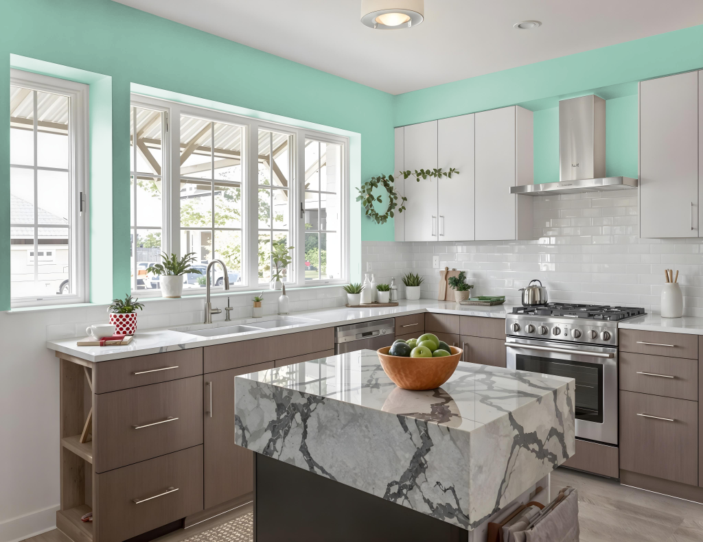
For a kitchen color scheme, RAL Effect 740-3 brings a balanced and stylish presence to modern cabinetry. It pairs seamlessly with neutral countertops, such as white or light gray, and integrates well with a variety of backsplash options—including combinations with complementary tones like dark gray, beige, or even metallic accents from the corresponding collection—to add depth and contrast.
This mid-tone hue enhances the overall design when used alongside hardware and fixtures in metallic finishes like chrome or brass, providing a pleasing counterbalance to its cool undertones. It also coordinates harmoniously with flooring selections, be it hardwood or tile with green or gray hints, resulting in a cohesive and thoughtfully curated kitchen environment.
Living Room
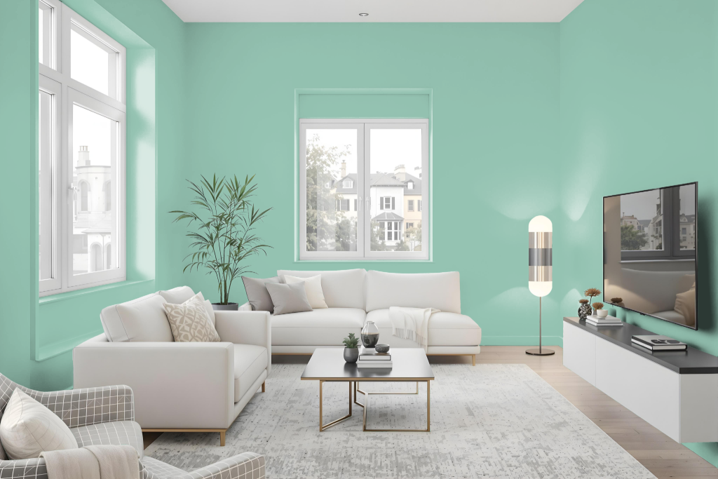
The living room color, RAL Effect RAL 740-3, adds a calming and natural touch to interior walls and trims while harmoniously complementing earthy or neutral tones in furniture and décor. Its gentle and soothing tone can be extended to kitchens, bedrooms, and bathrooms, where it enhances the sense of serenity in cabinets, accents, and soft-lit spaces for a spa-like ambiance.
This refined hue also contributes to a cohesive aesthetic for exterior applications, blending seamlessly with natural surroundings and greenery. Its consistent appeal across various settings helps create an inviting atmosphere that transforms any area into a peaceful retreat.
Outdoor
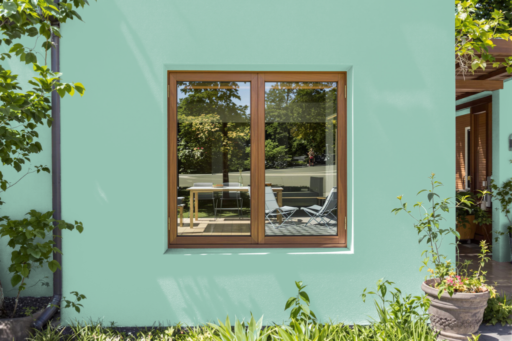
For home outdoor painting, RAL Effect RAL 740-3 offers a balanced choice with a light reflectance value of 50.12, ensuring that the color reflects a significant amount of light. This quality makes it suitable for enhancing various outdoor spaces, such as walls, trims, and furniture.
Because surface textures can influence the color's appearance—whether on rough walls or smooth finishes—it is important to test the color in real-life conditions. To guarantee accuracy before a full application, using a physical RAL color fan is recommended over relying solely on digital displays, which may not accurately represent the true look of the color.