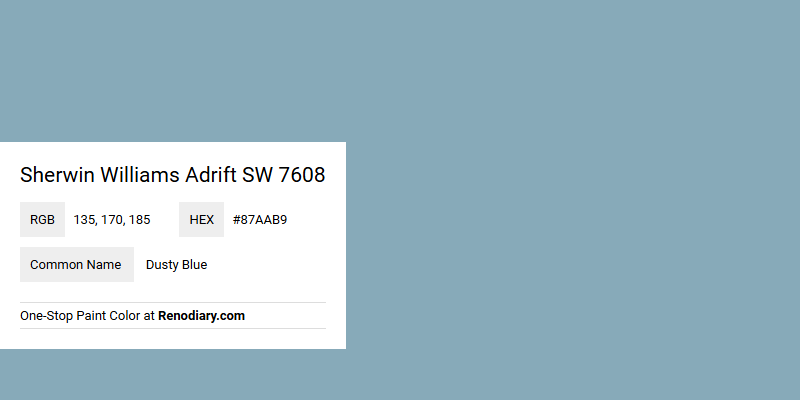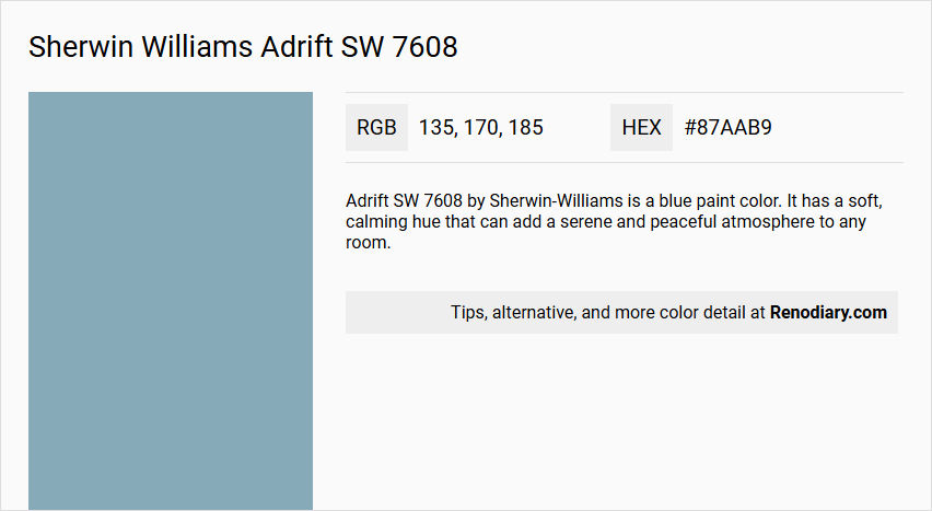
Sherwin Williams' Adrift SW 7608 is a soothing shade often referred to as Dusty Blue, with its RGB composition of 135,170,185. This particular hue features a soft blend of blue and gray tones, making it a versatile choice for both modern and traditional design schemes. Its calming presence is perfect for creating serene environments, whether used in living spaces or as a complementary accent color.
Color Description
Adrift SW 7608 by Sherwin-Williams is a blue paint color. It has a soft, calming hue that can add a serene and peaceful atmosphere to any room.
Undertones
The color Adrift SW 7608 has undertones that are generally described as soft blue, without strong leanings towards green or purple, making it a balanced and soothing choice.
Color Values
- Hex: #87aab9
- L*ab values: Available but not specified here; can be found on detailed color charts like those provided by e-paint.co.uk.
Usage
Adrift SW 7608 is suitable for both interior and exterior paint projects. It can be used on walls, ceilings, and trim to create a cohesive look. It is versatile enough to be used in various rooms, including kitchens, bedrooms, and living areas.
Atmosphere
This color creates a calm and serene atmosphere, making it ideal for spaces where relaxation is desired. It can help to create a sense of tranquility and can be paired with various trim colors to enhance its soothing effect.
Sherwin Williams Adrift SW 7608 Color Alternative
Sherwin Williams Aquitaine SW 9057 stands out as a refined alternative to Sherwin Williams Adrift SW 7608, offering a fresh twist with its balanced tone and clarity. Sherwin Williams Notable Hue SW 6521 provides another excellent option, delivering a subtle yet distinct feel that complements both modern and classic design schemes. Meanwhile, Sherwin Williams Open Seas SW 6500 rounds out the trio by introducing a vibrant depth and character, making it a versatile choice for spaces that require an invigorating splash of color.
Bathroom
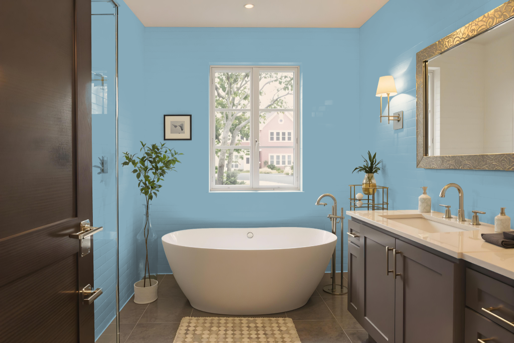
Sherwin Williams Adrift SW 7608 is an excellent choice for a bathroom, offering a distinctive and inviting aesthetic. Its soothing undertones can be beautifully paired with warm neutrals to create a harmonious look, or contrasted with deep navy hues for a more modern appeal.
This adaptable hue works well in both monochromatic and complementary schemes, providing an array of design options tailored to individual tastes. To guarantee the perfect match for your space, consider examining a physical color chip or card, as actual results may differ from digital displays.
Bedroom
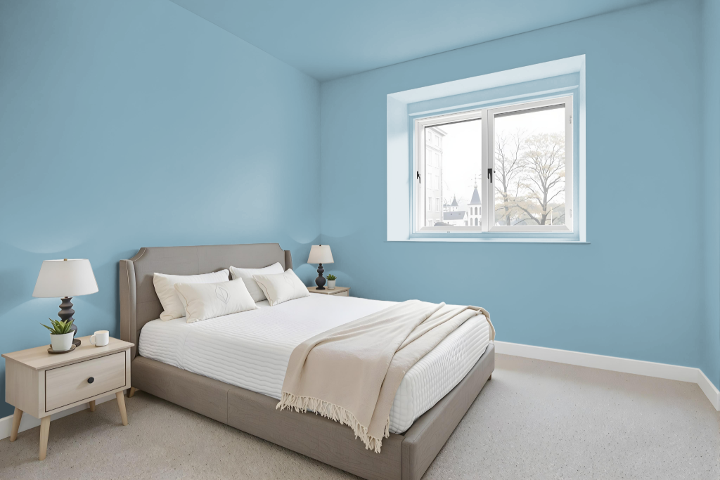
For a bedroom setup featuring Sherwin-Williams Adrift SW 7608, creating a welcoming space can be achieved by pairing it with complementary shades that enhance its warmth. Consider using a crisp, clean white for trim and accents to define the architectural details, while integrating deeper navy hues like those found in selected rich blue tones to add striking contrast and dimensionality.
Alternatively, a monochromatic approach using lighter and darker shades within the same family can lend an air of sophistication and calm. Focusing on subtle variations in tone not only reinforces the serene mood of the room but also allows you to balance soft neutral elements with bolder contrasts for an atmosphere that is both relaxing and refined.
Kitchen
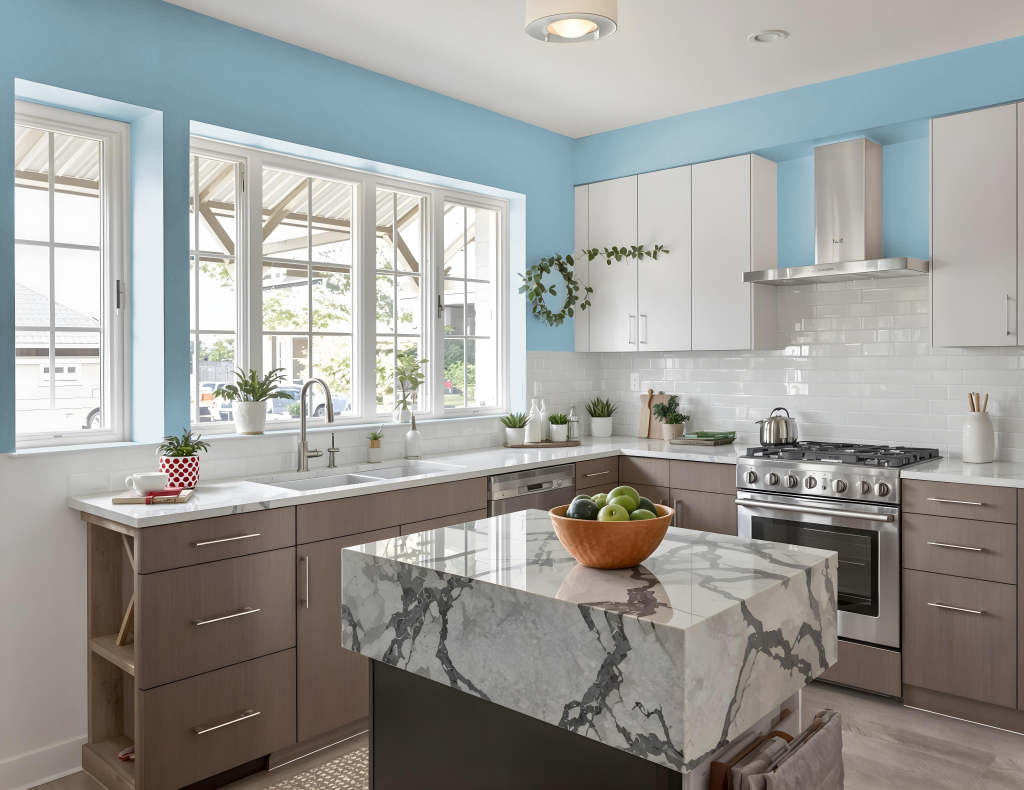
For a kitchen color scheme, Sherwin-Williams Adrift SW 7608 is a bold choice that sets the stage for an inviting and dynamic space. It pairs well with warm neutrals like Extra White and Accessible Beige to create a harmonious and welcoming atmosphere.
This distinctive hue also works beautifully when contrasted with deep navy tones such as Naval or Cityscape for a modern, bold look, or with lighter and darker shades of blue to craft a layered, monochromatic design. Additionally, incorporating red-hued accents like Mauve Tinge and Studio Mauve can introduce a vibrant visual contrast that enriches the overall aesthetic.
Living Room
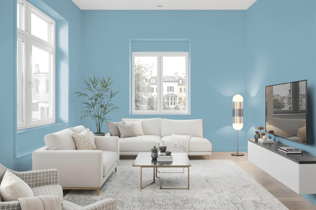
Sherwin Williams Adrift SW 7608 enhances living rooms with a serene and inviting aura, creating a calm, relaxing ambiance perfect for unwinding at home. Its soft hue pairs gracefully with warm neutrals like extra white and accessible beige to craft harmonious, inviting spaces for everyday living.
For a modern and striking look, this color can be paired with deep navy tones such as those found in tones reminiscent of Naval or Cityscape, introducing a bold contrast that elevates the overall design. Ideal for multiple rooms including kitchens, bedrooms, and bathrooms, it effortlessly adapts to both interior and exterior projects.
Outdoor
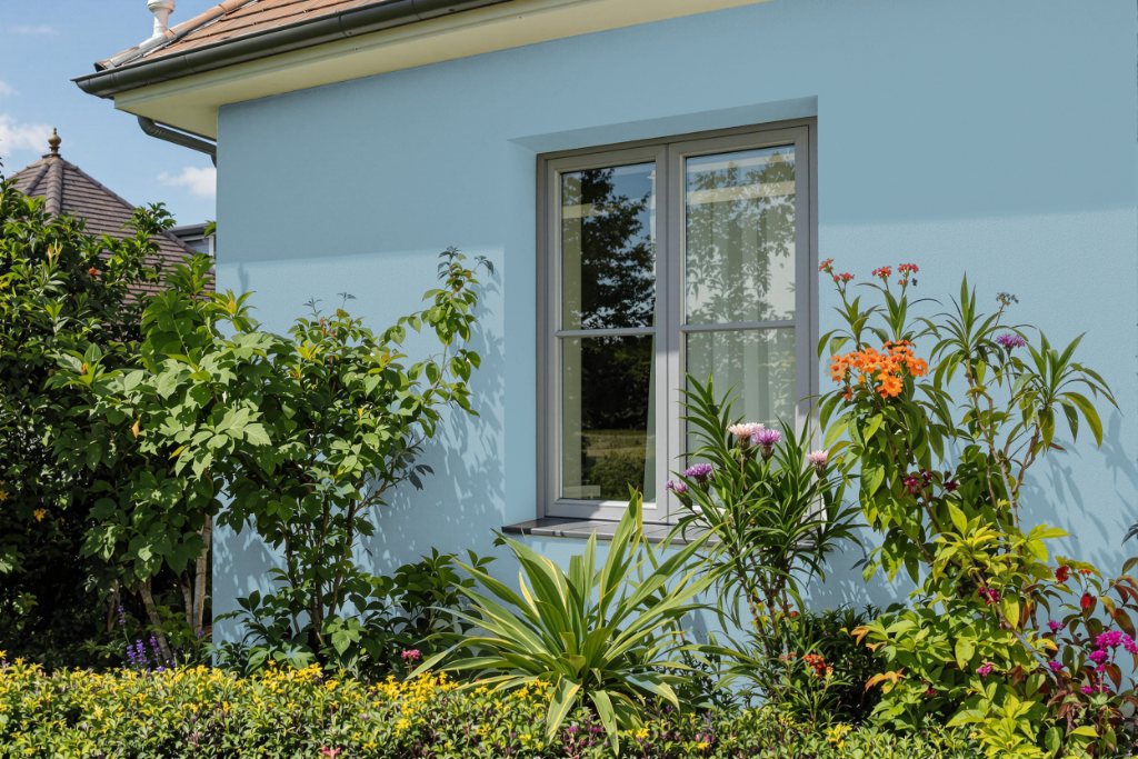
For home outdoor color, Sherwin Williams Adrift SW 7608 offers a soft blue hue that elevates the exterior appearance with its refined, coastal feel. It pairs well with warm neutrals such as Extra White or Accessible Beige for a seamless, harmonious look, while accent pieces in deeper navy tones can bring a bolder contrast.
The blue undertone in Adrift enhances both relaxed coastal and sophisticated themes when incorporated into exterior design. To ensure the desired effect, it is recommended to evaluate the color under various lighting conditions using physical samples.