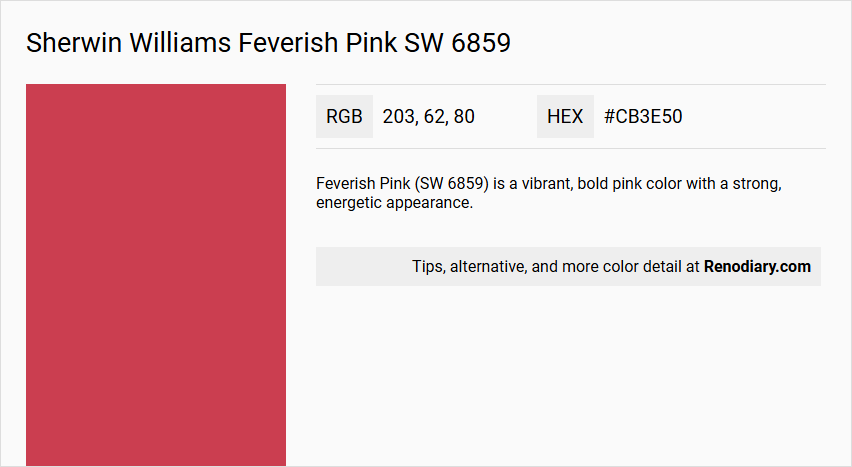
Sherwin Williams' color Feverish Pink SW 6859 exhibits a vibrant and bold hue that resonates with the passionate energy of a deep, rich pink. Its RGB composition of (203, 62, 80) contributes to a vivid color profile that leans towards a lively reddish-pink, distinct from traditional Brick Red. Perfect for creating a spirited and dynamic atmosphere, this shade can add a pop of personality to both interior and exterior design spaces.
Color Description
Feverish Pink (SW 6859) is a vibrant, bold pink color with a strong, energetic appearance.
Undertones
This color has noticeable red and slightly purplish undertones, contributing to its intense and lively hue.
Color Values
- Red: 203
- Green: 62
- Blue: 80
Hexadecimal: #cb3e50
Usage
Feverish Pink is often used in design to add a dramatic and eye-catching element. It can be applied on accent walls, decorative items, or as a bold color in graphic design to draw attention.
Atmosphere
This color creates a lively, energetic, and playful atmosphere. It is suitable for spaces where a vibrant and dynamic feel is desired, such as in children's rooms, creative workspaces, or areas needing a bold aesthetic statement.
Sherwin Williams Feverish Pink SW 6859 Color Alternative
Sherwin Williams Feverish Pink SW 6859 offers a vibrant base that inspires many designers to seek alternatives with similarly bold personalities. Little Greene Leather 191, RAL Classic Strawberry red RAL 3018, and RAL Effect RAL 440-2 each present their own distinctive nuances while echoing the energetic spirit of Sherwin Williams Feverish Pink SW 6859 in unique ways. These alternatives provide a versatile selection for projects that require a dynamic, eye-catching presence without compromising on the original's creative allure.
Bathroom
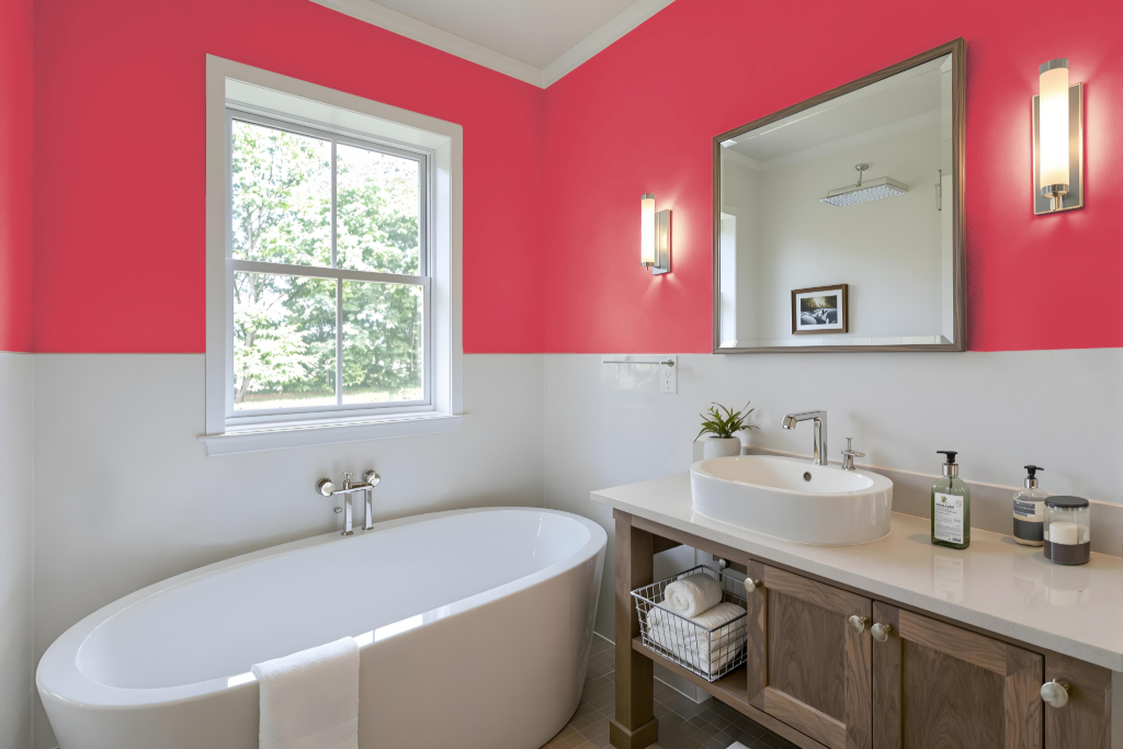
For a bathroom styled with Sherwin Williams Feverish Pink, the bold tone contributes a unique and playful touch that immediately sets a distinctive atmosphere. Its vibrant energy makes it an intriguing option for accent walls, decorative details, or statement pieces, especially in a space that might otherwise feel subdued.
To maintain a harmonious balance, this lively shade pairs best with softer neutral tones such as beige or ivory on the remaining walls while deep, contrasting hues for trim or accessories add sophistication. Careful integration with fixtures, tiles, and other design elements ensures that the overall aesthetic remains both engaging and functional without visual clutter.
Bedroom
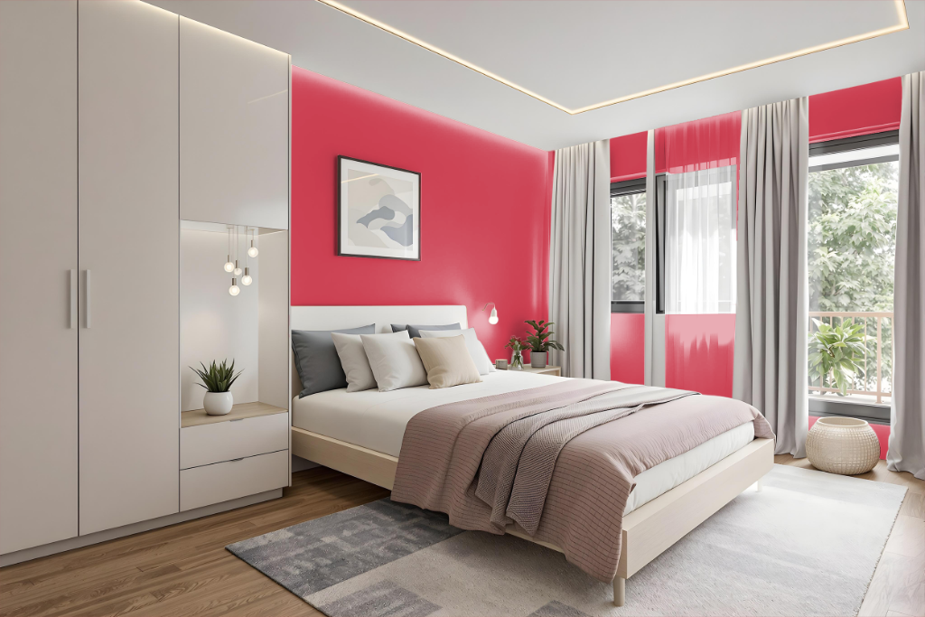
For a bedroom color scheme, Sherwin Williams Feverish Pink SW 6859 offers a bold and energetic option that sparks interest and creativity. This choice pairs beautifully with soft neutrals like beige or ivory to create a calming contrast while also working well as a statement wall or accent in the room.
For added depth and sophistication, incorporate dynamic shades such as deep emerald green or luxurious navy blue. Enhancing the effect further, consider using complementary hues inspired by nature to bring balance and playfulness, ensuring a cohesive and visually engaging space.
Kitchen
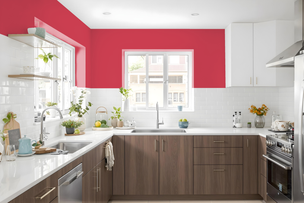
For a kitchen color scheme, Sherwin Williams Feverish Pink SW 6859 adds a vibrant, playful touch that instantly enlivens the space. Balancing this dynamic shade with soft neutrals such as beige or ivory on walls and cabinetry creates a warm, inviting atmosphere.
Enhance the design with sophisticated contrast by incorporating deep hues like emerald green or navy blue in accent areas such as a single wall, kitchen island, or backsplash. Additionally, pairing with complementary tones further amplifies the overall visual appeal for a striking, well-defined look.
Living Room
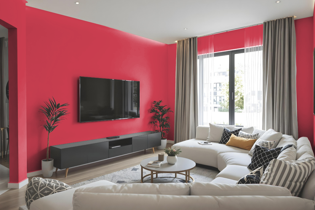
For a living room painted in Sherwin Williams Feverish Pink SW 6859, achieving a balanced ambiance is key. This vibrant tone can serve as a striking statement wall or be used in accents, and it pairs well with soft neutrals such as beige or ivory to provide a calming backdrop. Rich hues like deep emerald green or luxurious navy blue further contrast the energetic feel, elevating the overall design with sophisticated depth.
Integrating the color effectively can also involve using a monochromatic scheme that layers various shades and tints, or selecting complementary colors like cool whites, charcoal gray, or softer pinks to enhance the space. This thoughtful combination of elements creates a coherent and engaging environment, highlighting the dynamic character of the chosen living room color.
Outdoor
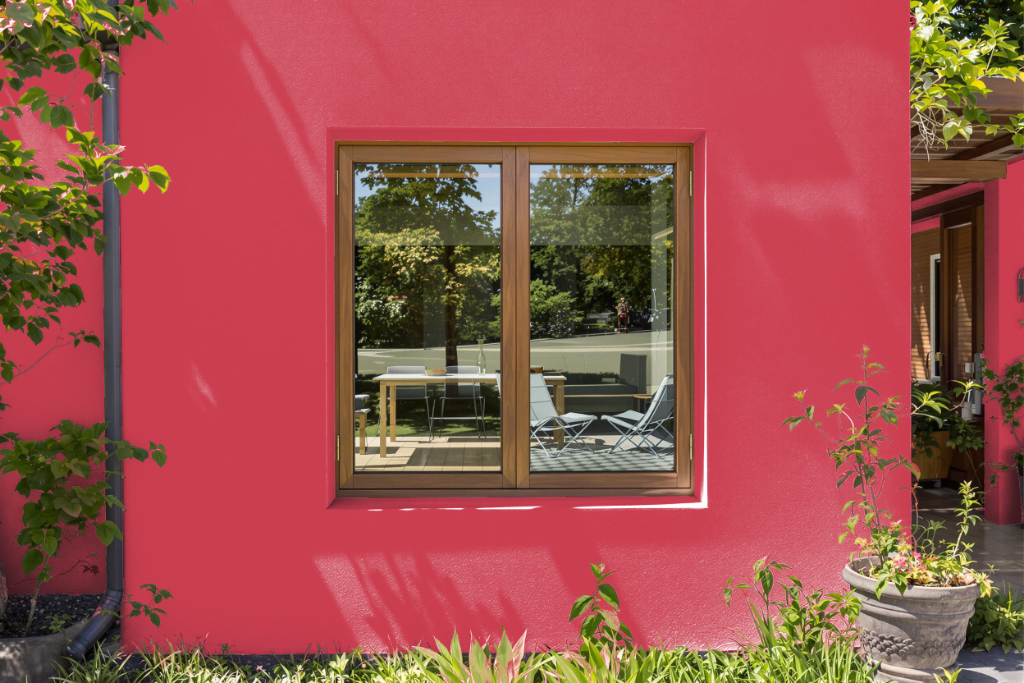
Sherwin Williams Feverish Pink SW 6859 makes a striking home outdoor color, perfect for adding a bold accent to exterior spaces. Its appearance varies on different materials, changing subtly between rough walls and smooth architectural details, so it is wise to test a sample on the intended surfaces and under varied lighting conditions.
Part of the Global Garden collection, this engaging hue pairs harmoniously with deep greens or blues to create a dynamic yet balanced look. Available in finishes such as satin, it offers a richer finish with a slight gloss, enhancing the overall visual appeal of the home environment.