Sherwin Williams' color "Something Blue" SW 6800, with its RGB composition of 176,214,230, is eloquently named Powder Blue, reflecting a soft and serene hue reminiscent of a clear, tranquil sky. This shade effortlessly inspires calmness and tranquility, making it a popular choice for spaces designed to evoke relaxation and peace. As a versatile color, it complements various decor styles, easily harmonizing with both modern and traditional aesthetics.
Color Description
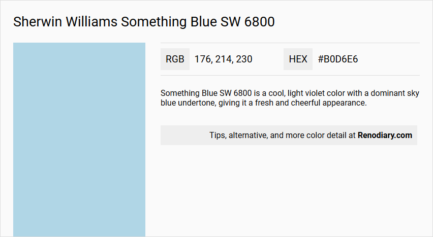
Something Blue SW 6800 is a cool, light violet color with a dominant sky blue undertone, giving it a fresh and cheerful appearance.
Undertones
The color has strong cerulean undertones, which contribute to its characteristic freshness and calmness.
Color Values
- Red: 176
- Green: 214
- Blue: 230
- HEX: #B0D6E6
Usage
This color is suitable for use in bathrooms or nurseries, where a bright and cheerful atmosphere is desired.
Atmosphere
The color evokes a sense of cheerful calm, new beginnings, and the freshness of spring skies, creating a serene and uplifting atmosphere.
Sherwin Williams Something Blue SW 6800 Color Alternative
Sherwin Williams Something Blue SW 6800 is a captivating hue that sets a serene and inviting tone in any space. Little Greene Sky Blue 103, Benjamin Moore Ocean Breeze 2058-60, and Benjamin Moore Little Boy Blue 2061-60 serve as excellent alternative options, each echoing the tranquil essence of Something Blue SW 6800 while offering subtle differences that can elevate a room's character. Exploring these alternatives allows designers to maintain a cohesive blue palette while adjusting the mood and style to perfectly fit their vision.
Bathroom
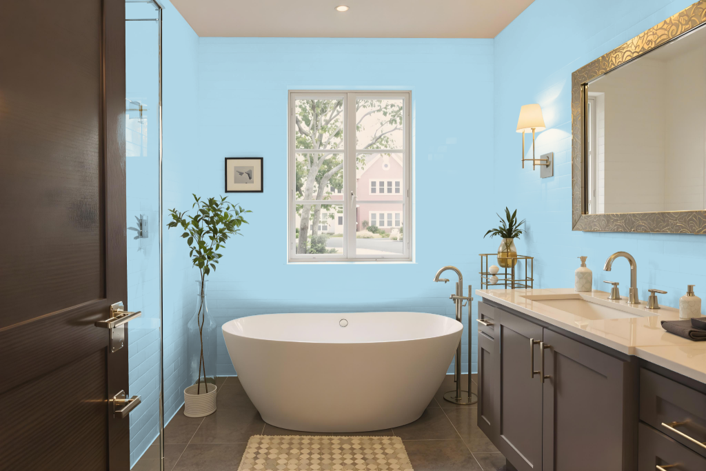
For a bathroom, Sherwin Williams Something Blue SW 6800 establishes a calming and inviting atmosphere. It harmonizes beautifully with soft neutrals such as Alabaster and warm greys like Requisite Gray, enhancing the overall sense of relaxation in the space.
Complementary accents in shades reminiscent of Misty and Sea Salt add contrast and visual interest, contributing to a setting that is both cheerful and serene. This thoughtfully curated combination is ideal for creating a balanced environment where tranquility meets subtle dynamism.
Bedroom
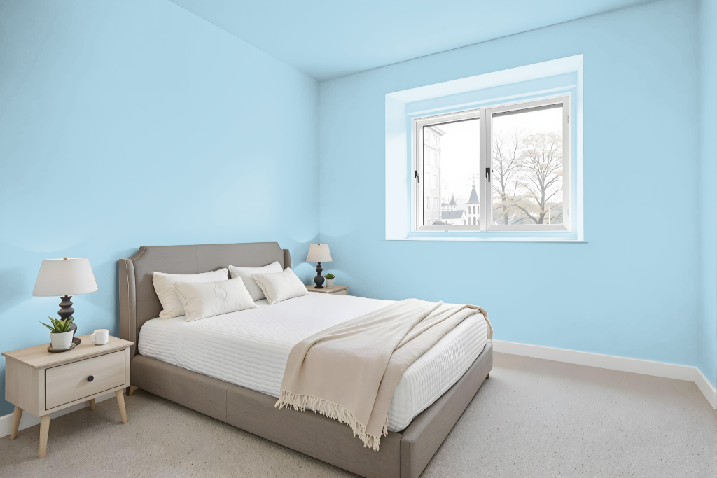
For a bedroom color scheme, Sherwin Williams Something Blue establishes a calm and tranquil atmosphere. Its deep yet soothing hue sets the perfect foundation for a space designed for relaxation.
When paired with soft, warm neutrals and gentle accent tones like Misty and Sea Salt, the color works harmoniously to create a refined and inviting palette. The combination of these tones fosters a sophisticated and balanced environment ideal for rest and rejuvenation.
Kitchen
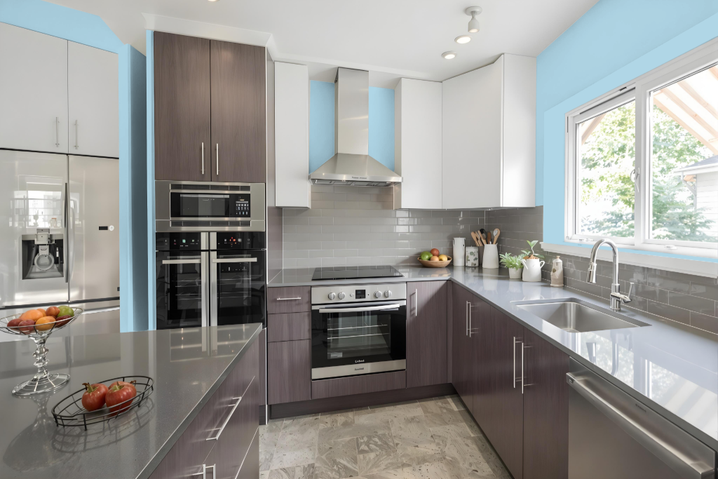
Kitchen color Something Blue creates a calm and inviting atmosphere, especially when paired with soft neutrals and warm greys. The serene hue works well with complementary tones to form a sophisticated and harmonious palette that enhances the overall ambiance.
When used in the kitchen, Something Blue harmonizes beautifully with white cabinetry and blue backsplashes, ensuring a clean and tranquil environment. Accents in shades like Misty and Sea Salt deepen the space while maintaining its soothing, balanced character, although caution is advised for north-facing rooms with limited lighting.
Living Room
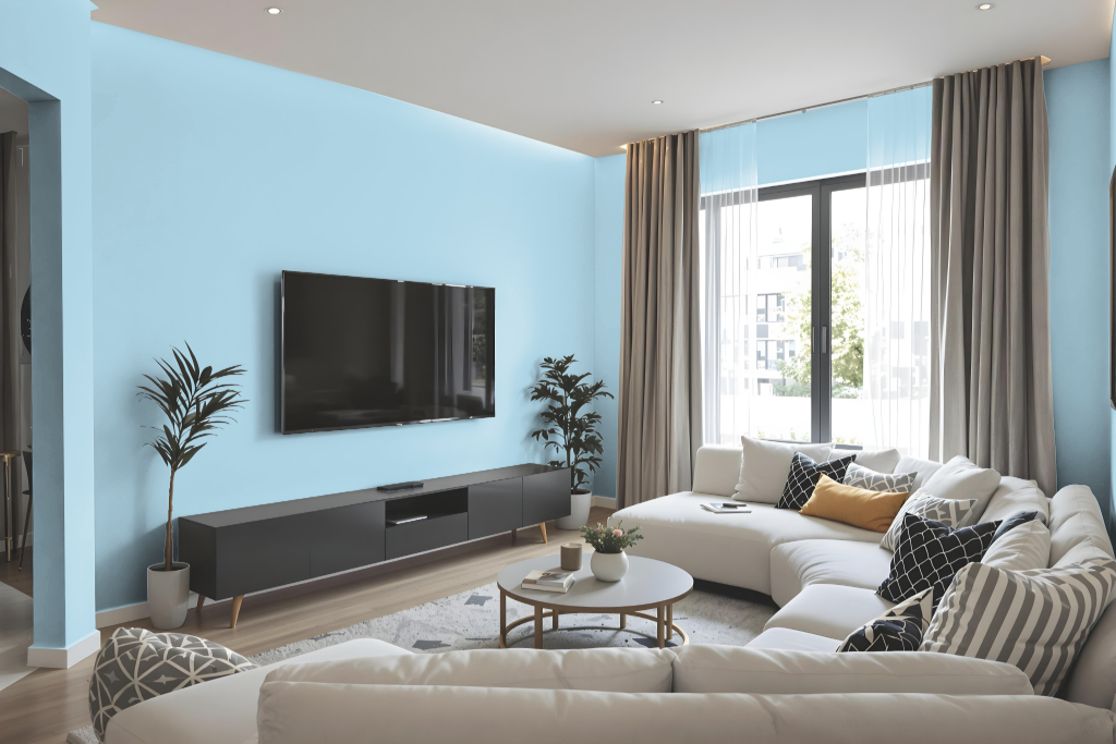
Living room color Something Blue creates a calming and inviting atmosphere, setting the stage for a soothing environment when paired with soft neutrals and warm greys. It establishes an ideal backdrop that invites relaxation and complements a range of design elements.
Accents in complementary shades provide depth and character, further enhancing the room’s appeal. Suitable for multiple spaces including bedrooms and bathrooms, this color can be confidently selected by testing physical paint samples or using digital visualization tools.
Outdoor
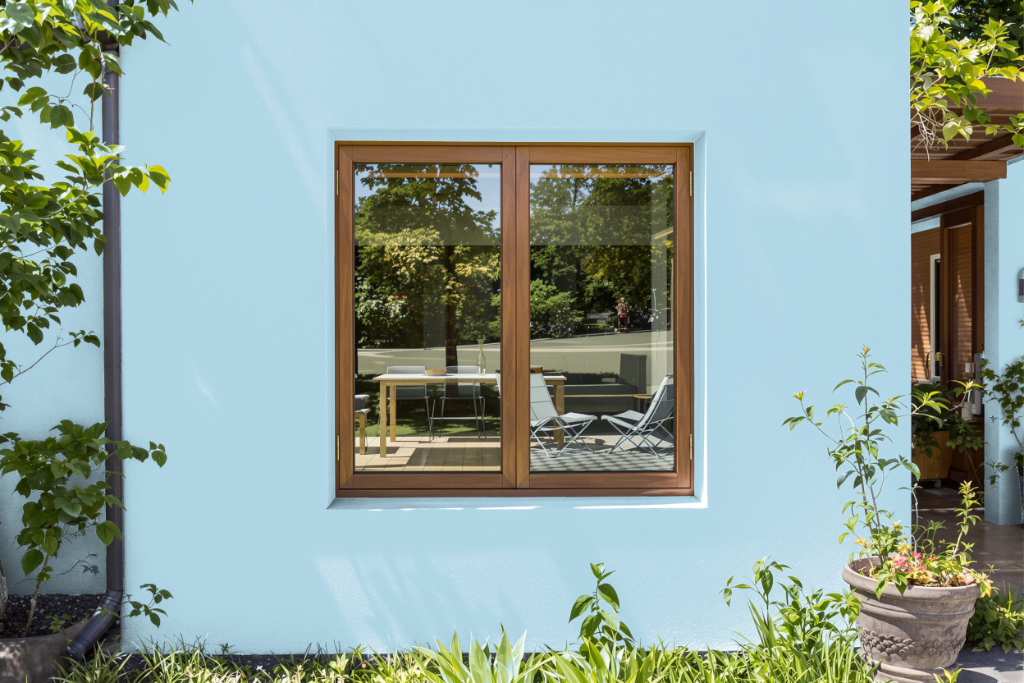
Sherwin Williams Something Blue SW 6800 is a standout home outdoor color that sets a calming and inviting tone in exterior spaces while translating beautifully indoors. Its cool undertones create a serene backdrop perfect for a range of painting projects, enhancing environments with a subtle, relaxed vibe.
For a coordinated look, consider pairing this hue with soft neutrals like Alabaster and warm greys such as Requisite Gray. Enhancing the soothing effect further, thoughtful accent shades like Misty and Sea Salt can be introduced, whether adopting a monochromatic design or a complementary color scheme.