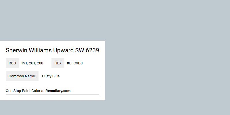
Sherwin Williams Upward SW 6239 is a paint shade that embodies a soft and calming Dusty Blue hue, making it a popular choice for creating serene environments. With its RGB composition of 191, 201, and 208, this color strikes a perfect balance between warmth and coolness, offering versatility in various design settings. Its soothing tone is ideal for spaces where a relaxing and sophisticated ambiance is desired, such as bedrooms and living rooms.
Color Description
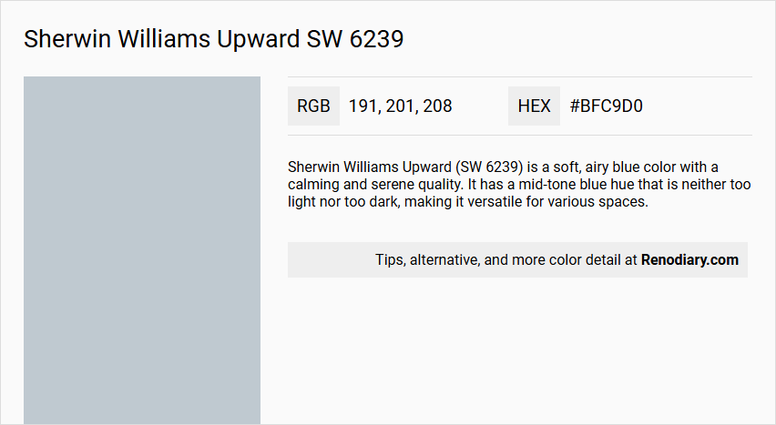
Sherwin Williams Upward (SW 6239) is a soft, airy blue color with a calming and serene quality. It has a mid-tone blue hue that is neither too light nor too dark, making it versatile for various spaces.
Undertones
Upward has subtle gray undertones, which contribute to its balanced and sophisticated appearance. This blend of blue and gray ensures the color remains neutral and adaptable to different lighting conditions.
Color Values
- HEX value: #BFC9D0
- RGB values: 191, 201, 208
- LRV (Light Reflectance Value): 57.37
Usage
Upward can be used in various rooms, including bedrooms, living rooms, and bathrooms. It is suitable for both interior and exterior applications. Here are some specific usage tips:
- It pairs well with crisp whites like Pure White (SW 7005) for a clean look.
- It can be complemented by neutral shades like Agreeable Gray (SW 7029) or warm tones like Kilim Beige (SW 6106) for added depth.
- For bold accents, Naval (SW 6244) or Tricorn Black (SW 6258) can create a dramatic yet natural contrast.
Atmosphere
Upward creates a calming and inviting atmosphere, making spaces feel fresh and alive. It adapts well to different lighting conditions:
- In the morning, it takes on a hint of periwinkle.
- By midday, it settles into a perfect neutral blue.
- In the evening, it deepens slightly, creating a cozy atmosphere.
This color is ideal for creating meditative and peaceful spaces, evoking a sense of calm and clarity.
Sherwin Williams Upward SW 6239 Color Alternative
Sherwin Williams Upward SW 6239 is a sophisticated color choice that can define modern spaces with its unique hue and character. For those seeking varied aesthetics, alternatives such as Tikkurila G489, Dulux Coastal Grey 70BG 56/061, and Little Greene Bone China Blue - Faint 325 offer complementary shades that maintain a similar level of style and depth. Each option provides a distinct twist on the original, ensuring designers and homeowners alike can choose a color that best fits the ambiance they wish to create.
Bathroom
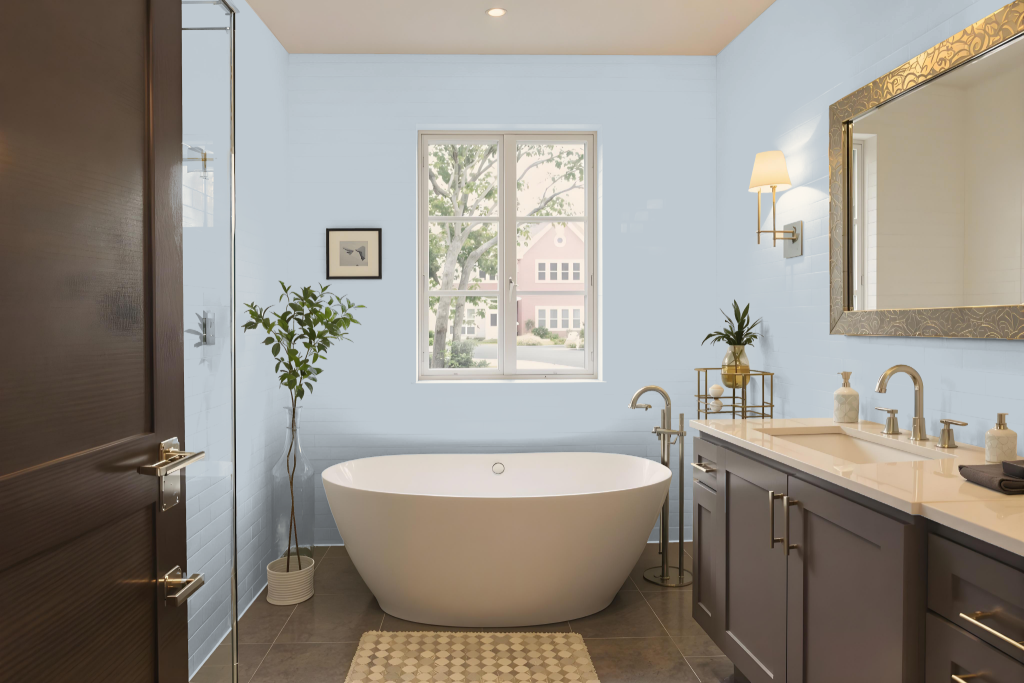
Sherwin Williams Upward SW 6239 is an excellent bathroom paint color that instills a calm, zen-like ambiance, transforming the space into a serene spa retreat. Its soothing hue softens morning light and maintains an airy feel, making even smaller bathrooms appear open and inviting when complemented with white tiles and chrome fixtures.
The color pairs beautifully with neutral tones like pure white or soft grays to create a balanced look, while dramatic accents in deep, rich shades add modern sophistication and contrast. This thoughtful combination elevates the bathroom into a tranquil oasis that blends relaxation and refined design seamlessly.
Bedroom
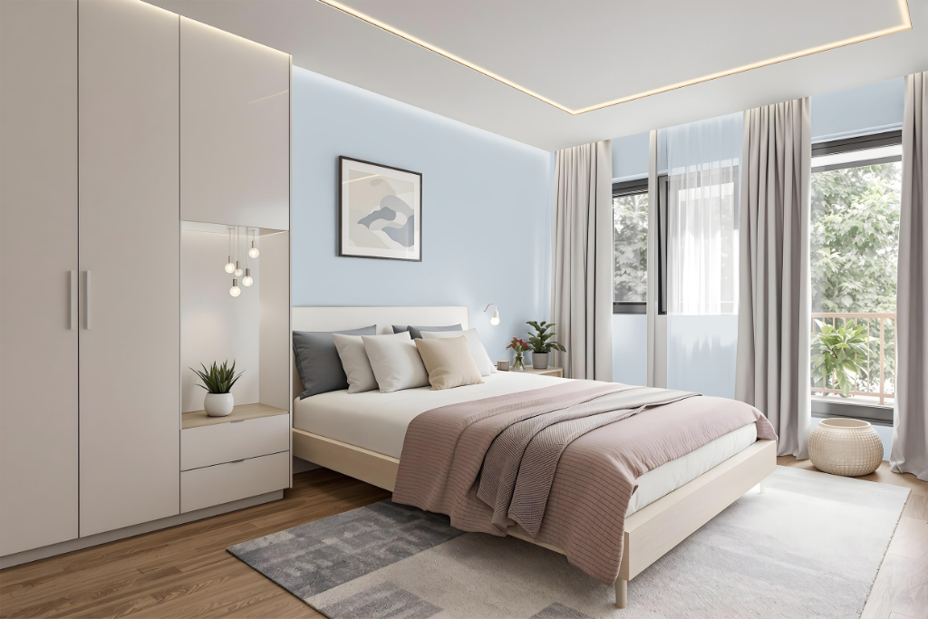
For a bedroom color scheme, Sherwin-Williams Upward sets a calming and inviting tone, perfect for transforming the space into a relaxing retreat akin to sleeping in a cloud. The soothing quality of this color works exceptionally well when paired with neutral hues like Pure White and muted grays, maintaining a light and airy feel while adding a touch of understated elegance.
Complementary elements in the decor enhance the overall ambiance; for instance, incorporating white tiles and chrome fixtures in adjoining bathrooms creates the feel of a refined spa escape. Bold accent colors on furniture or hardware offer contrast without overwhelming, and the color’s warm undertones harmonize beautifully with both light to medium and darker wood finishes, adding depth and richness to the overall design.
Kitchen
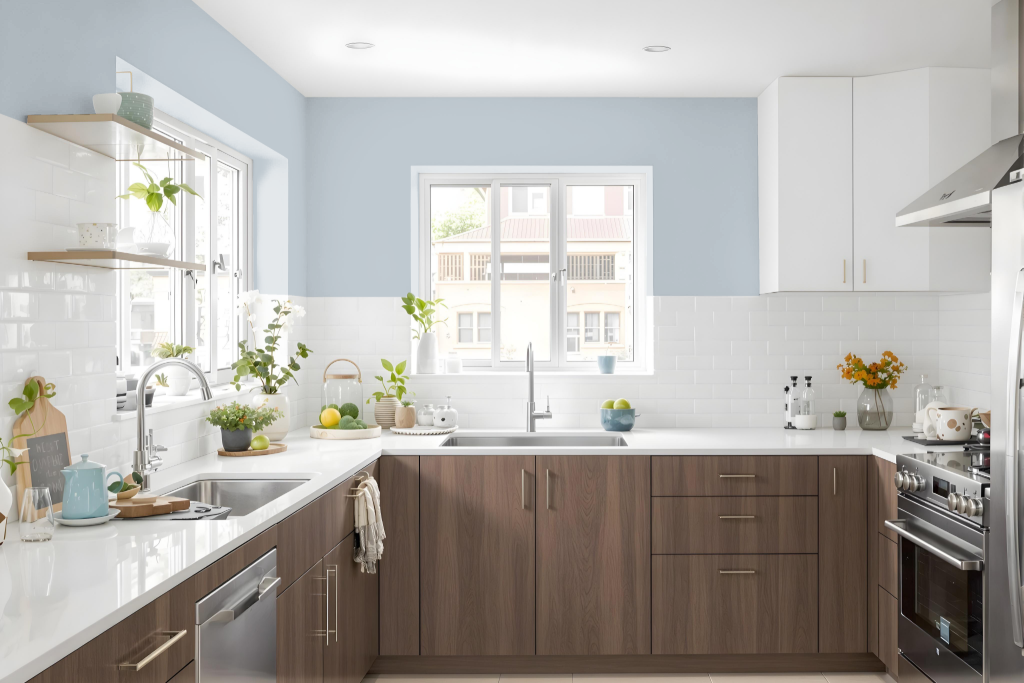
For a kitchen color scheme, Sherwin-Williams Upward SW 6239 offers a unique and calming touch when used on cabinets or as a backsplash to create a lively yet serene atmosphere. Its cool and soothing appearance sets the stage for a clean and refreshing design, inviting both simplicity and style in the heart of your home.
Pair this tone with crisp whites for countertops and trim to enhance clarity and brightness throughout the space. Subtle accents such as green plants, colorful accessories, or dark navy flooring can provide delightful contrast, enriching the overall balance and creating a welcoming environment.
Living Room
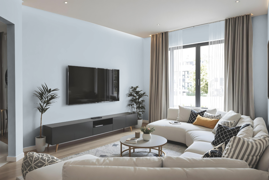
In living rooms, Sherwin-Williams Upward SW 6239 transforms the space by creating a balanced atmosphere that feels both expansive and inviting. It pairs beautifully with crisp white finishes to enhance its tranquil qualities and works harmoniously with neutral shades for an airy, refined look.
In addition, the color can be accented with deeper tones to introduce a modern edge, while a lighter version on the ceiling amplifies a sense of height and flow. This adaptable hue also proves effective in open-concept areas, bedrooms, and bathrooms, contributing to a serene, spa-like ambiance throughout the home.
Outdoor
Sherwin Williams Upward SW 6239 is an excellent choice for home outdoor color applications, providing a sophisticated yet distinctive touch to a residence’s curb appeal. Its ability to capture light on exterior elements, such as front doors, creates an inviting atmosphere that transitions elegantly from a muted morning tone to a deeper shade at dusk.
Paired with white trim or gray siding, this hue establishes a look that is both classic and contemporary. Homeowners are encouraged to test a sample on an exterior wall first, as intense sunlight may cause the color to appear lighter in some conditions.