Sherwin Williams' On the Rocks SW 7671 is a sophisticated blend known as greige, a versatile hue that seamlessly combines the warmth of beige with the cool undertones of grey. With its RGB composition of 208, 206, 200, this color creates a serene and balanced backdrop ideal for both modern and traditional interior designs. Its neutral character allows it to harmonize effortlessly with a wide range of accent colors, making it a popular choice among homeowners and designers alike.
Color Description
Sherwin Williams On the Rocks (SW 7671) is a versatile, neutral gray paint color. It is often described as a true gray with a balanced blend that avoids strong warm or cool undertones, making it appear as a soft, stormy, or middle-ground gray.
Undertones
On the Rocks has subtle undertones, primarily a violet undertone that can become slightly cooler in north-facing or cool lighting conditions. In warmer lighting, such as south-facing or western afternoon sunshine, it may pick up a tiny bit of warmth, but it does not lean heavily towards violet or blue. Some sources also mention slight green and taupe undertones, though these are less pronounced.
Color Values
- LRV (Light Reflectance Value): 62
- RGB: 208, 206, 200
- HEX: #D0CEC8
Usage
On the Rocks is highly versatile and can be used in various rooms, including dining rooms, kitchens, bedrooms, and bathrooms. It works well as both a main hue and an accent color. For exterior use, it can be effective if the home's finishes are compatible with its violet undertone, though it may appear more washed out in bright natural light.
Atmosphere
This color creates a sophisticated and inviting atmosphere, making it suitable for contemporary and luxurious interior designs. It can elevate the ambiance of a room by providing a refined yet welcoming feel. When paired with appropriate trim colors like Sherwin Williams Pure White or High Reflective White, it enhances the overall aesthetic.
Sherwin Williams On the Rocks SW 7671 Color Alternative
Sherwin Williams On the Rocks SW 7671 is admired for its balanced and contemporary appeal, making it a popular choice for modern spaces. Tikkurila offers compelling alternatives with Tikkurila Median X486, Tikkurila Piazza Y487, and Tikkurila Shawl Y467, each providing unique nuances that resonate with diverse design aesthetics. These options not only preserve the expressive character of On the Rocks SW 7671 but also allow for tailored interpretations in various architectural and interior projects.
Bathroom
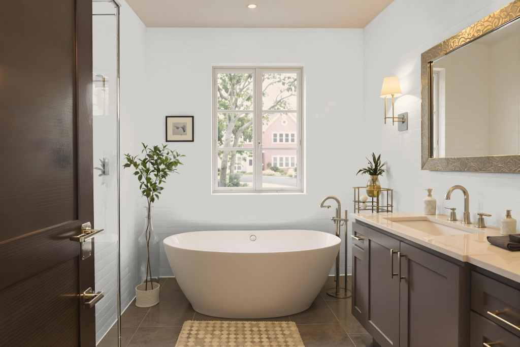
Sherwin Williams On the Rocks is a sophisticated bathroom color designed to bring a refreshing and uplifting feel to any space. With its high light-reflectance quality, it effectively illuminates rooms with limited natural light, ensuring that the space feels open and inviting when applied to surfaces like vanities, cabinets, and trim.
The paint maintains subtle undertones that prevent unexpected color shifts, allowing it to harmonize effortlessly with clean white accents and various decorative elements. Its consistent, fresh appearance pairs well with mirrors, mixed metal fixtures, and patterned tiles, creating a modern and sleek environment that enhances overall bathroom aesthetics.
Bedroom
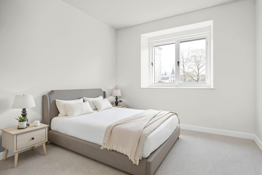
For a bedroom color scheme, Sherwin Williams On the Rocks is a great choice thanks to its calming effect and ability to maintain a soft, airy feel in various lighting conditions. Its serene quality makes it an excellent backdrop, even in rooms with limited natural light.
Paired with white trim for a crisp contrast, On the Rocks enhances decor that features warm wood tones, plush textures, and subtle accents, creating a clean and inviting aesthetic. Incorporating deeper accent colors further adds depth and sophistication, establishing a balanced and serene bedroom atmosphere.
Kitchen
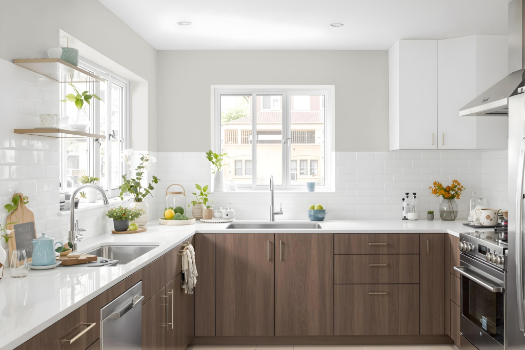
For a kitchen color scheme, Sherwin Williams On the Rocks sets a sophisticated tone that pairs well with crisp trim and deep charcoal accents. It creates a clean, calming backdrop that allows other elements—such as light neutrals on cabinets, natural wood tones, and textured rugs—to enhance the space’s understated charm.
To further elevate the overall design, complement On the Rocks with balanced shades including pure whites and softer neutrals for a modern, cohesive look. For those seeking dynamic contrast, subtle touches of greens or blues add depth and interest, while always ensuring the color appears as intended in your kitchen’s lighting.
Living Room
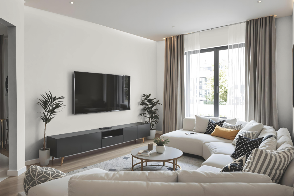
Sherwin Williams On the Rocks is a popular choice for living room walls, offering a balanced foundation that reflects ample light to keep spaces feeling open and inviting. The color exhibits subtle and shifting nuances—leaning cooler with hints of violet under certain lighting, while in other conditions, a touch of warmth reminiscent of taupe emerges—ensuring a dependable backdrop for thoughtful design.
In home interiors, On the Rocks complements neutral or monochrome color schemes and creates a striking contrast when paired with crisp white trim. Its nuanced character makes it an excellent candidate for pairing with complementary shades on accent walls, and testing the color in your specific lighting conditions is encouraged to achieve the desired modern and sophisticated look.
Outdoor
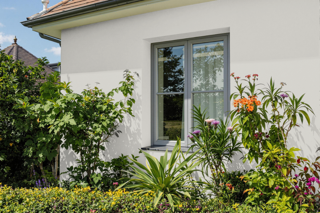
When considering Sherwin Williams On The Rocks for your home outdoor color, it's essential to note that its appearance can shift dramatically in varying natural light. The color shows a pronounced violet undertone under bright conditions, which may render it a bit washed out on exterior surfaces.
Given these lighting nuances, it becomes important to ensure that the violet hints harmonize with other finishes and accents around your home. Sampling the color in your specific setting is highly recommended to verify that its dynamic character complements the surrounding elements and maintains the desired aesthetic appeal.